


- The main headline
- Subtitle
- The call to action button
- Social Proof
- Dedicated content
- The form and fields people need to fill in
- and of course the main hero image
How to choose an image strategy for your landing page
The main hero image is meant to help potential customers see the value in our offer within the first couple of seconds, understand what’s in it for them and why they should take the next step in our customer journey vs. the competitor’s. On average we see between 4000-10,000 messages a day, we’re constantly bombarded with ads, text messages, calls and content everywhere, the possibilities and options online are endless and tiring. This is one of the main reasons potential customers easily and almost automatically navigate from one site to another without giving as much as thought for the page they just visited. As consumers we move quickly from one competitor to another until something clicks in our brain and catches our attention. That something is the value, the “What’s In It For Me?” To stand out from your competitors and gain your customer’s attention (therefore increase conversion rates), the hero image on every landing page, email campaign and especially your website should project immediate value to your customer.
This isn’t an image of your product, service or features, it’s an image that highlights the emotional value customers gain from being your customers (e.g increase self confidence, get appreciated by your boss or find true love). As I mentioned at Mozcon, insurance companies don’t sell insurance policy, they sell peace of mind; a happy carefree family.
While most landing pages show an image of the product, platform or service they’re providing, we’ve ran countless tests proving time and time again that value wins almost every time.
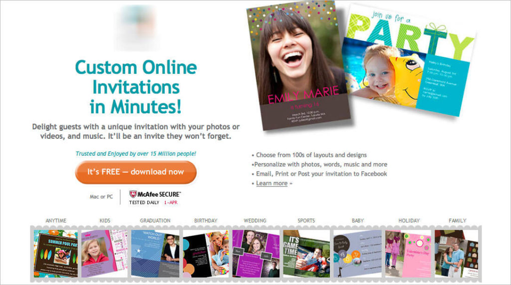
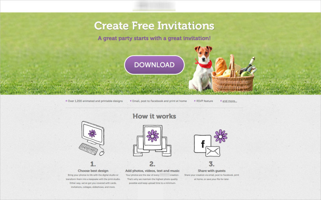
For example, this company provides an all-in-one solution for creating birthday and party invitations. While the original landing page featured images of the different templates available and featured a product focused headline: “Custom online invitations in minutes”
To stand out from your competitors and gain your customer’s attention (therefore increase conversion rates), the hero image on every landing page, email campaign and especially your website should project immediate value to your customer.
This isn’t an image of your product, service or features, it’s an image that highlights the emotional value customers gain from being your customers (e.g increase self confidence, get appreciated by your boss or find true love). As I mentioned at Mozcon, insurance companies don’t sell insurance policy, they sell peace of mind; a happy carefree family.
While most landing pages show an image of the product, platform or service they’re providing, we’ve ran countless tests proving time and time again that value wins almost every time.
For example, this company provides an all-in-one solution for creating birthday and party invitations. While the original landing page featured images of the different templates available and featured a product focused headline: “Custom online invitations in minutes”
 The variation we created visualized the party scene for our potential customers. Utilizing different colors to enhance certain feelings, an image of the park, a picnic basket and a dog this variation focused on helping people envision the perfect party, which starts with a great invitation. The results: 65% uplift in purchased subscriptions!
 Today, I’m going to show you exactly how to do that yourself.
There Are 3 Ways to Define Your Image Strategy
Before setting down to design your landing page and randomly choose your image, take some time to follow the 3 step process we use to define the customer’s value and the images we want to test: Step 1: Talk to your customers The great thing about talking to customers is that they have all the answers. They know why they purchased an item or service and have a clear reason for doing so. However, most customers will give you a list of tactical reasons for their purchase. This happens due to our brain’s tendency to rationalize our purchases, we may purchase on emotion but our brain quickly finds a way to rationalize that decision. For example – buying an expensive suit, or that lamp you don’t really need is then explained by attaining a good deal for it or your sudden need for more light around the house. So a great way to discover your value and avoid technical answers is asking them how they would feel about removing certain items from your stock or certain features from your platform. This will give you a clearer understanding of the real value people find in your service. You can also ask what may have stopped them from converting and more importantly, ask them about THEM: What are their dreams, aspirations and even what scares them – get to know them so you can offer relevant, more compelling images, colors and content. Talk to your team Your customer success team, your sales team and anyone who talks to your customers on a daily or weekly basis can provide key insights. They know what people complain about, what their main issues are and what people find exciting. Talk to your team, interview them and learn how they view the customer, what values they believe you offer and compare these to your customer interviews. Analyze direct and indirect competitor sites NO I’m not suggesting you copy from your competitors in anyway. What I am saying is that you should analyse the testimonials and especially the reviews found on your competitor’s site. This comes straight from Joanna Wiebe’s research process: See what reviews customers are leaving, what bothers them and what they care about to discover what you need to highlight on your landing page and what value you should focus on. — Once you’ve compiled all this data together you’ll be able to define the image strategy you want to test. The next step, is finding these images that highlight the value and have all of the qualities you’re looking for. Below are 6 rules you should follow once you’ve defined you’re strategy and ready to choose an image for your landing page:6 Rules for Choosing a Landing Page Image
#1 Use Real, Relatable and Authentic Images
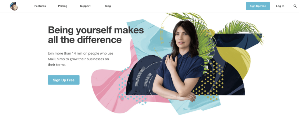
A successful image is one that your customers can to relate to. Either by seeing themselves in the image or someone they would want to be like, someone that reflects their challenges and values, or someone they can and want to connect to. Use authentic images of people and avoid ones that are clearly stock photos, bought for the sake of the page. Best case scenario – use real images of your customers or your team, if you can’t use those choose your images wisely. A quick google images search can show you how many companies are already using that image. Ask yourself, is this image authentic? Will my customers relate to it? Or does it look like this (in case this isn’t clear –> this is a bad image!): Mailchimp’s new homepage redesign (launched just a few weeks) ago baffles me. The image is clearly a stock photo image (if not… then bad execution) that feels cold and has no relation to their headline “Being yourself makes all the difference”. Does this image represent their target audience? The colorful background with different shapes, colors and palm leaves distracts the customer and has no value that I can personally detect. As a Mailchimp customer, personally I don’t feel comfortable with this women staring me in the eye and telling me to be myself. This image feels fake and I have a hard time relating to it in anyway.
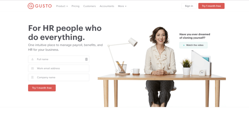
 Gusto on the other hand, has an image of a women sitting in front of her desk smiling. Now, granted I don’t really know if this a real photo of an HR person or a stock photo but it feels real and the connection between the image and headline is clear. I can immediately resonate with it, it’s authentic and relatable to HR personnel who do it all. Gusto makes the main image work with the strategy of the page, makes it about the customer and as opposed to the lady staring at us from Mailchimp’s new design, this women doesn’t feel alienating – she feels welcoming, someone you might want to meet. This is the difference between using authentic images that relate to your target audience vs. images that just look nice and have a “cool” composition.
#2 Reduce Visual Noise
“With great power, comes great responsibility” – As we’ve seen, our image captures most of the attentive mind of our landing page visitor, it’s almost always the first thing we see and it’s what determines if we should hang around a take a few more seconds to read and understand the offer. This means, that other than choosing a good strategic image, we also need to think about reducing the noise it creates so it doesn’t have a negative affect. We need to make sure it’s easy for customers to quickly see what’s in it for them and asses our services. How do you do that? By following these 3 simple rules:- Ensure high contrast between the image and the page content so it doesn’t “drown” out the text, making it hard for people to read, like this for example:
- Ensure the photo is distraction “clean” as possible and helps customers focus only on the most important elements of it unlike the landing page below for example. There’s so much going on within this image that it’s hard to focus on anything. Not to mention the fact that this is yet another common image used by thousands of startups to show another “unique” office space. This image has nothing to do with the service. How exactly does an image of random people in an office make you feel that this a “new model for talent development”? Clean images, mean using only the objects that help get the message across, remove any details that can cause confusion or stress on the eyes.

- Consider the colors you use – colors have an emotional effect on us and can assist us in saying things without actually spelling them to people. For example, you don’t have to say you’re trustworthy, you could (in Western cultures) use blue for that. Also, remember to reduce the amount of colors you use so it’s easier on the eyes and easy to take in.
#3 Use Images as Direction Cues
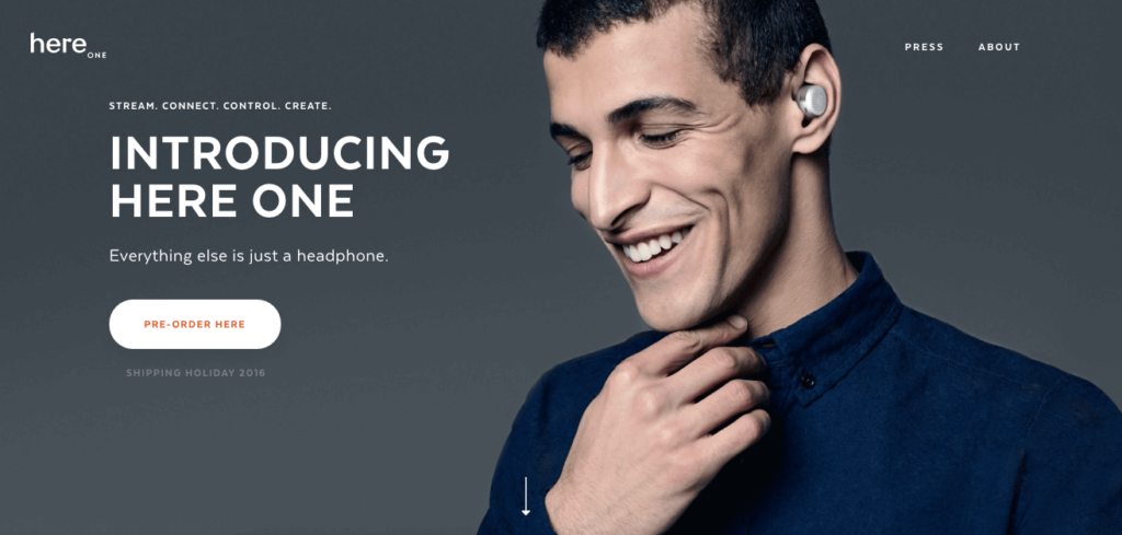
Our main image is there to create a certain atmosphere and feeling, but it’s also there to navigate the customer in the right direction and point them towards the next step (whether it’s subscribing, downloading something or simply reading more). You can use your main image as a directional cue to show people what to do next like the visual below. You’ll notice that all elements (computer, paper, earphones and pens) are placed around the call to action button making that the main focal point of the page. Granted, I’m not sure this is the best image to use to sell a UX class, since it’s only showing specific elements you’re going to use during the course, but doesn’t explain why you should actually take it. However the placement of elements is done well.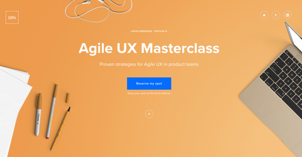 Perhaps a better example is by ‘Here One’. As you can see they’re using their main character (seems authentic and wearing product) to point with his entire body towards the call to action button.
#4 Avoid carousels and auto play videos
While tempting, carousels confuse visitors and make it hard on them to focus on the action they need to take so don’t use them. This is actually a well known fact and many case studies have shown that rotating images reduce conversion rates. And so do automatic background videos! instead of reading your content and taking the next step, the visitor is now engaged in a moving video that’s distracting and has nothing to do with your goal. Have multiple images in mind? Test them, don’t use them all at once.#5 Consider Mobile
Just because an image performs well on desktop, does not mean it will work or look well on mobile. First, you’ve got the fact that technically the image may look bad on mobile:- It may look stretched
- Take too long to load
- Completely dominate the page
- Move all your content below the fold
- or simply won’t make sense to a visitor on mobile.
#6 A/B test your Strategies
Once you have an hypothesis for your image strategy, take the time to test it vs. the one you already have. In fact, test different strategies, for example an image of your product or someone using the product vs. an customer centric image. This is not only a great way to validate your hypothesis but also a good way to show numbers, figures and facts to your team who might have a hard time getting behind this new initiative. A/B testing image strategies instead of just simple elements such as the color of the call to action button will give you greater insights that can then be presented to your team for convincing them to get on board.Image Checklist
Use the following checklist and process to define the images for every landing page, email campaign or website you launch:- Define the goal of your page (e.g – subscribe, download)
- Evaluate current image strategy (Does it highlight the customer or yourself?)
- Use heatmaps to determine current image (e.g – is it a focal point, are people clicking on it)
- Conduct customer surveys
- Conduct interviews with team
- Analyse competitor websites for reviews and testimonials
- Combine all data to define a customer centric image strategy
- Choose image (using the 6 rules)
- Launch A/B test of current variation vs. new variation
Over to You
Remember that the image doesn’t work alone, it’s part of a whole composition working with the copy, your fonts, colors and call to action button. All elements together should be geared towards helping the customer immediately seeing what’s in it for them and helping them take the next step.This post originally published on Talia Wolf’s blog