Colors, can have a tremendous impact on a consumer’s decision to purchase. With today’s 3 seconds to convince visitors to convert kind of world it’s important to use colors, images and messaging the best way we can. As our brains process images 60,000 times quicker than text, color can have a huge impact on your landing page’s conversion rate. In the following article we will explores the emotional power color has on our brains and decisions, along with tips for how you can incorporate color psychology into your landing page designs.
The Emotional Power of Color
Colors are a way of communicating certain messages and feelings in a matter of seconds. When we use the right colors, they can have an emotional effect on our visitors and direct them in to action. According to Kissmetrics, 85% of shoppers place color as the primary reason for why they buy a product and color increases brand recognition by 80%. People are also said to make subconscious decisions in under 90 seconds, and color is a great way to trigger action.
Segmenting Colors by Gender & Age
In general when we design our landing pages we don’t put a large emphasis on gender unless we’re targeting our product to a specific gender. We use colors to portray specific emotions and make a memorable experience for our client’s users. Depending upon the type of product or service you offer, and the industry in which you operate, gender preferences may play heavily into purchase decisions. It pays to understand which colors persuade a particular gender to stay on a page or make a purchase.
According to research from Sherwin-Williams colors that appeal most to women are blue, purple and green while orange, brown, and gray are least appealing.
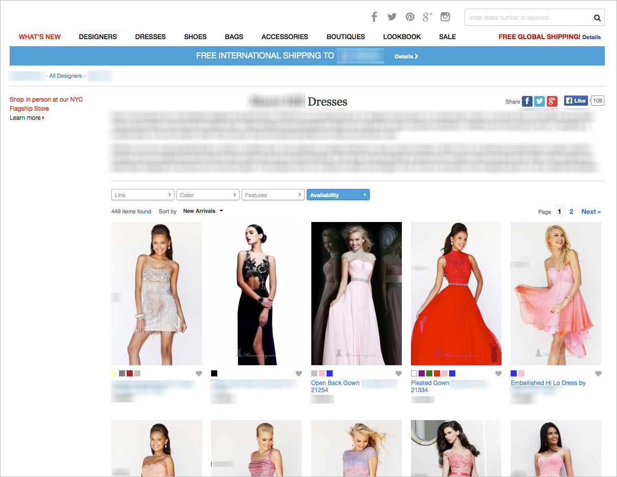
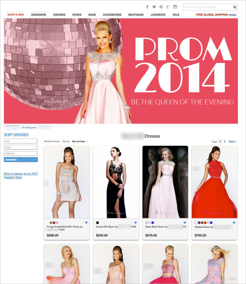
Earlier this year we worked on a women’s ecommerce store selling prom dresses in the US. in this test we introduced the color pink to project calm, hopeful and positive feelings towards shopping prom dresses online. The color pink was introduced to more than just the banner or background, the images on the page were given a pink hue and were all directing to a certain type of experience – our goal was to help women (mothers and daughters) experience the delight of shopping online in a world of calm and positive emotions . These changes and others increased revenues by 86%.
Before:
After:
According to the same research from Sherwin-Williams, men preferred blue, green, and black, while brown, orange, and purple were the least loved. Again, again and again we see that the emphasis shouldn’t be on the gender or age but on the experience you’re creating for the visitor.
When designing your landing page you should also take into account the age of your audience. You may already have a clear sense of the age of your audience, or if you are using Google Analytics, you can find this information under the Audience tab. Children and younger generations tend to prefer warmer colors that are associated with positivity and high energy. These include red, orange, pink, and yellow. Brown, purple, yellow, and blue are generally associated with sadness and negativity by children.
Colors & Types of Consumers
Color also has a unique ability to attract certain types of consumers and impact shopping behavior.
- Impulse shoppers tend to gravitate toward black, red orange, and royal blue. This is evidenced by the colors found in fast food, outlet malls, and clearance sales.
- Shoppers on a budget tend to be influenced by navy blue and teal. This is evidenced by the typical color schemes found in large department stores and retail banking.
- Traditional buyers are drawn to pink, sky blue, and rose. Clothing stores will use these customers to attract traditional buyers to their shops.
Designing For Emotion
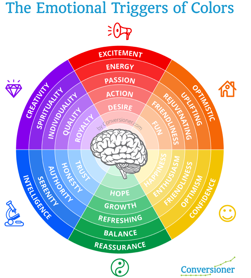
Color is one of the most subtle and effective ways to instill a specific emotion. Colors can make us feel happy or sad, relaxed or hungry. Different research shows that certain colors elicit particular emotions, and by understanding the psychology of color you can establish an emotional connection with consumers.
Yellow
Yellow is a great color to give a gentle energy to a landing page. It is mainly used to inspire happiness, laughter, hope, and sunshine. However, you should use yellow sparingly as it can also irritate the eyes if it is overused. In the landing page below we used the color yellow and other yellow elements to generate fun and sunshine.

Red
Red can be a great way to draw attention to an element, like a call to action, but use in moderation as the color can become overwhelming. Red can can bring out emotions of passion and love, as well as anger or danger. Red also has a tendency to cause us to feel hungry, which is why you see fast food chains like KFC and McDonalds make heavy use of these colors in their branding.
Green
The use of the color green can be done to emphasis regeneration, clean, health and wealth. Green is commonly found in financial institutions, as it is indicates growth, financial health, and possibility. Earlier this year we introduced the colors green to establish a look and feel of wealth, relaxation, fresh and new. Green is also known as being the easiest color our eyes can process making it easier for us to focus on other elements on the landing page.
This increased conversions by 65% in the first round.
From:
To:
Orange
Orange is more inviting than Red, but still grabs attention. Orange is one of the most common colors for creating call to action buttons. Earlier this year we discussed Fanta’s use of the color orange and
Blue
Seeing the color blue causes the body to release chemicals that are calming, which causes it to evoke feelings of soothing, calmness, and spirituality. Dark blue is commonly found in corporate designs because it promotes stability and professionalism. Lighter blues give a more relaxing and friendly feel. Take Twitter and Facebook, for example.
Purple
This color is associated with creativity, royalty, nostalgia, and wealth. Like blue it can also have a calm and soothing effect, however depending on the shade it can also be used to create intrigue. Purple can be used to make a design appear more luxurious or wealthy, and is often used in beauty and anti-aging products.
The Impact of Color on Conversions
There are plenty of examples where a simple change in the color of increased sales and conversions, since other than copy, design and color play a huge role in the success or failure of any landing page or product. Although changing an elements color on a landing page can have great impact on conversions, it is very hard to analyze results from these types of tests and scale from them. Deciding on the colors of your landing page or brand is more than just the color of your Call to Action button, it’s a strategy. Since colors portray emotions, you can use them in a way that communicates a certain experience.
I just got back from Europe and witnessed all of the McDonalds chains around me in Green. It intrigued me to understand why such a strong brand known for its RED color would change to Green and apparently McDonalds is swapping its traditional red backdrop for a deep Green — to promote a more eco-friendly image in Europe. The power of color.
McDonalds isn’t alone, in a marketing study, Heinz changed the color of their signature ketchup bottle from red to green and sold over 10 million bottles in seven months, resulting in sales of $23 million.
What’s Next?
With all of the information and data provided you should be able to start incorporating color psychology into your landing page designs in order to see which colors resonate with your target audience. It’s important to understand that work does not end with simply creating a landing page and that continual testing of copy, layout, imagery, and particularly color is need to truly impact conversions. How have you incorporated color into your designs?
This post originally published on Talia Wolf’s blog