Most marketers spend the majority of their time and budget on driving users to their sites and landing pages, but very little thought is given to the experience the user has once they reach there. In fact, companies typically spend $92 to bring customers to their site, but only $1 to convert them (Eisenberg Holdings). This lack of attention and investment in landing page optimization is a huge missed opportunity for organizations.

Learning From Others
A great place to get started in optimizing your own pages is to look at common landing page examples and mistakes that many companies are making on a daily basis. In this article I’ll explore 15 landing pages’ major mistakes and offer different tests you can run to increase conversion:
6 Elements Addressed in Each Landing Page Design
1. Call To Action (CTA) – This is the most important part of the landing page as it is the end goal for what you want the action you want the user to perform. The CTA should be the first natural object a visitor sees. An effective landing page services on clear objective (e.g. sign up, leave their contact information, download a whitepaper, request a demo, or buy now). The call to action should represent the only action you can take on the landing page, which means removing any menus or links on the page. The CTA should also stand out from all other elements by using high contrast, bright colors, and strategic placement. Lastly, make it absolutely clear what the user will get when they click on it. For more information on CTA’s, check out this detailed article on Call to Action Buttons.
2. Messaging – An effective landing page talks about benefits, not features:
Putting the customer in the spotlight, not your product or service. Good messaging conveys the change a customer will experience in their daily lives with your product, not how amazing your product is. This message should also be conveyed in a matter of seconds. Providing convincing information to allow a visitor to make a decision. Understanding the experience a visitor needs to go through is key to higher conversions.
3. Registration Forms – If the goal of your page is to capture leads or contact information, your landing page will have a registration form. Creating an effective, and high converting registration form involves several factors and there are several ways to increase their conversion:
a. Minimize your request – ask for the minimum possible
b. Be precise- Explain the reason for singing up and be specific.
c. Call to action – make sure to have a clear call to action that indicates the next steps that need to be taken.
d. Guide the user – Help users understand where they are, and where they’re going. Use indicators, explanation fields and don’t surprise the user.
e. Consider social signups – Following the minimizing requests necessity, introduce social connect for easier signup.
There are many other elements to take into consideration, and we’ll discuss them when we dig deeper in to our landing page examples.
4. Page Structure– The look, feel, and overall structure of a landing page will have a large impact on how it performs, and ultimately conversion. Minimalist design tends to perform better, so be sure to maintain a clean landing page with clear navigation and little distraction. The most important content should be placed at the top of the page, or “above the fold.” This way a user does not have to scroll in order to get all of the necessary information to convert.
5. Images – I know, I’m probably like a broken record by now BUT: Our brains process images 60,000 times faster than text. The Image is IMPORTANT.
A picture is worth a thousand words, and having an image that captures your visitors’ attention, or stirs emotion can make or break landing page performance. Some things to keep in mind:
a. Use imagery to add meaning: either to the brand, or to the content
b. Get more meaning from fewer graphics
c. Use images deliberately to support your message and communication goals
d. Remember the landing page’s goal and the users’ goals, and apply graphics in subtle proportions
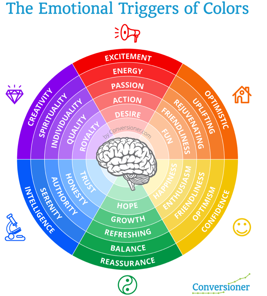
6. Colors – Believe it or not, color has a powerful influence on our emotions and decision-making abilities. Colors are a great way to communicate emotions in a matter of seconds. Checkout this extensive article on color psychology.
So, lets take a look at these landing page critiques and learn as much as possible from them. I’d love to hear your thoughts and comments on the landing pages. If you’d like to have your landing page critiqued next, send a quick email to [email protected].
—-
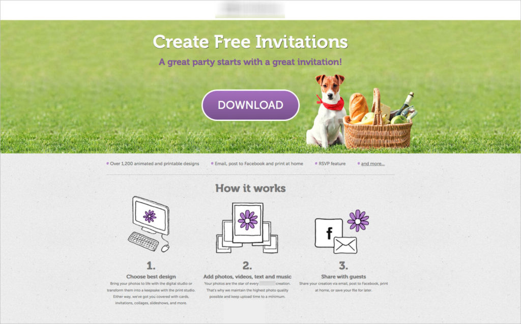
GolfLinked
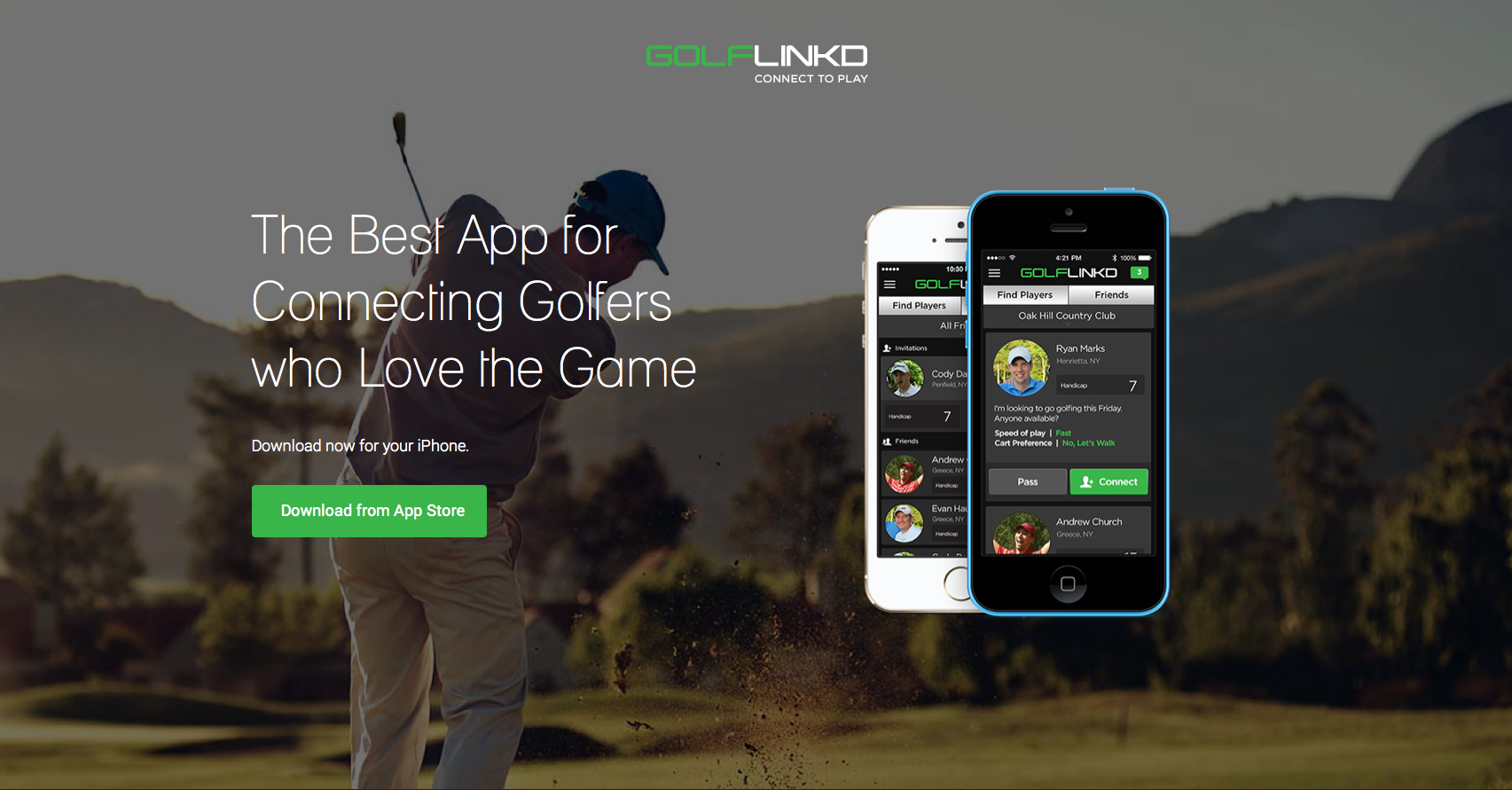
I know I’m not the targeted audience, BUT:
What’s in it for me? So this is the BEST app for connecting golfers. Great, but how is it going to change my life? Circling back to messaging –> it should be about the customer not the app. What’s in it for the user?
Let’s talk about the image –the image is one of the most dominating elements on your landing page and can be used not only to convey a message but to direct users attention to other important elements. The image shows a golf player with his back to us (which makes it impersonal) but further more, the image is distracting. In fact the first thing a visitor notices on the page is the iPhone and not the call to action, which is what we want them to notice.
The Call to action is placed on his butt. Enough said. No one wants to click on anyone’s butt.
Stop emphasizing your logo and even worst making it clickable, companies do this all the time. It’s attention grabbing, if you’re not Apple or another huge brand there’s no need to highlight your logo. Move it out of the spotlight.
The use of colors – Green is a great color for creating a fresh, clean and new feeling. Green also serves as a great natural color that is easy on the eyes.
What to test:
- Have your image facing/pointing at the call to action button – it will focus the visitor’s attention in the right direction. Finding an image that works for golf isn’t easy at all, we ran a similar test last year.
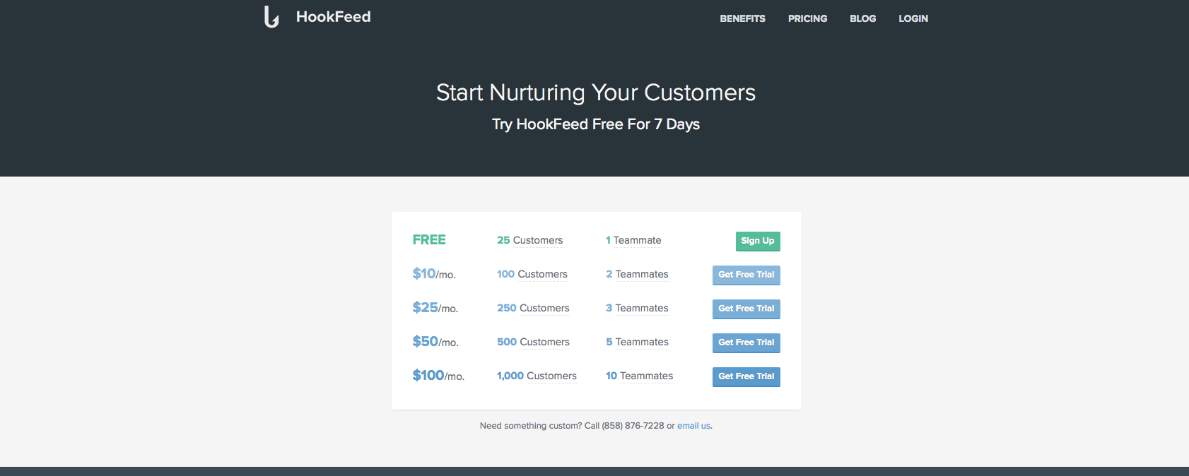
HookFeed
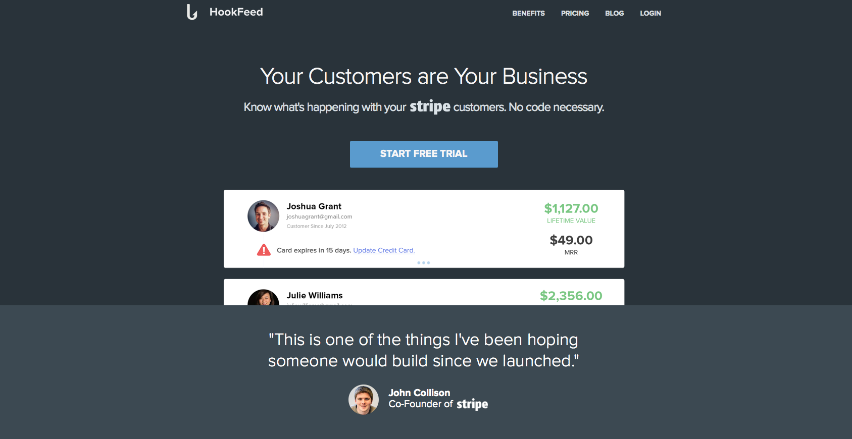
The headline is really vague. My customers are my business? What do you do? Why should I use this product? It doesn’t give me enough of an insight to how this will make my life much easier. I’m not sure how segmented are the visitors arriving on this page, but it lacks a more in-depth explanation.
Great use of social proof quotes, especially from Stripe’s co-founder. People love to feel others like them are using the same products and services as they are.
Nice call to action, contrasted from the rest of the page, stands out and it is the first natural elements my eyes focus on.
Extremely Confusing Funnel – The call to action button opens a confusing list of options. You’ve just gotten people to tryout your free trial but instead you’re confusing people and asking them for too much.
2 Elements You Can Test:
- Before showing them a list of prices, start by collecting their email details that way you can follow up on them if they leave.
- Once they’ve entered their email address, send them to the product and have your list of offers in a layer above it. This way, customers will feel they’re just a step away from reaching the product and will complete the funnel.
Present
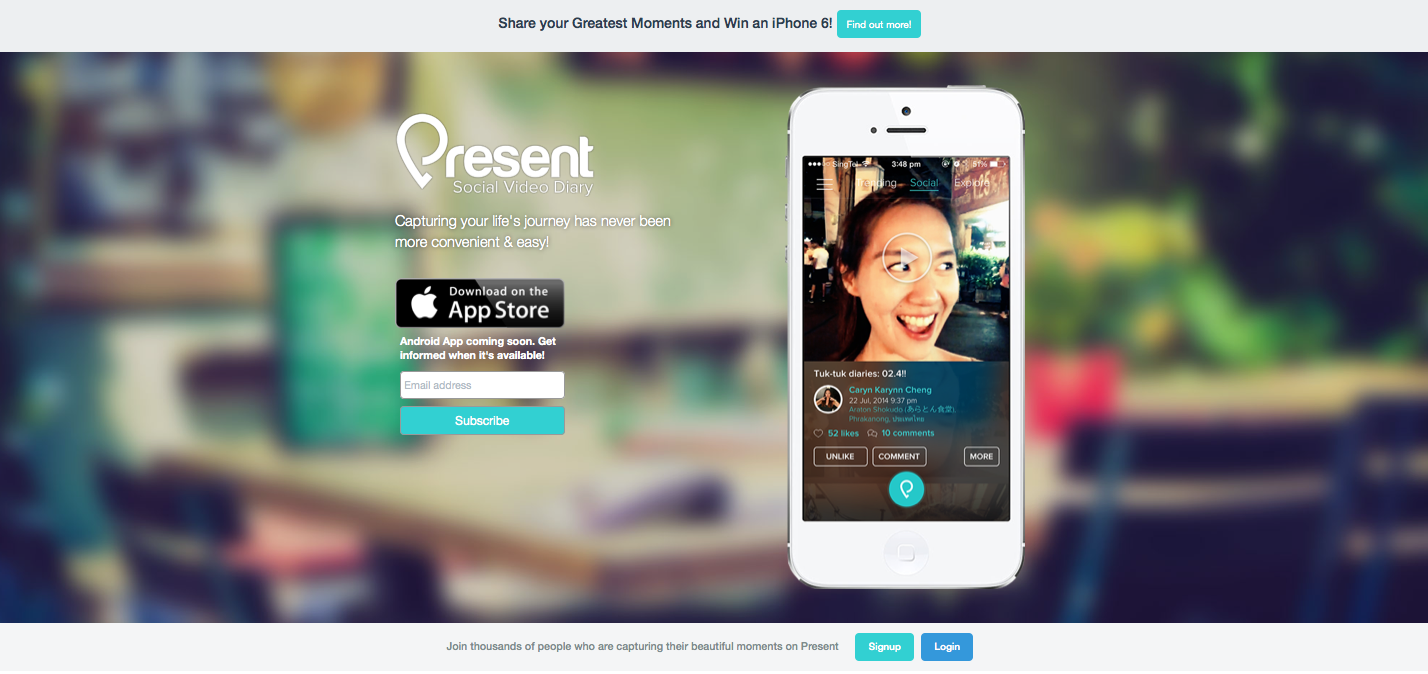
The image of the girl conveys a great feeling of excitement and adventure. For an app that wants to get you excited about capturing your life in video, it does a great job. One comment: Flip her! Get her to look the other direction.
The messaging is great – “A social Video Diary, capturing your life’s journey.” I know what this is, I know how it will improve my life and I can get this in less than 5 seconds.
What do you want a visitor to do? Find out more, download the app or subscribe? All 3 buttons on the page have the same weight and it’s not clear what the target is.
What To Test:
- Flipping the girls image to look at the CTA
- Try using the “Win an iPhone 6″ competition as an exit pop, so that when people come to leave they have a last minute proposition.
- If you want to subscribe Android users to a mailing list, you can do that with a simple link under the “Download App” button asking: “Android user?” a click on that can open a subscribe window.
StampReady
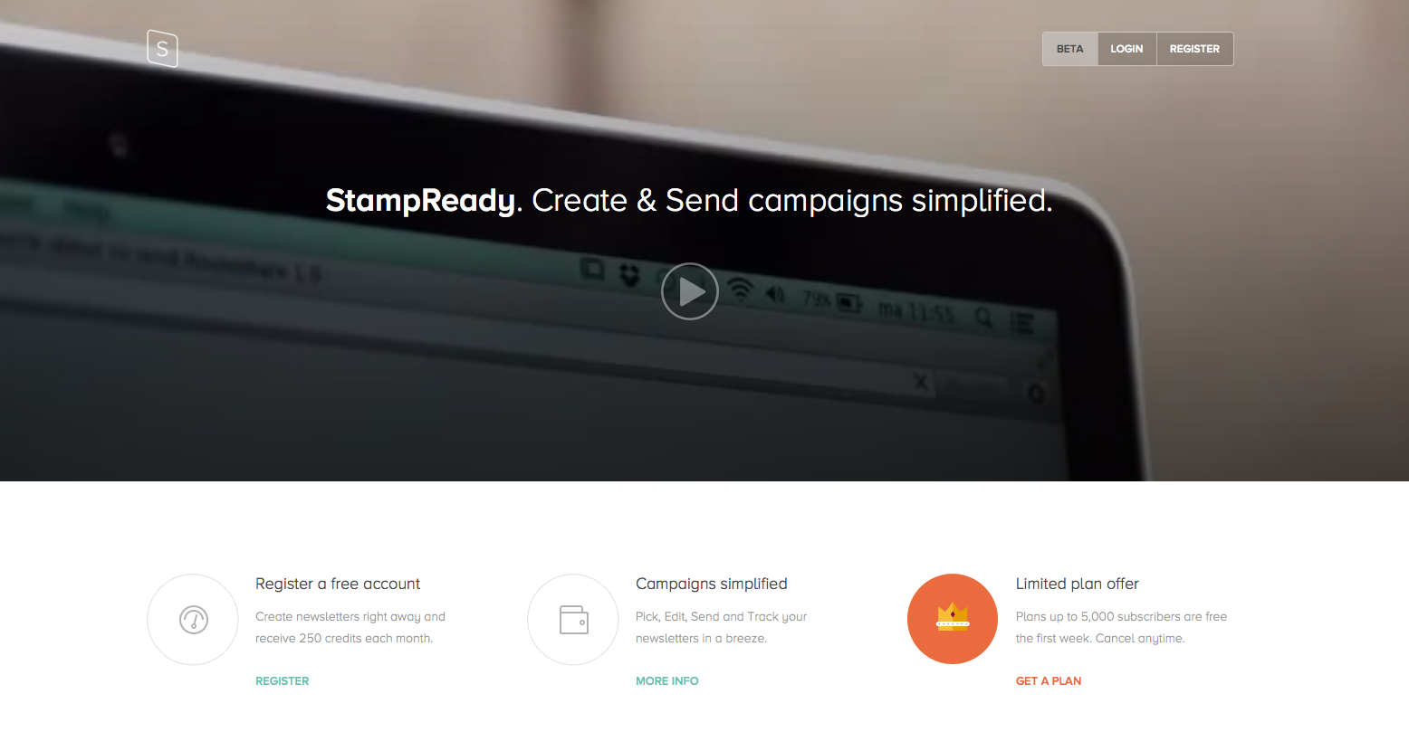
What is your call to action? Are you trying to get people to watch the video? Or register?
Everything’s grey. You need to use your design and colors to point the visitor in the natural direction of the call to action.
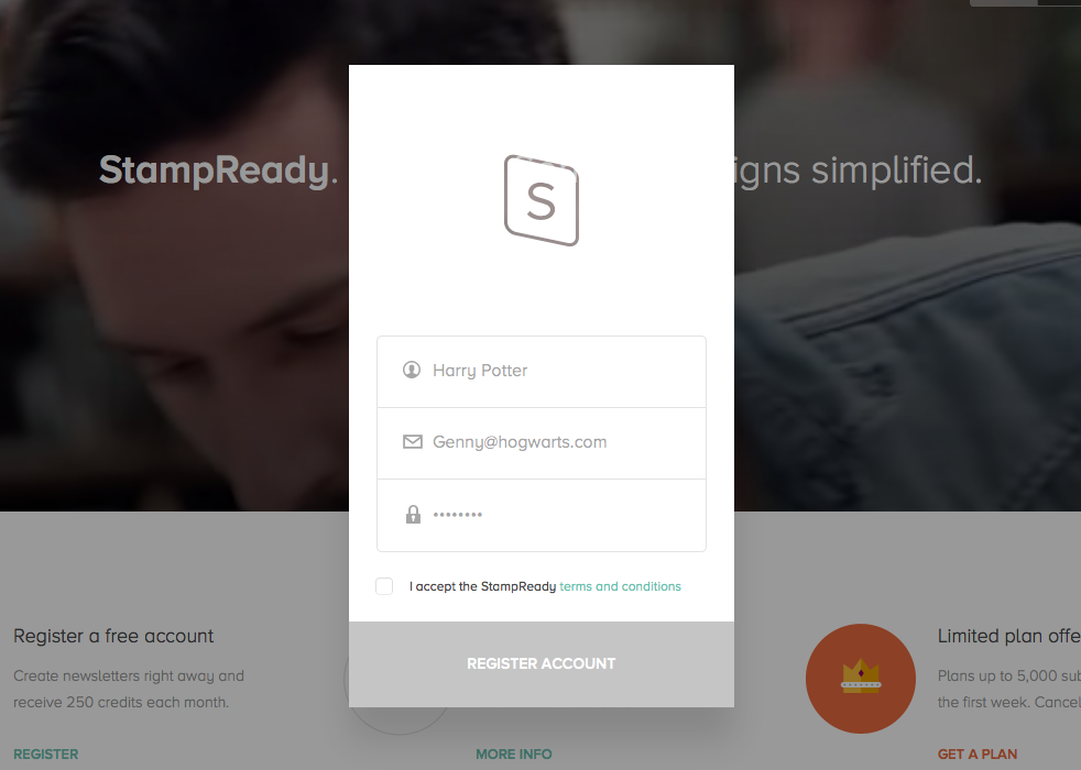
Nice work on the signup form, it’s short and to the point. I would however change the color of “Register account” to something different than grey, more actionable and I would think about changing the messaging on the call to action to something more exciting.
The messaging doesn’t tell me anything. What are you offering? Why is StampReady better for me? How is it going to simplify my life? I’m also not sure about having the name of your company in the headline. The headline is meant to give you the big picture in under 3 seconds, unless you’re a well known brand, that won’t work.
What to Test:
- The image/video in the background says nothing about the service. As you’re already showing a video as your main call to action, I would have a static image in the background that would give more of a feeling of what StampReady is for its customers.
- Add a clear call to action
- Change the messaging
- Add color to page
PeekCalendar
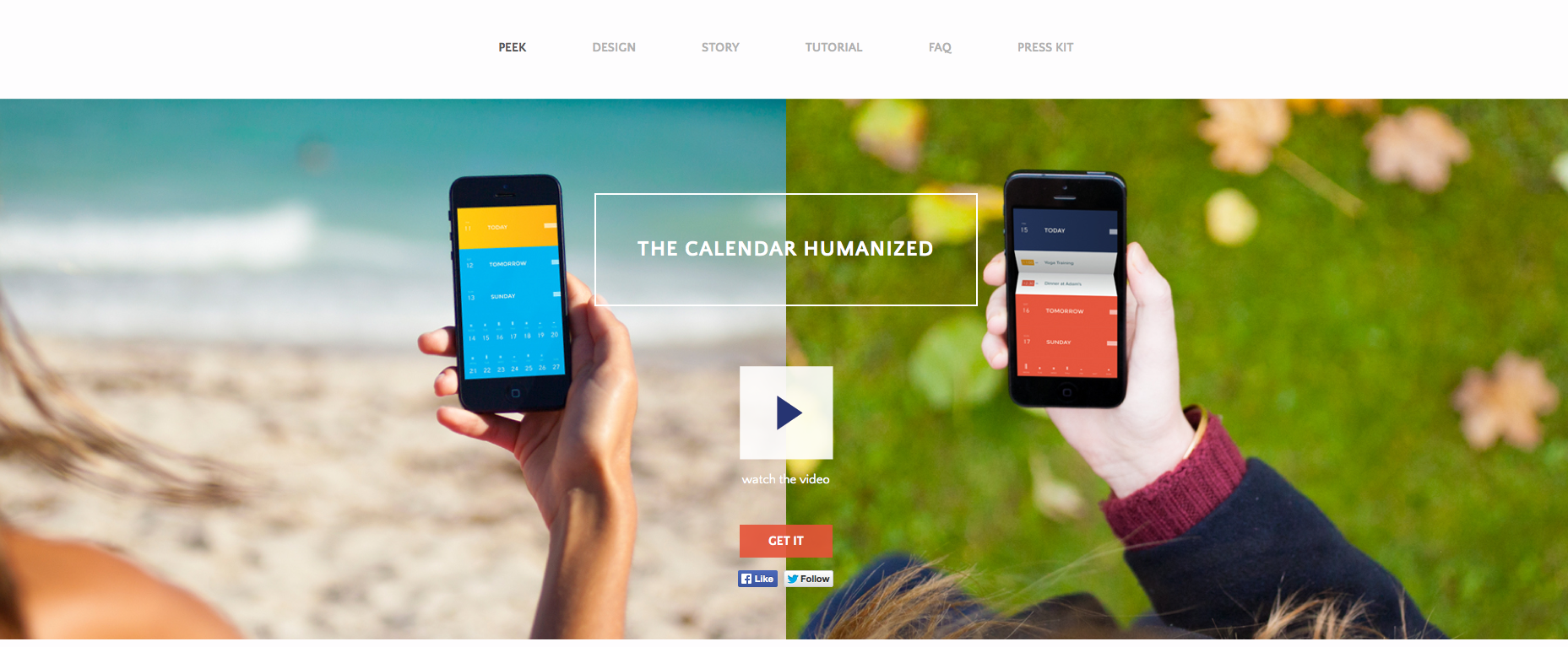
What’s the CTA? “Watch the video” or “Get it”? choose.
What do you want me to look at? This is similar to the previous comment. There’s so much going on with colors, images, text, screenshots, buttons I have no idea what the flow is, what I’m suppose to do or what your app does.
I’d definitely test one main image, or if you’re set on having 2 then less colors, more focus. Also, note how you can barley read the “watch the video” text, it almost blends in with the background…
Where’s the emotion? Where’s the “This is the answer to all your scheduling turmoil’s?” (and there are soooo many!!) A pair of hands holding an iPhone with a calendar that looks just any other isn’t the answer.
Love the title, calendars are extremely hard to manage (like email) and I like the reference to it being humanized for actual people to use.
Things to test:
Find the right image
- Test using a screenshot from the app that shows the actual difference and value you bring
- If you can’t, then test using an image that conveys emotion (no screenshots or iPhones), just an image that says “this is how you will look like/feel once you use our app.”
Munchery
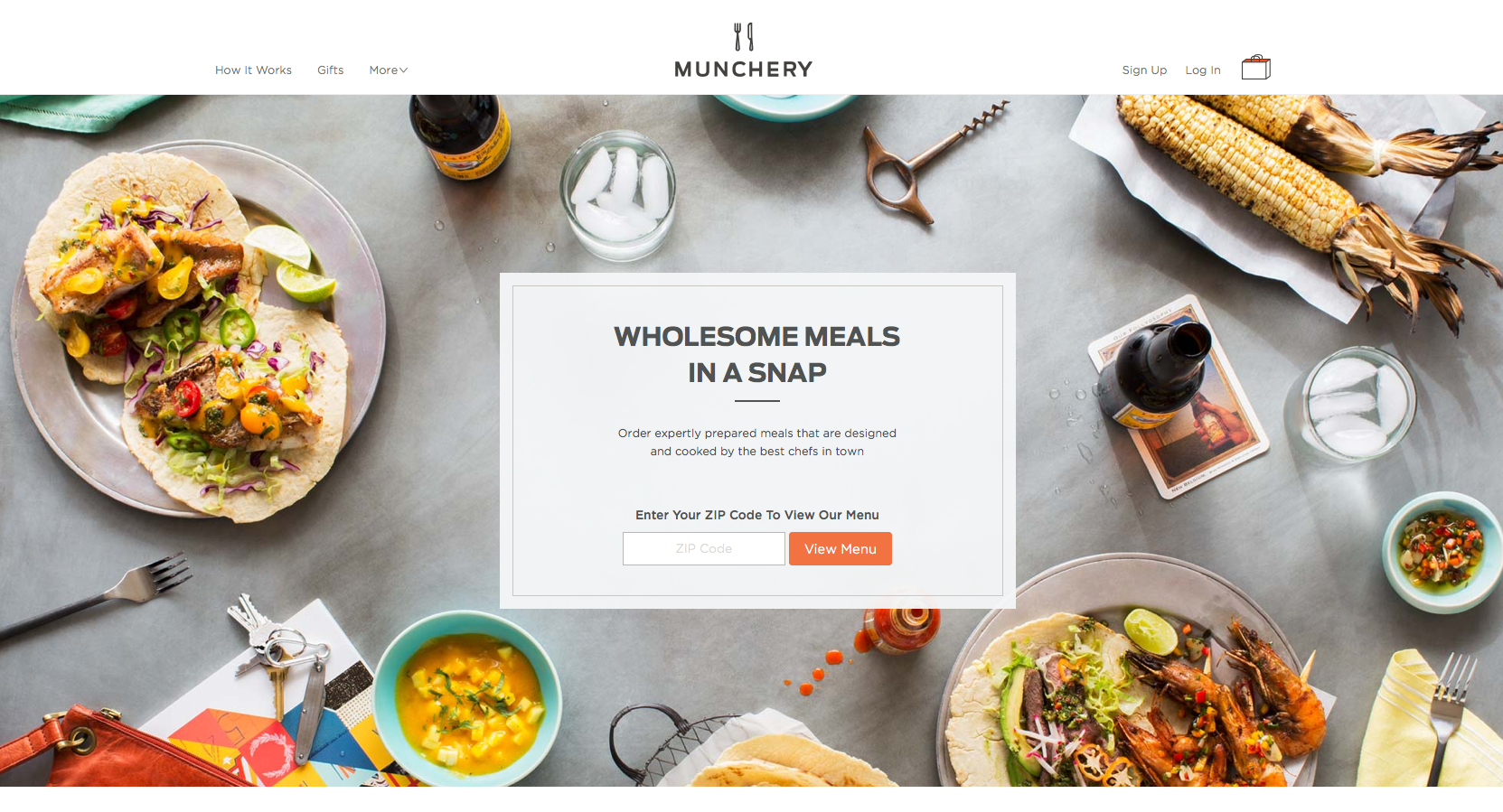
The use of images could be optimized. A great way to direct users attention to the call to action button is using the images themselves as indicators. For example, instead of having the corn facing outwards, have it facing the call to action button. Basically all elements on the landing page should point to the call to action.
I’d definitely look into focusing the user on one message only that explains the service quicker.
Actionable call to action messaging: “View Menu” – I know exactly where I’m heading with it and it gives a safe feeling.
Great use of colors to provoke emotion, arouse the taste buds and basically make people hungry.
What to Test:
- The Messaging doesn’t explain the product. In fact, you have to read the fine print to really understand what Munchery do ‘Wholesome Meals In a Snap’ could be a site with recipes… There’stoo much text and it’s hard to take in. Try reducing the text “Order expertly…” and see if you can use it as your headline.
Frank & Oak
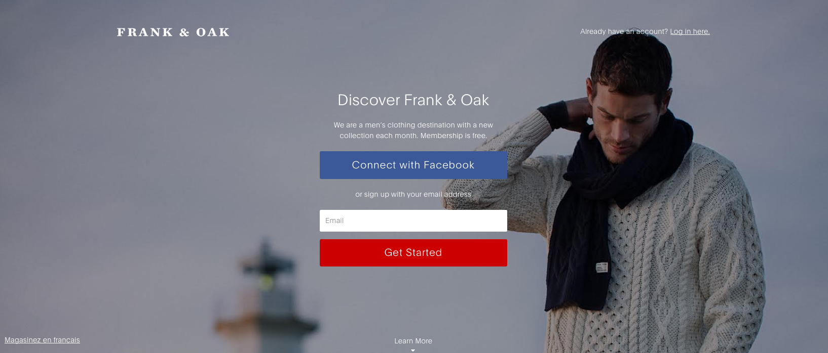
The messaging is completely vague. Why should I discover Frank & Oak? Similar to the case of StampReady, putting your brand’s name in the headline is like answering a question with a question. You’re basically asking people to read more and investigate, people don’t have time for that.
Too many ‘Call to Action’ buttons. Both their colors are in complete contrast to each other and the background and I don’t understand what you prefer I’d do: Signup with facebook or my email? It’s extremely important to have one call to action, if you want to give people another way of signing up offer it under the large call to action button in a way of a link.
What to test:
- The image is a controversy, on one hand it’s doing great use in pointing towards the call to action. On the other hand, he has his head pointing down and he looks sad. Depending on culture, an image of a person staring at the user is too intrusive, but no eye contact whatsoever creates the sense of detachment, depression and seclusion. I’d test a different image, still pointing at the CTA but something more cheerful.
Mixioapp
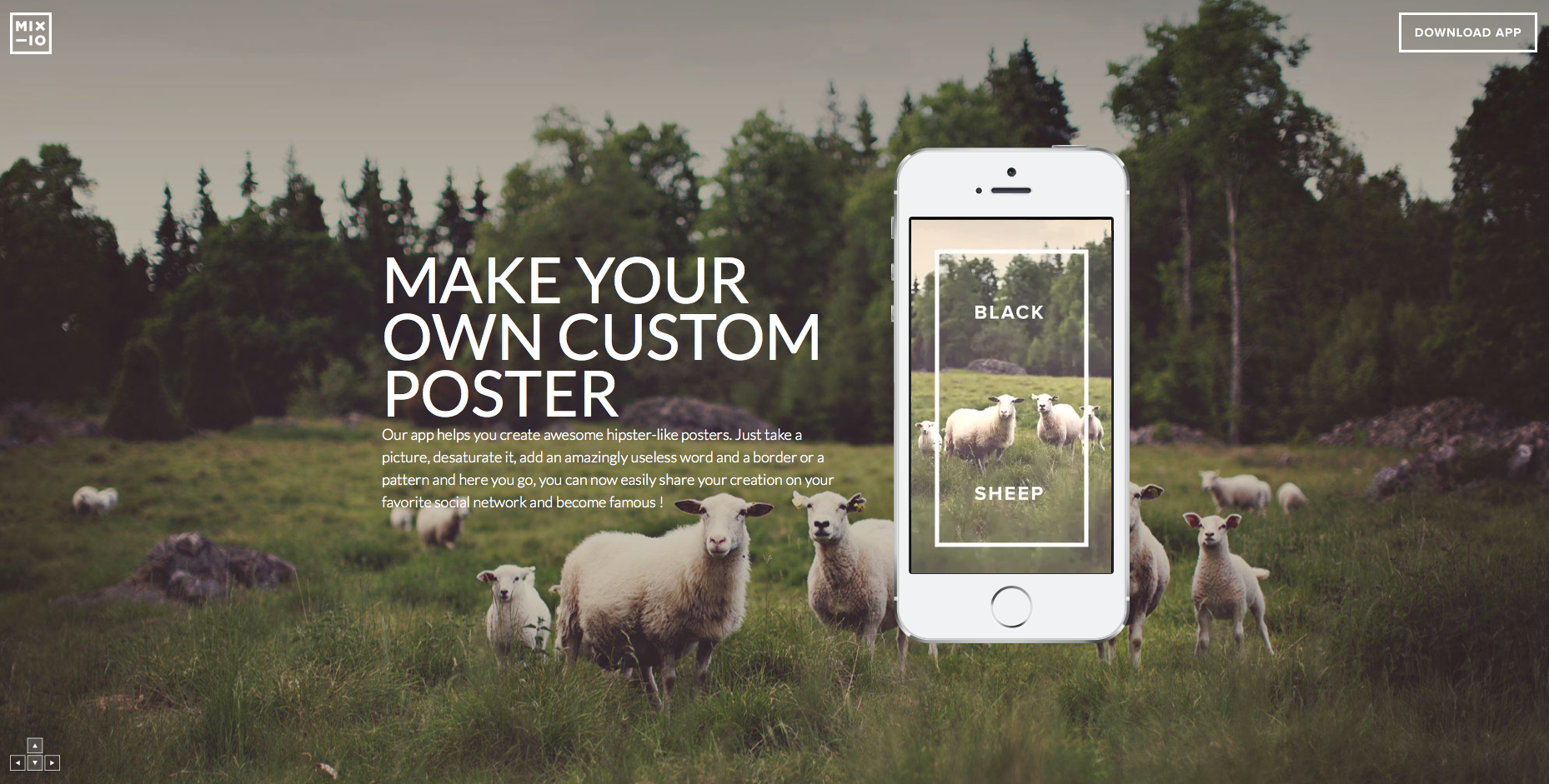
To understand Mixioapp I had to do some scrolling, downloading and watching.
The messaging isn’t clear enough to understand how this works or when. The amount of text under the main headline is basically telling visitors “Don’t read this!”
The call to action button almost doesn’t exist. Located on the far top right corner in the same white color that all other elements on the page are in, it’s hard to see how people even notice it.
To play fair, I checked the page on my mobile device and was surprised to find that although it is a downloadable app, there was absolutely no call to action to be found. Basically, you have to scroll all the way to the bottom of the page to be told how to use this app. Not to mention to be told what this app is…
The use of color on the landing page is important. Mixioapp’s messaging is all about taking pictures while on an adventure or just on a daily basis when magical things happen. Green represents fresh, new and growth, which is just what their targeted audience needs.
One Hour Translation
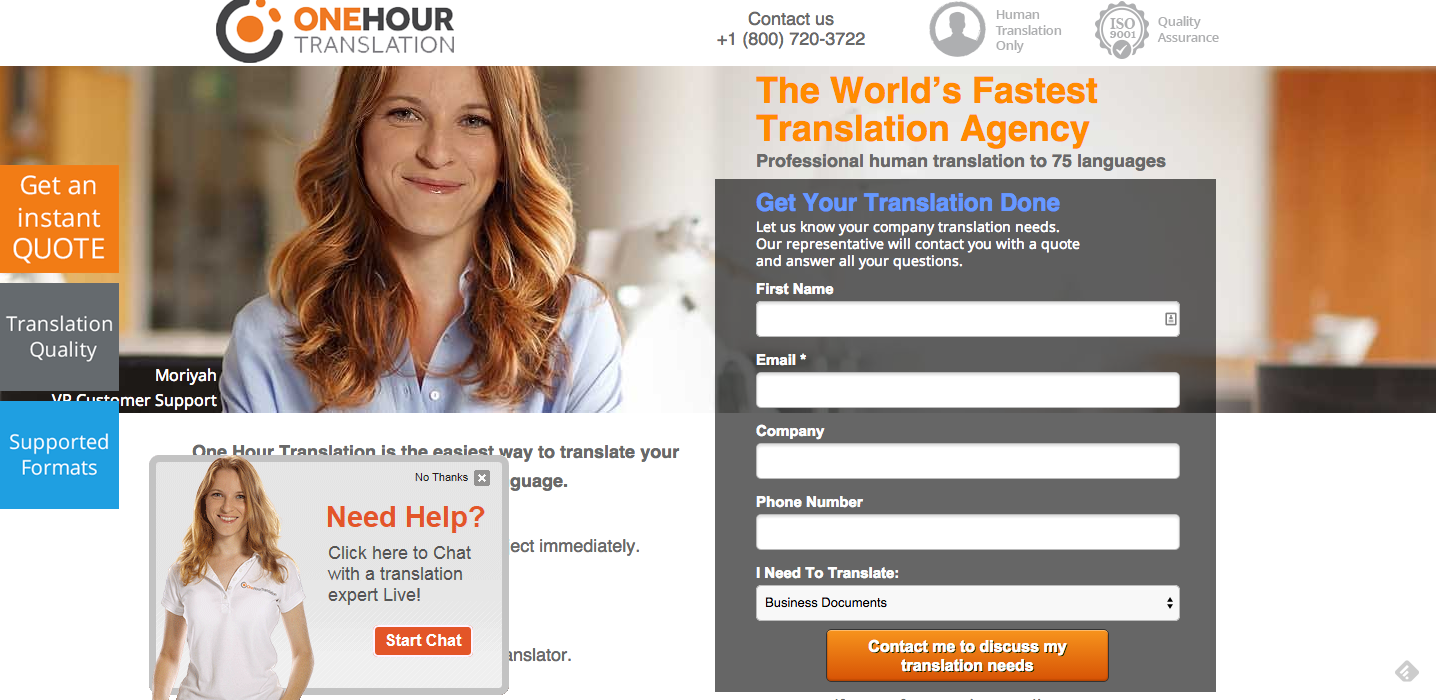
It’s easy to get what you do, but the first thing that appears on this landing page is clutter. The amount of colors and things going on this page is overwhelming.
The amount of call to action buttons is distracting and hard to comprehend. There’s no room to breath. Do you want people to fill in the form? Or do you want people to click on ”Get an instant quote”? The page can benefit from some cleaning up and redefining the goals of the landing page.
The amount of text is also an issue, all the text is on the right of the page and as a result you get is headline attached to a subtitle the additional text, the form and the security icons. Keep in mind that people may need al this info in bullets + the text needs more spacing.
I cannot say this enough: Marketing isn’t about the product or service, it’s about the change you make in a consumers life. Being the world’s fastest translation agency is fantastic but it’s about you, not the customer. I’d definitely mention it, but would try and test over headlines with a more targeted message to the customers.
I love using icons to ensure trust and security; the use of badges and certificates is a great way toenhance brand security. In One-hour translations’ case I would suggest repositioning them in a place that would give them more emphasis.
What to test:
- A good way to emphasis an element is to give it some white space. Whitespace will help differentiate between the important and the less.
- Cleaning the page completely. Removing text, all the elements and amount of colors.
Dynado
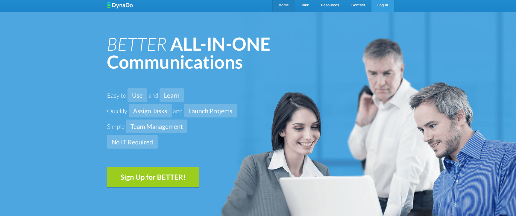
It took me too long to understand what Dynado is offering. “Better All-In-One communications” could be so many products… why are there random words highlighted below the headline? It makes it extremely hard to read the text and understand what they do.
There are literally hundreds of products out there today doing team management and communications. I have no idea why Dyando is better than others.
Using random stock photos of people around a computer does not help their case. Most companies use a task management and communication tool for teams that are remote… they don’t sit around looking at a computer together so I’m not sure what they were going for here.
What to test:
The call to action button has two issues that I’d fix:
- The first is the text – the title of the page says Dynado and the headline of page uses the word ‘Better’ as part of the sentence, so most people have no idea that “Better” is the name of the product and it’s very confusing.
- The other thing I’d test is the color of the button, I don’t usually do these kinds of tests (before testing strategies) but the white text on the neon green button make my eyes squint.
daPulse
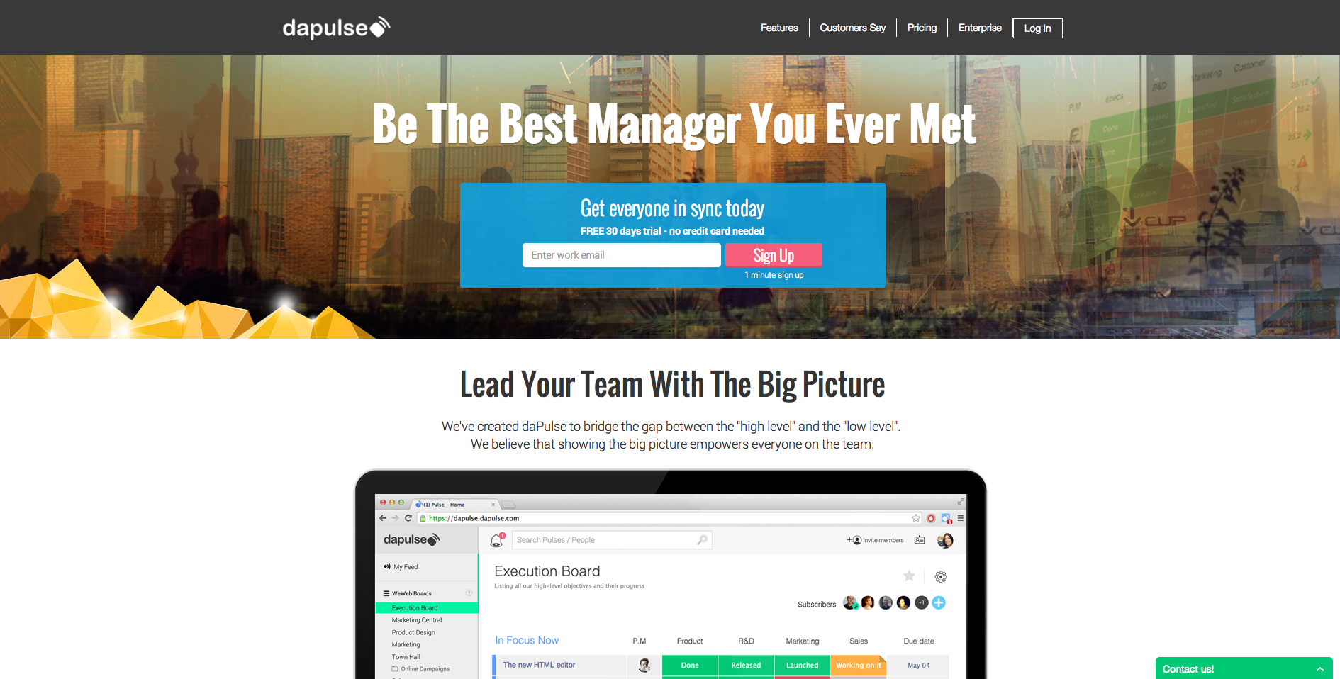
I decided to critique daPulse as a second point of view on team collaboration platforms (full disclosure, I used to work with these guys):
The messaging is great, as mentioned before the world is crowded with different platforms and products and it is extremely important to stand out and say how your product benefits the customer. This is true to all industries, your competitors are doing the same as you more or less and it’s up to you to show your customers the emotional benefits in purchasing your product or software. It’s not about being the best product, it’s about making a change in your customers life.
Appealing to managers on a personal level and telling them they’re going to become amazing managers is what categorizes daPulse as different (Great job!).
The signup area is a little over crowded, I would definitely test moving the “free 30 days trial” sentence below the form and giving it less emphasis. Visually, I’d also enlarge the top part of the page to give it more emphasis and in turn enlarge the signup area.
Notice how the image in the background amplifies the “connecting remote teams” theme; although not a clear image and I’m not quite sure what the gold in the corner stands for, the idea of worldwide collaboration is clear and precise.
What to test:
- I’d consider using the testimonials and trust elements in a more prominent position on the page (right now it’s at the bottom).
- I don’t know how targeted and segmented are the visitors arriving on this page but I’d consider further clarifying what it is that you do by adding a subtitle.
The John Maxwell Team
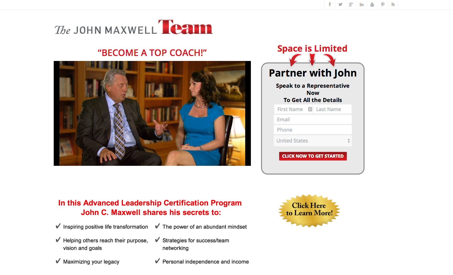
The first thing that comes to mind when looking at this page is: A coach of what? Very vague headlineand I’m not sure why it is in quotes. I’d move the part about “leadership” to the headline.
Starting a video automatically is extremely annoying. Don’t do it.
The registration form is short and to the point, I would however merge the first and last name fields. I’d also work on the text above the fields, as it is very hard to read clearly.
The messaging of the entire page is about life’s transformation and then the call to action button says, “click here to get started”, I’d consider trying “Change your life today!” or something along those lines.
What to test:
- The call to action should also be a contrasting color to the rest of the page. I’d also consider adding some type of background color.
Cricket IP Security Cameras
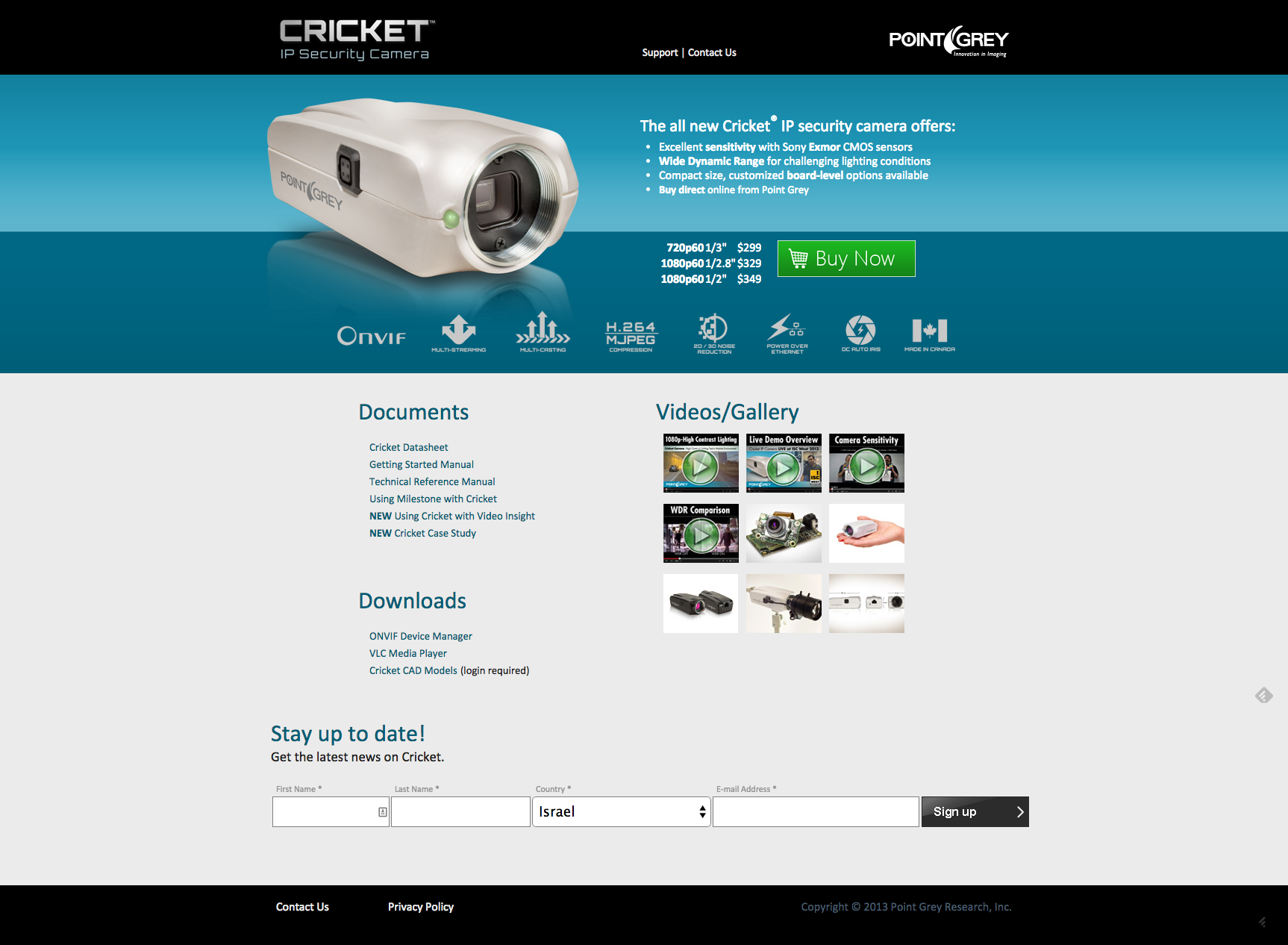
The use of the color Green on the call to action button is very good as it is the general direction in which a visitor will look at.
The list of benefits is great but I can’t read it. White space is crucial here, and I’d also increase the headline to make it more noticeable.
Great use of security elements and icons blow the call to action.
What to test:
- I know they’re selling security cameras but that image is just terrible. No emotion, no interest and no purpose other than showing the visitor what the camera looks like. When talking about security you want to make visitors feel secure and peaceful before even purchasing the product. Show them how safe they’ll be once they acquire this camera.
Last but not least
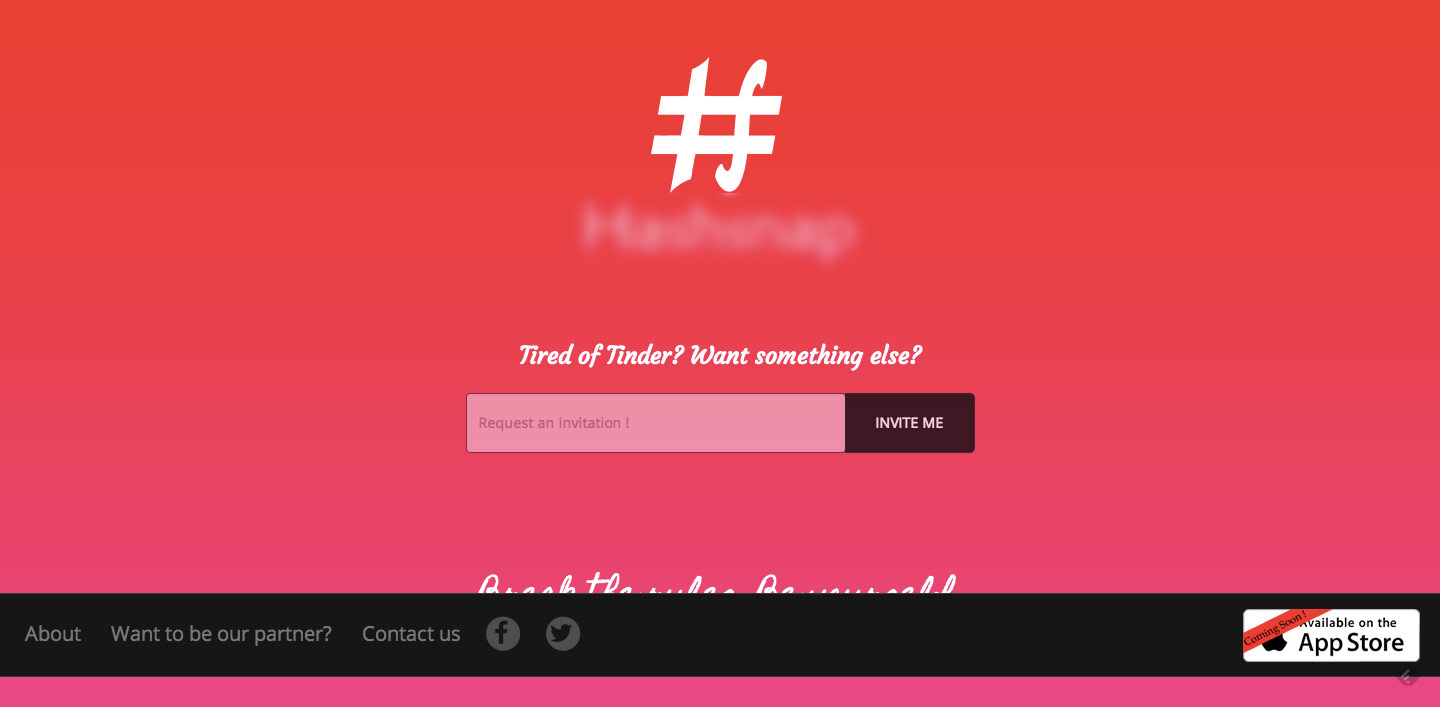
A company that will be launching their dating app in 1.5 months sent this landing page to me and asked me to review it. Their goal for now is to sign up people, so that once they launch they can send them the news and get them engaged. As there’s not a lot to go on, this will be short but I do have some important comments.
This is a screen capture from a standard screen, which means you have a bug and it needs to be fixed, as I can’t read that sentence at the bottom
The hierarchy of elements on your landing page doesn’t make sense. It seems that your logo and company name are more important than the sign up form. I’d enlarge the signup field and button and give it much more weight. In addition the black stipe stands out more than other elements on the page and is hovering all the attention. I’d consider changing the color, moving it lower in the page.
What does “invite me” mean? This again to do with the messaging, you need to put yourself out there and not by compering yourself to your competitors. Explain what happens when you signup, what is the value and why it’s worth your visitors while.
What to test:
- Your messaging gives the visitor absolutely no value; you’re basically just saying you’re an alternative to Tinder. Nothing about your product, why it’s different or how it will make a change in the world of online dating. There are literally thousands of online dating platforms; you have to give people a reason to signup, because right now there isn’t one.
This concludes this month’s landing page examples and critiques. I hope you get a few ideas from these landing pages critiques and I’d love to hear about them. If you have any questions about my comments let me know in the comments below, I’d love to hear them.
This post was originally published on Conversioner blog