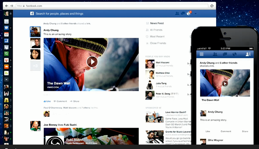
Facebook is known for the frequent changes it makes to its News feed layout and page functionality. Readers may recall that it was only back in September 2011 when the California-based company announced an entirely new kind of UI profile, and not so long ago, released a new breed of search graph engine. Today, the social media giant is launching yet another new design, to shake and stir up their outmoded News-Feed layout. And while you won’t be seeing this beautiful update immediately (Facebook says it will carefully roll things out within the following weeks), there’s definitely a lot to expect.
Facebook’s Mark Zuckerberg said that “the stories around you deserve to be displayed with more than just text,” thus the change in concept, which is now consisted of Bigger Images (and videos), Multiple Feeds, and Mobile Consistency – One hell of a change. The new design, has taken into account mobile devices as well as desktop and tablet machines, adding a new side-vertical navbar, with some extra empty space around. Photo albums will also receive a cosmetic facelift, in a way that will justify their dominance along the News Feed, with practically almost 50% of the entire visible content.
From now on, users will be able to subscribe to different type of feeds in their news layout, whether they decide to choose music, games, photos, or even friends. Each story will be more vibrant and colorful than before, and the order will be sorted to your own personal preference, chronologically.
Be sure to check out your Facebook account and let us know if you are one of the lucky users to receive the first “early access preview.”
[Facebook]


