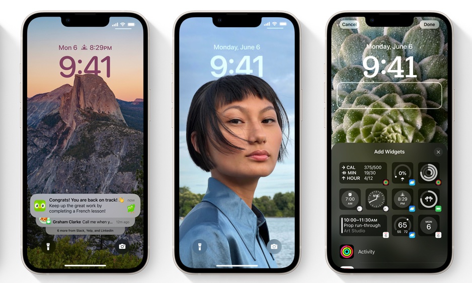
Have you ever visited a website while logged onto a desktop or laptop computer, only to visit the same website on a mobile device and find the experience clearly displeasing? That, of course, is an example of how to quickly turn off a customer (or potential customer): by denying them the ability to get the information they need in what is more and more the way of viewing the internet and interacting for the things we want. In fact, more and more people are turning off their computers entirely and instead moving to a mobile-only experience.
And making sure the mobile experience is optimized affects you in a more practical way, too: You’ll get dinged by Google if your site doesn’t work well on smart phones and tablets. But luckily, diving in and re-adjusting the experience isn’t that hard and there are some good practices to put into place. This graphic reviews them.


