Tag Archives: Design

How Augmented Reality Is Being Used in Home Decor

Augmented reality or AR is growing at a compound annual growth of 24.4% and is predicted to be worth $950 million by the end of next year. This technology may seem futuristic, but in reality it’s being used in a variety of different markets. From construction to maintenance, AR is able to solve problems and make processes faster and easier. 

One unlikely candidate for this type of technology is the home decor and renovation sector. While a home remodel might not strike you as a space to integrate digital content with the real world, there are many innovative apps that are doing just that. 

Augmented reality apps allow you to do a variety of things, from see how furniture will look in your apartment to test out paint colors to measure the room and create a floorplan. These AR apps make the process quick, easy and attainable to anyone not just contractors and interior designers. 


How Do These AR Apps Work in Your Home?

Each app has a different set of directions based on its intent, but in general they can be figured out in a few steps. First you’ll be selecting the feature you want. This could be a new sink for the kitchen or a rug for the living room. Some apps allow you to choose specific products you can buy and others give you generic items to test out.

Once the product is chosen, you’ll scan the room with the camera on your phone. This will give the AR software an idea of the original space. Often times the app will direct you to scan the floor so it can gauge the depth of the room. 

When the room is scanned, you’ll be able to view how your feature looks in the home. You can adjust its size and position to how you would normally have it and see if it will fit in the space. 

animation of augmented reality in home decor


7 AR Apps You Can Try in Your Home

Not all AR apps are the same. They each have a different specialty. To help you decide which is best for your home, ApartmentGuide has a list of seven augmented reality apps for the home

Build.com

This is an app made for remodeling the home. It specializes in home appliances and allows you to experiment with different finishes and styles. 

magicplan

This AR app will help you measure how many square feet you have in your home. This is helpful when renovating or viewing a new home. It will create a floorplan so that you know exactly how much space you have to work with.

Graham & Brown

This company lets you visualize a new paint color or wallpaper on your wall without sampling it yourself. This app will also estimate how much wallpaper or paint you’ll need to complete the projects which save you money and time. 

ColorSnap

ColorSnap is perfect for those painting a room. It allows you to conceptualize a color palette and will also suggest complementary colors to try. 

DecorMatters

This app is made for redecorating your space. It allows you to view home furniture, decorations and art from popular stores like IKEA, Target, Overstock, WestElm, Crate&Barrel, Living Spaces and Ashley. 

roOomy

If you want to stage a room, roOomy allows you to create a custom design. This app is targeted towary homebuyers, renters and real estate agents.

Housecraft

This app allows you to see furniture in a space, but only provides generic furniture. This works well for people who don’t want to be pressured into purchasing anything right away. 

4 Signs That It’s Time To Upgrade Your CAD Software

In any business that focuses on design as part of a project, CAD software is often very important. Once you have been using the same piece of software for a while, it can be easy to ignore the fact that another package could be better suited to your needs.

The truth is that CAD software in 2019 is very advanced and it is likely that the package that you are using isn’t aiding your design as much as it could be. Here, we are going to look at some of the signs that might indicate that you need to upgrade your CAD software. Keep reading to find out more.

You Have High Scrap Costs

One of the biggest signs that you need to upgrade your CAD software package is the fact that your scrap costs are too high. When you constantly need to scrap projects because of errors in the design, this could be down to the CAD software package that you are using. If this is the case, you might want to invest in a more accurate package that aids your design rather than hinders it.

You Don’t Have 3D Design View

Did you know that the latest CAD software packages offer 3D design? When you can design in 3D, you are more likely to find issues early on and so you can have a more accurate design. A 3D view can be very helpful for many different types of projects so make sure to upgrade your CAD software package if you find that yours doesn’t offer this.

You Have Some Spare Project Cash

If you have some spare cash for your next project, then you might want to use that to upgrade your CAD software package. You might not notice the issues at first, but once you replace your software, you will see that you should have been using the latest version before now. Of course, you can also download CAD software free trials from websites such as Altium. This will give you the chance to try it out and make sure that it is right for your business.

Things Are Taking Longer Than They Should

The final sign that it might be time to upgrade your CAD design software package is that your projects are taking longer than they should. If you find that you are wasting both time and money waiting for your software to respond or save a file, then you need to think about upgrading it. Once you have your upgraded version, you will notice the difference in how long things take.

Final Verdict

In any company, it is advised that you have the latest software to ensure your projects are completed as well as they can. If you use a CAD system, then you should make sure that you are taking advantage of the latest technology that aids design. Replace your CAD software today and you’ll notice the difference in no time at all.

How Augmented Reality is Transforming the Construction Industry

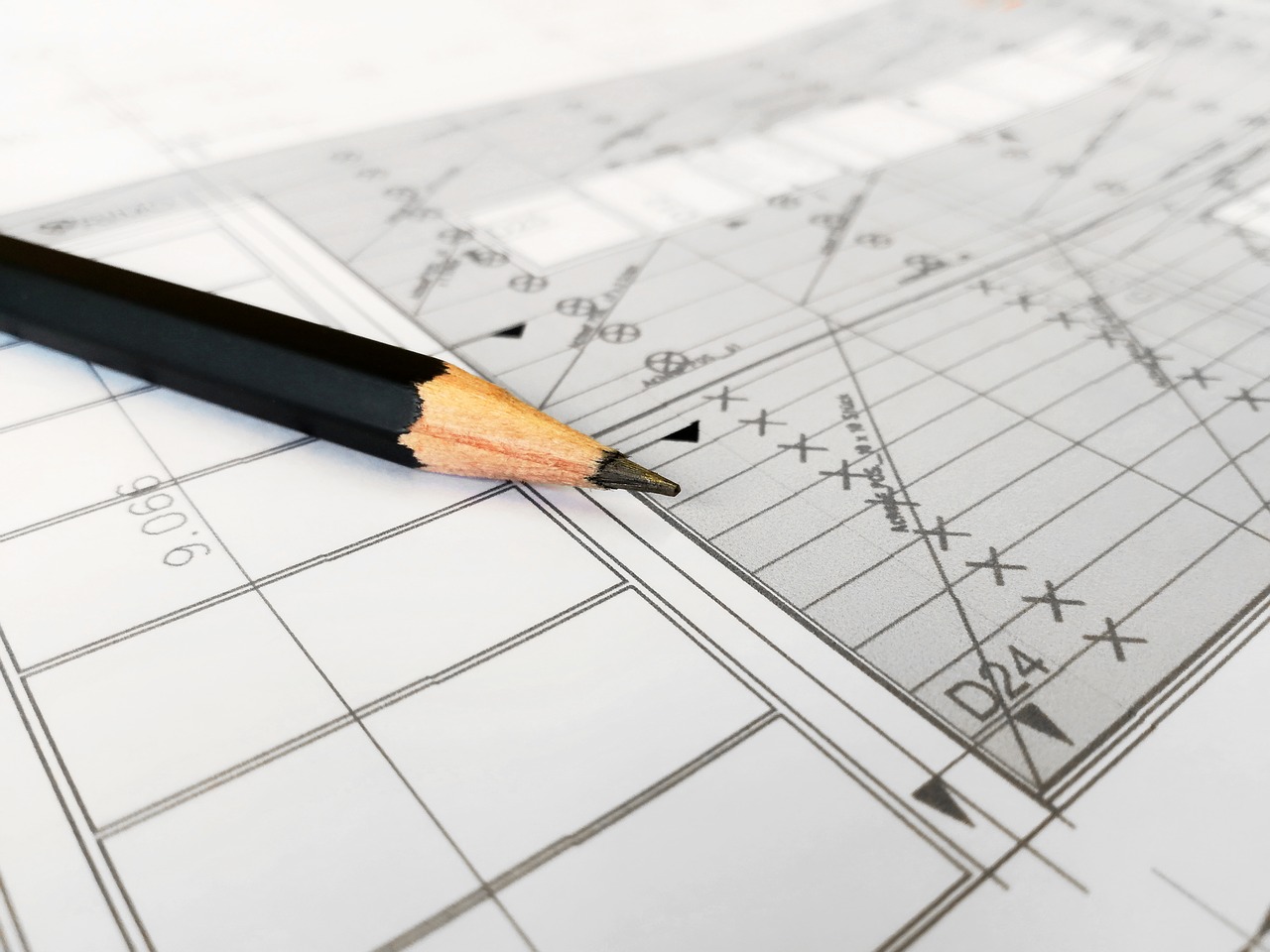
The building and construction industry has started appreciating the benefits of technology. Though it has taken quite some time, the construction industry is prepared to capitalize on technological advances just like any other industry.

The construction industry is now going paperless. Big blueprints, plans, and endless forms are being done away with. Construction workers and foremen are becoming familiar with the use of smartphones and tablets.

Construction records and data are now being stored on hard drives, cloud, and servers. The entire industry is becoming paperless. This technological advancement has taken years before being incorporated into the construction industry. In fact, the construction processes and systems had remained unchanged right from the 1940s.

Currently, things such as automation, mobile computing, cloud-based data analytics, and artificial intelligence are being used. These components are not only boosting margins but also driving efficiency. Besides, there is the use of drones to gather information from areas inaccessible to humans.

Augmented reality is expected to really change the construction industry. This is possible if only construction companies embrace it.

Augmented Reality

AR (Augmented Reality) has some close relationship with Virtual reality. Augmented reality is becoming more and more useful in offering solution to daily activities. It is evident in surgical procedures and social media filters.

Augmented reality takes up the virtual world elements and integrates them to the real world. As a result, it enhances everything you feel, hear and see. Augmented reality is aimed at enhancing our real world. It adds touch feedback, sounds, and graphics into the natural world.

How does it work?

Augmented Reality works in three technologies which are:

Simultaneous Localization and Mapping( SLAM)

SLAM is focused on solving complicated Augmented Reality simulation problems. It is neither a specific software nor an algorithm. It is a group of algorithms which solves both localization mapping and simultaneous problems.

Recognition Based

This is also referred to as Marker-based Augmented Reality. Here cameras are used to discover objects or visual markers, for instance, NFT makers and QR codes to reveal an overlay whenever a device identifies a marker. It makes use of cameras to differentiate a natural project from a marker. This gives the user a chance to assess all the object’s details.

Location-based

Location-based is also referred to as markerless. It uses an accelerometer, velocity meter, and digital compass to offer data in relation to augmented reality visualizations and location which are activated by the inputs. This Augmented reality technology is becoming more popular now that it can be used right from your smartphone. It is used in searching nearby services and mapping directions.

Augmented reality applications in the Construction industry

There are many ways in which Augmented reality will be applied in the construction industry. Below are the ways through which this technology will benefit the construction industry:

Accuracy

Accuracy is very crucial in construction activities. First of all, accuracy saves money and time. Augmented reality is going to provide exact measurements and specific details in construction plans. Engineers, Architects and project managers are to get the needed data for better speed and accuracy.

Saves time and money

Time and money are important in construction. AR is expected to save not only time but also money. It will curb any need for brand new architectural plans, that indeed is time-consuming and expensive. This technology, allows you to modify virtual plans and 3D models prior to construction.

Project management

Augmented reality does not condole any guesswork. This technology will do away with manual drawings and records. It is expected to deliver accurate images and create whole spaces. Not only planning but also managing projects are to become a time saving and efficient.

Design Analysis

AR is going to induce accuracy in design analysis. Architects and other construction professionals will go through a project to correct possible errors. No guesswork will be carried out. Thorough inspections are going to be carried out in the finished building to get rid of any simple mistake.

Actual Construction

Construction processes are bound to take the least time possible. A construction expert can access a project’s virtual model easily. The smooth flow of construction processes is expected to make companies save money and time.

Construction safety

Safety is very important during construction. Workers at the construction site need to be protected at all costs. This is a mandate that is going to be quite easy with the application of Augmented reality technologies. Augmented reality emphasizes on equipment training effectiveness to ensure safety is upheld during construction. Besides, AR is to ensure instant access to every worker at the construction site.

Change is inevitable

It is evident that important changes are set to be incorporated in the construction industry. The industry is to undergo a great revamp. Augmented reality is arguably one of the things at the center of the revamp. The use of tablets and smartphones in construction is going to become popular.

How Tech Is Making Homes More Energy Efficient

The United States uses the most energy in the world, responsible for 20% of global consumption. China takes second place, coming in at 15%. The more energy used, the more carbon emissions there are, which is bad news for the planet. Electrical devices, appliances and gadgets are part of life and all require power, as well as the need to heat and cool homes. Tech is finding new, innovative ways to help people live their lives in an energy efficient way without having to make sacrifices. 

Energy-efficient dishwashers 

Ditching washing up at the sink and opting for a dishwasher has many benefits, but you may be surprised to know that it can save you water and energy. Washing by hand can use up to 27 gallons of water per day, whereas an energy efficient dishwasher can use as little as 3 gallons. Using less water means less energy is used to heat the water too. Even dishwashers that have a long run cycle will use very little energy and water, yet get your dishes clean and dry every time. Technology is making dishwashers smarter so that they can detect how dirty dishes are and jets are more powerful, meaning less energy is needed to operate them.

Smart windows

Lawrence Berkeley National Laboratory have teamed up with Pella Windows to create a highly insulated window that uses sensors and microprocessors to adjust how much light, and therefore warmth, is let into a home. It bases this on the amount of sunlight and time of day to give highly efficient lighting and temperatures. Another company, View, have worked on similar technology and claim that savings on lighting, electricity, heating, ventilation and air conditioning can add up to 23% at peak times. 

Magnetized fridges

Currently, refrigerators in the US use approximately 60% less energy than they did 20 years ago, which is down to technology helping to making them more energy efficient. Oak Ridge National Laboratory and General Electric have teamed up to take the energy efficiency of fridges one step further. Their aim is to make a domestic fridge that uses 25% less energy than current modern fridges by using a technology known as magnetocaloric effect, or MCE, instead of conventional vapor compression. Basically, temperature is controlled by a changing magnetic field, which means the use of harmful refrigerants is eliminated.

Technology has been responsible for an increased consumption of energy, but it’s also being used more to look at ways of making appliances and devices work in an energy efficient way. Tech can also take everyday objects and make them smart to help reduce the need for electrical devices to be turned on, such as air conditioning, which further helps to reduce energy consumption.

8 Ways to Strengthen Your Awesome Brand Online and Offline

Your company’s brand is a work in progress, so it’s important to always look for ways you can improve it. Whether you are refining your messaging, choosing a consistent color scheme, or finding your voice on social media, strengthening your brand is an ongoing project that happens on- and offline.

How to Strengthen Your Brand Online

Learning the most effective ways to do both can help you build a stronger brand for your company overall, which can help you keep your customers coming back while reach out to new ones. Here are a few tips to help you build up your brand online:

1. Blog Frequently

Blogging is crucial for any business seeking to reach new customers online. A well-maintained blog can keep your business at the top of search engines, which makes it easier for potential customers who need the services you offer to find you.

Focus on creating high-quality, engaging and relevant content for your target audience, and add new content regularly. Consider guest blogging on related sites, or extending such an invitation from your site to industry professionals. Your blogs can showcase your expertise to potential customers and could help them decide to seek out your services.

2. Create a Social Media Presence

Social media offers businesses a simple, effective, and low-cost means to stay in touch with their current customers and to reach new ones. Create profiles on the sites most likely to be used by potential customers, such as Facebook, Twitter, Instagram or LinkedIn.

You’ll be able to easily share content, post updates about your business, or address complaints as they arise. This can help to build a strong connection between your business and its customers, since they will be able to interact with your business directly and can see that their concerns matter to it.

3. Share Testimonials

A glowing testimonial from a previous customer can provide dividends for your business for years to come, especially if they are famous or well-known in your industry. Many customers determine where they will make a purchase from based on online reviews, and a collection of testimonials could help to win their business.

A testimonial provides your business with social proof and gives potential customers a chance to learn about your services and expertise from people just like them. Ask some of your customers who were especially satisfied to leave you a review, and consider posting them on a special section of your website.

4. Find Your Personality

Consumers today are more likely to frequent a business that has a recognizable personality than one which has a bland or generic voice. It may take some time, but finding your business’s unique voice can help you better connect with customers and provide them with a personalized experience.

Every business is different and will have its own way of appealing to its buyer personas. Take some time to experiment and create a unified voice for all of your communications which speaks to the customers you are trying to attract.

Whether you opt for a snarky, social-media savvy persona perfect for reaching millennials or a more reserved, sophisticated persona which can connect with professionals getting ready for retirement, finding the right voice for your company is crucial to building a successful brand.

How to Strengthen Your Brand Offline

While making effective use of the Internet is crucial to the success of any business, keeping your brand strong offline is just as important. Whether through stunningly designed business cards, elaborate print collateral or full production television commercials, brand strengthening happens at all levels:

5. Define Your Brand (in Opposition to Competitors)

What makes your brand different, or better, from your competitors? If you don’t know this, your customers won’t either. Placing this front and center in any marketing campaign can help you easily distinguish your business. This can also provide inspiration for your marketing efforts.

You’ll be able to highlight some quality of your business which is superior to your competitors, and can inform potential customers of what you have to offer, especially if you are new to the market. Buyers could immediately take an interest in your business and see what you have to offer.

6. Keep Fonts, Colors and Logos Consistent

Your customers need to be able to quickly identify your business from your competitors. The last thing you should do is confuse them with multiple color schemes, too many fonts, or chaotic logos.

Choosing a consistent font, color scheme and logo can help to make your brand more recognizable to customers and can make your own marketing efforts easier. You’ll have fewer moving parts to keep track of and can better build campaigns around a definite aesthetic, feeling or lifestyle, which itself can serve as inspiration for future campaigns.

7. Create Your Niche

Part of what makes a marketing campaign a success is its specificity. Focusing your marketing efforts on baby boomers getting ready for retirement isn’t nearly as effective as focusing on professionals with advanced degrees in the same age group who require financial consulting services to prepare for retirement in the next ten years.

Limitations can prove to be powerful aids when it comes to finding clients, as you’ll be able to automatically filter out many people who won’t be interested in your services, and can instead focus on the handful who are actively looking for your services.

8. Set Deadlines

You could have an endless well of ideas for your marketing campaign, but if none of them come to fruiting, they won’t be worth anything. You can easily spend too much time modifying your original idea to try to cover too many angles at once, and come up with a campaign that lacks a clear focus and which is ineffective at reaching any particular audience.

Setting a deadline can help you focus your efforts on a handful of ideas without losing control of them.

Building your brand is a long-term project, and it’s not uncommon for companies to change their brand multiple times. Don’t be afraid to experiment in order to find the brand that best suits your business, but always make sure each element contributes to a complete experience for your customers.

———————————–

With over 18 years in business, Silkcards specializes in unique and beautiful print that reflects a brand’s image and makes a positive first impression.

7 Photoshop Tricks Every Beginner Should Know


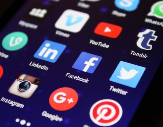
If you are serious about online marketing, basic design skills are a must. Whether you want to make a few quick adjustments to a photo before posting on Facebook, or need to change a banner ad for your new campaign, Photoshop is the undisputed king of design software that will let you create virtually any look you want.

Photoshop is so comprehensive that it can be overwhelming to the beginner. With the ability to do just about anything, where do you start?

We suggest starting with the basics. Here are seven basic Photoshop skills you will use again and again as a marketing professional.

Using Layers

Layers let you move, arrange and edit objects and/or text independently. This vital feature is a super time saver. Knowing how to create, delete, group and merge layers lets you easily edit and repurpose your photos and other digital files.

Straighten a Picture

Using your own photos keeps you safe from copyright issues. However, it’s easy to snap a photo only to discover that it’s out of kilter. You can salvage crooked pictures in a flash with Photoshop’s ruler tool, once you know how.

Create Adjustment Layers

Sometimes you need to play with your design a bit before you come up with the right look. However, you might not want to lose the original. Instead of creating a lot of confusing duplicate layers, Photoshop lets you easily create an adjustment layer that lets you apply an effect, and toggle back and forth between options with a click of the mouse.

Remove Spots and Blemishes

Little imperfections such as pimples or stains can ruin the impact of what you’re trying to sell. It should come as no surprise that Photoshop has a tool you can use to make those annoying blemishes disappear. You can learn how to use it in two minutes or less.

Remove Red From Eyes

Sure, you might have stayed awake all night setting up your latest funnel, but there’s no reason to look like it. Just reach for Photoshop’s red-eye tool, and you can banish those flash photo demon eyes forever in about three clicks.

Isolate an Object

If you design ads, web pages or virtually any other piece of marketing material, you will often want to place an object over a different background, or eliminate the background altogether. There are a number of ways to do this. Some take hours, others only minutes. Needless to say, the sooner you learn the quick solutions, the better.

Apply an Effect to an Object or Text

Photoshop offers a wonderful array of effects you can use to spice up any object or text in your design, including drop shadow, bevel, glow, and many more. Adding them is almost too easy — once you know how, you may need to hold yourself back from going overboard!

Get Started Learning Photoshop

Check out the slideshow below for step-by-step instructions on how to do all of the basic Photoshop skills in this article.


—————–

Author Bio: Rocco Lungariello is a Marketing and Social Media Content Creator at New Horizons. He has been generating content surrounding the IT Industry for more than four years.

The Story of Houzz – The Home Design Platform


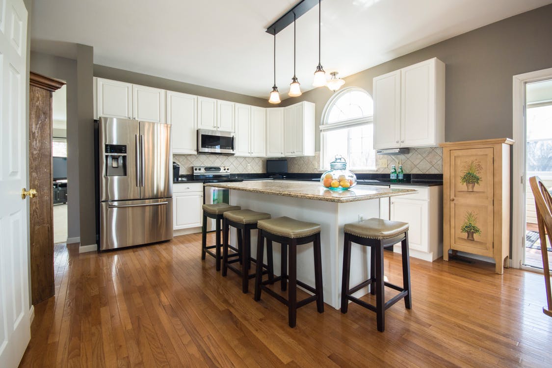
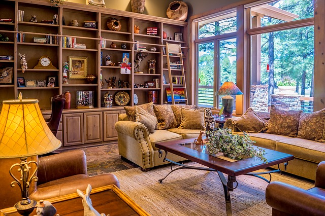
Houzz at its essence is a community of people who are passionate about home design. Many of our readers will have already used Houzz but may be unsure about the history of Houzz and its rising popularity. While its main user base is in the United States, other markets such as the UK and Australia are starting to see large growth.

The internet is built on communities, and before Alon Cohen and Adi Tatarko founded Houzz in 2009, there was no community for people passionate about home design. The husband and wife team came up with the idea for Houzz after having difficulty finding inspiration when redesigning their own home. Houzz’s expansion has been helped by the well-timed financing they received as the company was growing.

Check out this infographic from Half Price for more information on the growth of the world’s biggest home design platform.

The Ultimate Guide to Choose the Right Image for Your Landing Pages

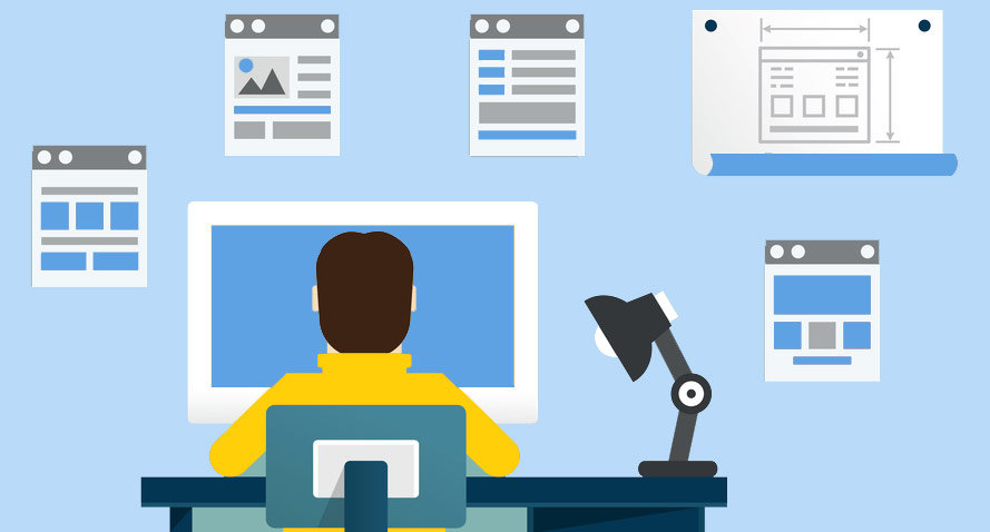
Web design is an extension of page design, and when it comes to page design, there are plenty of rules and principles for putting together a winning website. Landing pages can be tricky; they have many elements to them that require careful consideration;

  1. The main headline
  2. Subtitle
  3. The call to action button
  4. Social Proof
  5. Dedicated content
  6. The form and fields people need to fill in
  7. and of course the main hero image

While each element is equally important and cannot work without the other, the image and the colors we use on our landing page have the largest impact on our customer’s initial impressions of us, their experience and as a result, our conversion rates.

Since our brains process images much faster than text, the first thing our potential customer sees on the landing page is the image and it is all that’s standing between your customer bouncing from the page or choosing to read more or convert.

How to choose an image strategy for your landing page

The main hero image is meant to help potential customers see the value in our offer within the first couple of seconds, understand what’s in it for them and why they should take the next step in our customer journey vs. the competitor’s.

On average we see between 4000-10,000 messages a day, we’re constantly bombarded with ads, text messages, calls and content everywhere, the possibilities and options online are endless and tiring.

This is one of the main reasons potential customers easily and almost automatically navigate from one site to another without giving as much as thought for the page they just visited. As consumers we move quickly from one competitor to another until something clicks in our brain and catches our attention. That something is the value, the “What’s In It For Me?”

whats-int-for-me

To stand out from your competitors and gain your customer’s attention (therefore increase conversion rates), the hero image on every landing page, email campaign and especially your website should project immediate value to your customer.

This isn’t an image of your product, service or features, it’s an image that highlights the emotional value customers gain from being your customers (e.g increase self confidence, get appreciated by your boss or find true love). As I mentioned at Mozcon, insurance companies don’t sell insurance policy, they sell peace of mind; a happy carefree family.

While most landing pages show an image of the product, platform or service they’re providing, we’ve ran countless tests proving time and time again that value wins almost every time.

For example, this company provides an all-in-one solution for creating birthday and party invitations. While the original landing page featured images of the different templates available and featured a product focused headline: “Custom online invitations in minutes”

original-landing-page

The variation we created visualized the party scene for our potential customers. Utilizing different colors to enhance certain feelings, an image of the park, a picnic basket and a dog this variation focused on helping people envision the perfect party, which starts with a great invitation. The results: 65% uplift in purchased subscriptions!

landing-page-variation-1

Today, I’m going to show you exactly how to do that yourself.

There Are 3 Ways to Define Your Image Strategy

Before setting down to design your landing page and randomly choose your image, take some time to follow the 3 step process we use to define the customer’s value and the images we want to test:

Step 1: Talk to your customers

The great thing about talking to customers is that they have all the answers. They know why they purchased an item or service and have a clear reason for doing so. However, most customers will give you a list of tactical reasons for their purchase. This happens due to our brain’s tendency to rationalize our purchases, we may purchase on emotion but our brain quickly finds a way to rationalize that decision. For example – buying an expensive suit, or that lamp you don’t really need is then explained by attaining a good deal for it or your sudden need for more light around the house.

So a great way to discover your value and avoid technical answers is asking them how they would feel about removing certain items from your stock or certain features from your platform. This will give you a clearer understanding of the real value people find in your service. You can also ask what may have stopped them from converting and more importantly, ask them about THEM: What are their dreams, aspirations and even what scares them – get to know them so you can offer relevant, more compelling images, colors and content.

Talk to your team

Your customer success team, your sales team and anyone who talks to your customers on a daily or weekly basis can provide key insights. They know what people complain about, what their main issues are and what people find exciting. Talk to your team, interview them and learn how they view the customer, what values they believe you offer and compare these to your customer interviews.

Analyze direct and indirect competitor sites

NO I’m not suggesting you copy from your competitors in anyway. What I am saying is that you should analyse the testimonials and especially the reviews found on your competitor’s site. This comes straight from Joanna Wiebe’s research process: See what reviews customers are leaving, what bothers them and what they care about to discover what you need to highlight on your landing page and what value you should focus on.

Once you’ve compiled all this data together you’ll be able to define the image strategy you want to test. The next step,  is finding these images that highlight the value and have all of the qualities you’re looking for. Below are 6 rules you should follow once you’ve defined you’re strategy and ready to choose an image for your landing page:

6 Rules for Choosing a Landing Page Image

#1 Use Real, Relatable and Authentic Images

A successful image is one that your customers can to relate to. Either by seeing themselves in the image or someone they would want to be like, someone that reflects their challenges and values, or someone they can and want to connect to.

Use authentic images of people and avoid ones that are clearly stock photos, bought for the sake of the page. Best case scenario – use real images of your customers or your team, if you can’t use those choose your images wisely. A quick google images search can show you how many companies are already using that image. Ask yourself, is this image authentic? Will my customers relate to it? Or does it look like this (in case this isn’t clear –> this is a bad image!):

team-corporate-people-group-office-company

Mailchimp’s new homepage redesign (launched just a few weeks) ago baffles me. The image is clearly a stock photo image (if not… then bad execution) that feels cold and has no relation to their headline “Being yourself makes all the difference”. Does this image represent their target audience? The colorful background with different shapes, colors and palm leaves distracts the customer and has no value that I can personally detect.  As a Mailchimp customer, personally I don’t feel comfortable with this women staring me in the eye and telling me to be myself.  This image feels fake and I have a hard time relating to it in anyway.

mailchimp-new-homepage

Gusto on the other hand, has an image of a women sitting in front of her desk smiling. Now, granted I don’t really know if this a real photo of an HR person or a stock photo but it feels real and the connection between the image and headline is clear. I can immediately resonate with it, it’s authentic and relatable to HR personnel who do it all.  Gusto makes the main image work with the strategy of the page, makes it about the customer and as opposed to the lady staring at us from Mailchimp’s new design, this women doesn’t feel alienating – she feels welcoming, someone you might want to meet. This is the difference between using authentic images that relate to your target audience vs. images that just look nice and have a “cool” composition.

good-landing-page-example

#2 Reduce Visual Noise

“With great power, comes great responsibility” – As we’ve seen, our image captures most of the attentive mind of our landing page visitor, it’s almost always the first thing we see and it’s what determines if we should hang around a take a few more seconds to read and understand the offer. This means, that other than choosing a good strategic image, we also need to think about reducing the noise it creates so it doesn’t have a negative affect. We need to make sure it’s easy for customers to quickly see what’s in it for them and asses our services. How do you do that? By following these 3 simple rules:

  • Ensure high contrast between the image and the page content so it doesn’t “drown” out the text, making it hard for people to read, like this for example:

landing-page-examples

  • Ensure the photo is distraction “clean” as possible and helps customers focus only on the most important elements of it unlike the landing page below for example. There’s so much going on within this image that it’s hard to focus on anything. Not to mention the fact that this is yet another common image used by thousands of startups to show  another “unique” office space. This image has nothing to do with the service. How exactly does an image of random people in an office make you feel that this a “new model for talent development”? Clean images, mean using only the objects that help get the message across, remove any details that can cause confusion or stress on the eyes.

landing-page-examples-1

  • Consider the colors you use – colors have an emotional effect on us and can assist us in saying things without actually spelling them to people. For example, you don’t have to say you’re trustworthy, you could (in Western cultures) use blue for that.  Also, remember to reduce the amount of colors you use so it’s easier on the eyes and easy to take in.

#3 Use Images as Direction Cues

Our main image is there to create a certain atmosphere and feeling, but it’s also there to navigate the customer in the right direction and point them towards the next step (whether it’s subscribing, downloading something or simply reading more).  You can use your main image as a directional cue to show people what to do next like the visual below.

You’ll notice that all elements (computer, paper, earphones and pens) are placed around the call to action button making that the main focal point of the page. Granted, I’m not sure this is the best image to use to sell a UX class, since it’s only showing specific elements you’re going to use during the course, but doesn’t explain why you should actually take it. However the placement of elements is done well.

landing-page-tips

Perhaps a better example is by ‘Here One’. As you can see they’re using their main character (seems authentic and wearing product) to point with his entire body towards the call to action button.

image-landing-page-tips

#4 Avoid carousels and auto play videos

While tempting, carousels confuse visitors and make it hard on them to focus on the action they need to take so don’t use them. This is actually a well known fact and many case studies have shown that rotating images reduce conversion rates. And so do automatic background videos! instead of reading your content and taking the next step, the visitor is now engaged in a moving video that’s distracting and has nothing to do with your goal. Have multiple images in mind? Test them, don’t use them all at once.

#5 Consider Mobile

Just because an image performs well on desktop, does not mean it will work or look well on mobile. First, you’ve got the fact that technically the image may look bad on mobile:

  • It may look stretched
  • Take too long to load
  • Completely dominate the page
  • Move all your content below the fold
  • or simply won’t make sense to a visitor on mobile.

Let’s look at the same example by ‘Here One’: it looks and works great on desktop. However, on mobile it’s a different story. The image of the guy and the colors they’re using make it hard to read the text. It’s not immediately clear what this product is and could be perceived as a hearing aid rather than advanced, cool earphones. The strategy of this image, doesn’t work well on mobile.

mobile-version-1-e1478795856894

#6 A/B test your Strategies

Once you have an hypothesis for your image strategy, take the time to test it vs. the one you already have. In fact, test different strategies, for example an image of your product or someone using the product vs. an customer centric image. This is not only a great way to validate your hypothesis but also a good way to show numbers, figures and facts to your team who might have a hard time getting behind this new initiative. A/B testing image strategies instead of just simple elements such as the color of the  call to action button will give you greater insights that can then be presented to your team for convincing them to get on board.

Image Checklist

Use the following checklist and process to define the images for every landing page, email campaign or website you launch:

  • Define the goal of your page (e.g – subscribe, download)
  • Evaluate current image strategy (Does it highlight the customer or yourself?)
  • Use heatmaps to determine current image (e.g – is it a focal point, are people clicking on it)
  • Conduct customer surveys
  • Conduct interviews with team
  • Analyse competitor websites for reviews and testimonials
  • Combine all data to define a customer centric image strategy
  • Choose image (using the 6 rules)
  • Launch A/B test of current variation vs. new variation

Over to You

Remember that the image doesn’t work alone, it’s part of a whole composition working with the copy, your fonts, colors and call to action button. All elements together should be geared towards helping the customer immediately seeing what’s in it for them and helping them take the next step.


This post originally published on Talia Wolf’s blog

Talia helps businesses plan and execute conversion optimization programs. She runs thousands of A/B tests using emotional targeting and persuasive design to grow their business.


Talia is a frequent keynote speaker at marketing conferences and was recently listed as one of the most influential experts in conversion optimization. Follow her on twitter at @taliagw and learn more about her conversion optimization training programs.

Here Are Some Of The Most Important Conversion Optimization Numbers You Should Know About

It is that time of the year again when everyone rushes to sum up the year and plan for the next. So these past few weeks we have been working on getting as many numbers as possible to understand the current conversion optimization statistics. Understanding what marketers are doing, how shoppers are behaving, what devices people are converting on and more importantly what to look forward to in 2015 can be a crucial part of your plans for the upcoming year.

Here are some very interesting numbers coming up from this year’s companies and spenders:

  • 63% of marketers optimize websites based on intuition & best practices.
  • 73% of companies have no idea why consumers abandon their shopping carts.
  • Poor A/B testing methodologies are costing online retailers up to $13bn a year in lost revenue.

Here’s what you all should look at in the conversion optimization statistics infographic below:

2014:

  • What marketers are doing
  • How Customers Are Spending
  • Conversion by traffic
  • Conversion by Devices
  • Mobile Apps Numbers
  • Where & When to Invest in Social Marketing
  • Making Videos Convert
  • Retail Numbers and Stats

2015:

  • What’s next?

Conversion-optimization-numbers-2014


This post originally published on Talia Wolf’s blog

Talia helps businesses plan and execute conversion optimization programs. She runs thousands of A/B tests using emotional targeting and persuasive design to grow their business.


Talia is a frequent keynote speaker at marketing conferences and was recently listed as one of the most influential experts in conversion optimization. Follow her on twitter at @taliagw and learn more about her conversion optimization training programs.

42 Tips And Tricks For Mobile Landing Page Optimization

mobile-colors

We’ve all heard the phrase “you only have one chance to make a first impression”, this is even more true when it comes to mobile landing pages. At the most basic level a landing page is the first interaction a customer will have with your website.  Getting that first impression right is critical.  Earlier this year we published the post, responsive design is not a mobile optimization strategy focusing on the importance of creating dedicated mobile landing pages for your mobile traffic and not using responsive design to convert visitors into customers.

Mobile Statistics:

  • Smartphone mobile commerce revenues amounted to 14.8 billion U.S. dollars this year. (Statista) (tweet this)
  • By 2016, mobile local search is expected to make $3.2 billion in revenue compared to desktop’s $10.2 billion. (Kelsey report)
  • 50% of smartphone users have made a purchase via their phone (Prosper Mobile Insights). ()
  • 73% of smartphone users say they used the mobile web to make a purchase instead of using an app (JumpTap.com). ()

Below are 42 mobile landing page optimization tips that will set you on your way to convert more mobile visitors into paying customers divided to:

  • Strategy
  • The Basics
  • AB Testing

The Strategy

1. Know where to start – Creating an entire mobile web site is expensive and tales a lot of time. The best way to get started is by tracking analytics and understanding the pain points and drops in conversion you currently have. Once you’ve understood those, you’ll know where to start. The most important elements you want to track for mobile conversions are volume of traffic, demographics and buying patterns.

2. Understand your customer’s goals – Make sure you understand how your goals differ with mobile and desktop users. Do you want them to have the exact same experience? We use web differently than mobile, the experience is different and sometimes we use 2 or 3 devices at the same time for completely different reasons. Figure out what your visitors are doing on your mobile site, understand what they’re trying to achieve and create a user journey that helps them get there faster and quicker.

3. Define Your Goals – Once you’ve defined and understood your visitor’s goals, define yourlanding page goal and design an experience with that goal in mind. Remove side information, multiple call to actions buttons and other gimmicks. Focus on the most important elements of your landing page and how they help visitors complete your goal.

4. Change their life: There are thousands of companies doing the same. People spend very little time on mobile sites and need to understand your value proposition in a matter of seconds. Remember to focus on the customer and their benefit. Less: “We are the best in the world” more: “This will change your life”.

5. Define the desired action – know the one desired action you want visitors to take on your mobile landing page and lay out a clear call to action that stands out and logically moves visitors to the next step.

6. Say it at the top – A visitor should be able to identify what’s in it for them quickly without needing to read complicated texts and stories. Make sure to have your value proposition at the top of the page. Your headline and call to action should be above the fold (what visitors see when the land on the page) and give your visitor the information they need quickly.

7. Be clear about the outcome – it’s important that visitors clearly understand what they will receive if they provide information and how you will use that information once it is collected.

The Basics

8. Forget about scrolling – Create pages that fit within the boundaries of a mobile screen that eliminate the need to scroll. This should apply to both landscape and portrait modes.

9. Design for landscape and portrait – most people think of the portrait view when designing mobile landing pages, but depending on how your visitor orients their phone they may also be seeing your mobile site in landscape mode.  Make sure your mobile landing page scales for both.

10. Use Localization – GPS-enabled devices allow for specific, localized content that can reduce friction and increase conversions. In your registration forms you can detect your visitor’s state and city by the zip code they insert. Make the “zip code” your first address field to leverage on this option.

11. Remove external links – By removing the external links to other parts of the site you can control the visitor’s journey and focus them on your call to action. Remember, new tabs open immediately in mobile and navigate the visitor away from your target. Make it a quick and easy journey for your users without luring them to other places.

12. Clean out the clutter – Focus on what’s important, keep the page as clean as possible, minimize friction and keep buttons as far away from each other as possible. The less clutter, text and colors, the more visitors will complete the funnel.

13. Maintain consistent flow and design –Don’t surprise your visitors or try to fool them, use the same messaging and design on your mobile landing page as they saw in the ad. Be consistent with the messaging, this will assist with converting visitors once they’re on your page and improve your ad’s quality score.

14. Don’t make people pinch and zoom – The focus point of a landing page is determined by you. The way you design your landing page will determine what visitors do on your site. By making them pinch, they, not you, choose where to focus on the site.

sleekmakeup

15. Click to call – Many of mobile searches are aimed at immediate contact. By using direct “click to call” buttons instead of a copy-pasted number you allow for quick conversions and an easier path your visitor. Make sure to set up your phone tracking to track incoming calls before starting out.

16. Adjust the Keyboard – make sure you use the proper keyboard for each form field. When a visitors needs to insert a number or an email, they should be able to do so quickly without changing their keyboard output.

17. Keep your forms minimal – Registration forms are frustrating on all devices, when it comes to mobile, even more so.  Avoid open text fields when possible, as writing on mobile can be exhausting. Make sure your form is large and clear, using the full extent of the screen, and keep fields as well as the submit button large enough for clicking with a thumb (missing the right field because its too small can be a drag).

18. Simplify search – make it easy on your visitor to find what they need quickly. Have the search element in a key position to ensure people find what they want fast. (Remember it’s not the most important feature so don’t let overtake other elements).

Etsy

19. Carry your visitor’s identity – The vast majority of smartphone conversions come from either a direct link or email marketing. Use emails to carry the identity of your users into your mobile platform.

20. Allow to “shop later” – Sometimes we just don’t have the time or energy to complete our registration or purchase process. Make it easy on users to complete their journey on other devices and convert later. Offer a simple way to complete the funnel on another device via email or save-to-cart functionality.

21. QA, QA, and QA – Just because you tested the mobile site on your mobile phone doesn’t mean it works on everyone else’s. Before starting out check Google Analytics to discover the most common mobile screens your visitors use. Make sure to check your landing page on multiple devices and track it over time.

22. Ask for less – to minimize friction and increase conversion, ask for less from your visitors. Get the most important information you need to start a process and get additional information later. Screens are small, time is short and people won’t stay there if your funnel is hard work.

23.Keep copy to a minimum – Most visitors will not want to read through several paragraphs of text.  Surface the most important information on your landing page and quickly move visitors to the next step in your conversion funnel.

24. Emphasis your call to action – The call to action is the first thing a visitor should see on your landing page. Provide a quick way for people to follow your call to action and make it easy to complete the funnel. Make your call to action button visible and easy to click on with a touch screen.

Check out the example below by Naked Wines:

  • A lot of text
  • The call to action button is cut

wines

25. Optimize your forms – To make it as simple as possible for visitors to complete your forms, test breaking them into multiple, simple steps.

26. Keep titles short – Keep your title no longer than 3-4 words to maintain a one-line headline and not more.

27. Build for limited data – Mobile data connections can be slower than home broadband connections. Users can run out of patience waiting for your mobile site to load. Make sure to keep it relevant for mobile users and light.

28. Stay away from flash –it may look nice on web (and doesn’t convert), but it won’t on mobile. HTML5, GIFs and JPEGs highly recommended.

29. Take location into account – We use our smartphones while watching TV, driving, shopping and other various locations. Make it easy on the eyes & use icons for faster navigation (include short explanatory text).

30. Embrace social behavior – Social login have high conversion rates and are a great way to encourage visitors to interact socially with your product.

31. Offer exclusivity – The majority of people prefer to checkout on desktop screens. To increase conversions try offering mobile exclusive sales to reduce friction and increase sales.

iconixx

32. Design for action – Design all clickable elements as buttons (not just text links), make them big enough and add white space around them to emphasis them.

33. Less is more– Use as less text as possible and eliminate all unnecessary design elements – leave only functional elements.

34. Personalize your message – smartphones offer a lot of important information on visitors. Incorporate features that are available on mobile like GPS and location-based information for the users, for example: Shipping to Washington!

35. Take font into account – make texts more readable. Use larger font, bigger line-spacing and letter-spacing to allow for easy reading and skimming.

36. Optimize for SEO without damaging conversions – Avoid using a lot of text on your mobile landing page and introducing clutter by using an expandable-div. This will make pages shorter, and visitors will be able to click on what interests them.

AB Testing on Mobile

37. Test KPI’s – Before setting out to start testing, establish your business goals and translate them into digital KPIs (e.g – signups, purchases, downloads). Once you’ve determined your KPI’s make sure your tracking is set up correctly.

38. Reach significance – while running tests make sure you run them until you reach statistical significance, Google Experiments will tell you when you’ve reached it or you can use this A/B test calculator.  Reaching significance will ensure you learn as much as possible from your tests and know they’re correct.

39. Exclude irregular days – conduct your tests in an environment that will give you the most authentic results. Avoid testing during holidays, events or paycheck days.

40. Be systematic – To achieve clear results and understand the meaning of the test results, make sure to run one test a time or, if you have sufficient traffic run simultaneous tests with different test groups.

41. Test Strategies, not elements – After you’ve taken care of all the technological issues and elements that can increase conversion, be sure to start testing strategies to better understand your users. Testing button colors or titles will only get you to a certain point. In order to gain larger wins and learn more from your tests, you need to start testing emotional strategies.

42. Use a checklist – with so many things to remember prior to launching your campaign it is best to use a checklist to make sure no important steps have been missed.  A checklist also ensures that you and your team are following a consistent process for each new campaign.

Wrapping up

Responsive design is not a mobile optimization strategy. To get more out of your mobile visitors, creating dedicated landing pages and different user journeys for them is key for success.

Do you have any mobile landing optimization tips of your own? I’d love to hear your comments!


This post originally published on Talia Wolf’s blog

Talia helps businesses plan and execute conversion optimization programs. She runs thousands of A/B tests using emotional targeting and persuasive design to grow their business.


Talia is a frequent keynote speaker at marketing conferences and was recently listed as one of the most influential experts in conversion optimization. Follow her on twitter at @taliagw and learn more about her conversion optimization training programs.

15 Landing Page Design Examples And What They Can Teach Us

Most  marketers spend the majority of their time and budget on driving users to their sites and landing pages, but very little thought is given to the experience the user has once they reach there. In fact, companies typically spend $92 to bring customers to their site, but only $1 to convert them (Eisenberg Holdings). This lack of attention and investment in landing page optimization is a huge missed opportunity for organizations.

landing-page-examples

 Learning From Others

A great place to get started in optimizing your own pages is to look at common landing page examples and mistakes that many companies are making on a daily basis. In this article I’ll explore 15 landing pages’ major mistakes and offer different tests you can run to increase conversion:

6 Elements Addressed in Each Landing Page Design

1. Call To Action (CTA) – This is the most important part of the landing page as it is the end goal for what you want the action you want the user to perform. The CTA should be the first natural object a visitor sees. An effective landing page services on clear objective (e.g. sign up, leave their contact information, download a whitepaper, request a demo, or buy now). The call to action should represent the only action you can take on the landing page, which means removing any menus or links on the page. The CTA should also stand out from all other elements by using high contrast, bright colors, and strategic placement. Lastly, make it absolutely clear what the user will get when they click on it. For more information on CTA’s, check out this detailed article on Call to Action Buttons.

2. Messaging – An effective landing page talks about benefits, not features:
Putting the customer in the spotlight, not your product or service. Good messaging conveys the change a customer will experience in their daily lives with your product, not how amazing your product is. This message should also be conveyed in a matter of seconds. Providing convincing information to allow a visitor to make a decision. Understanding the experience a visitor needs to go through is key to higher conversions.

3. Registration Forms – If the goal of your page is to capture leads or contact information, your landing page will have a registration form. Creating an effective, and high converting registration form involves several factors and there are several ways to increase their conversion:

a. Minimize your request – ask for the minimum possible
b. Be precise- Explain the reason for singing up and be specific.
c. Call to action – make sure to have a clear call to action that indicates the next steps that need to be taken.
d. Guide the user – Help users understand where they are, and where they’re going. Use indicators, explanation fields and don’t surprise the user.
e. Consider social signups – Following the minimizing requests necessity, introduce social connect for easier signup.

There are many other elements to take into consideration, and we’ll discuss them when we dig deeper in to our landing page examples.

4. Page Structure– The look, feel, and overall structure of a landing page will have a large impact on how it performs, and ultimately conversion. Minimalist design tends to perform better, so be sure to maintain a clean landing page with clear navigation and little distraction. The most important content should be placed at the top of the page, or “above the fold.” This way a user does not have to scroll in order to get all of the necessary information to convert.

5. Images – I know, I’m probably like a broken record by now BUT: Our brains process images 60,000 times faster than text. The Image is IMPORTANT.
A picture is worth a thousand words, and having an image that captures your visitors’ attention, or stirs emotion can make or break landing page performance. Some things to keep in mind:

a. Use imagery to add meaning: either to the brand, or to the content
b. Get more meaning from fewer graphics
c. Use images deliberately to support your message and communication goals
d. Remember the landing page’s goal and the users’ goals, and apply graphics in subtle proportions

6. Colors – Believe it or not, color has a powerful influence on our emotions and decision-making abilities. Colors are a great way to communicate emotions in a matter of seconds. Checkout this extensive article on color psychology.

So, lets take a look at these landing page critiques and learn as much as possible from them. I’d love to hear your thoughts and comments on the landing pages. If you’d like to have your landing page critiqued next, send a quick email to [email protected].

—-

GolfLinked

Landing page examples

I know I’m not the targeted audience, BUT:

What’s in it for me? So this is the BEST app for connecting golfers. Great, but how is it going to change my life? Circling back to messaging –> it should be about the customer not the app. What’s in it for the user?

Let’s talk about the image –the image is one of the most dominating elements on your landing page and can be used not only to convey a message but to direct users attention to other important elements. The image shows a golf player with his back to us (which makes it impersonal) but further more, the image is distracting. In fact the first thing a visitor notices on the page is the iPhone and not the call to action, which is what we want them to notice.

The Call to action is placed on his butt. Enough said. No one wants to click on anyone’s butt.

Stop emphasizing your logo and even worst making it clickable, companies do this all the time. It’s attention grabbing, if you’re not Apple or another huge brand there’s no need to highlight your logo. Move it out of the spotlight.

The use of colors – Green is a great color for creating a fresh, clean and new feeling.  Green also serves as a great natural color that is easy on the eyes.

What to test:

  • Have your image facing/pointing at the call to action button – it will focus the visitor’s attention in the right direction. Finding an image that works for golf isn’t easy at all, we ran a similar test last year.

HookFeed

Landing page Examples

The headline is really vague. My customers are my business? What do you do? Why should I use this product? It doesn’t give me enough of an insight to how this will make my life much easier. I’m not sure how segmented are the visitors arriving on this page, but it lacks a more in-depth explanation.

Great use of social proof quotes, especially from Stripe’s co-founder. People love to feel others like them are using the same products and services as they are.

Nice call to action, contrasted from the rest of the page, stands out and it is the first natural elements my eyes focus on.

Extremely Confusing Funnel – The call to action button opens a confusing list of options. You’ve just gotten people to tryout your free trial but instead you’re confusing people and asking them for too much.

Hookefeed 2

  2 Elements You Can Test:

  • Before showing them a list of prices, start by collecting their email details that way you can follow up on them if they leave.
  • Once they’ve entered their email address, send them to the product and have your list of offers in a layer above it. This way, customers will feel they’re just a step away from reaching the product and will complete the funnel.

Present

Landing page examples

The image of the girl conveys a great feeling of excitement and adventure. For an app that wants to get you excited about capturing your life in video, it does a great job. One comment: Flip her! Get her to look the other direction.

The messaging is great – “A social Video Diary, capturing your life’s journey.” I know what this is, I know how it will improve my life and I can get this in less than 5 seconds.

What do you want a visitor to do? Find out more, download the app or subscribe? All 3 buttons on the page have the same weight and it’s not clear what the target is.

What To Test:

  • Flipping the girls image to look at the CTA
  • Try using the “Win an iPhone 6″ competition as an exit pop, so that when people come to leave they have a last minute proposition.
  • If you want to subscribe Android users to a mailing list, you can do that with a simple link under the “Download App” button asking: “Android user?” a click on that can open a subscribe window.

StampReady

landing page example

What is your call to action? Are you trying to get people to watch the video? Or register?

Everything’s grey. You need to use your design and colors to point the visitor in the natural direction of the call to action.

Nice work on the signup form, it’s short and to the point. I would however change the color of “Register account” to something different than grey, more actionable and I would think about changing the messaging on the call to action to something more exciting.

stampready 2

The messaging doesn’t tell me anything. What are you offering? Why is StampReady better for me? How is it going to simplify my life? I’m also not sure about having the name of your company in the headline. The headline is meant to give you the big picture in under 3 seconds, unless you’re a well known brand, that won’t work.

What to Test:

  • The image/video in the background says nothing about the service. As you’re already showing a video as your main call to action, I would have a static image in the background that would give more of a feeling of what StampReady is for its customers.
  • Add a clear call to action
  • Change the messaging
  • Add color to page

PeekCalendar

landing page examples

What’s the CTA? “Watch the video” or “Get it”? choose.

What do you want me to look at? This is similar to the previous comment. There’s so much going on with colors, images, text, screenshots, buttons I have no idea what the flow is, what I’m suppose to do or what your app does.

I’d definitely test one main image, or if you’re set on having 2 then less colors, more focus. Also, note how you can barley read the “watch the video” text, it almost blends in with the background…

Where’s the emotion? Where’s the “This is the answer to all your scheduling turmoil’s?” (and there are soooo many!!) A pair of hands holding an iPhone with a calendar that looks just any other isn’t the answer.

Love the title, calendars are extremely hard to manage (like email) and I like the reference to it being humanized for actual people to use.

Things to test:

Find the right image

  • Test using a screenshot from the app that shows the actual difference and value you bring
  • If you can’t, then test using an image that conveys emotion (no screenshots or iPhones), just an image that says “this is how you will look like/feel once you use our app.”

Munchery

landing page examples

The use of images could be optimized. A great way to direct users attention to the call to action button is using the images themselves as indicators. For example, instead of having the corn facing outwards, have it facing the call to action button. Basically all elements on the landing page should point to the call to action.

I’d definitely look into focusing the user on one message only that explains the service quicker.

Actionable call to action messaging: “View Menu” – I know exactly where I’m heading with it and it gives a safe feeling.

Great use of colors to provoke emotion, arouse the taste buds and basically make people hungry.

What to Test:

  • The Messaging doesn’t explain the product.  In fact, you have to read the fine print to really understand what Munchery do ‘Wholesome Meals In a Snap’ could be a site with recipes… There’stoo much text and it’s hard to take in. Try reducing the text “Order expertly…” and see if you can use it as your headline.

Frank & Oak

Frank & Oak

The messaging is completely vague. Why should I discover Frank & Oak? Similar to the case of StampReady, putting your brand’s name in the headline is like answering a question with a question. You’re basically asking people to read more and investigate, people don’t have time for that.

Too many ‘Call to Action’ buttons. Both their colors are in complete contrast to each other and the background and I don’t understand what you prefer I’d do: Signup with facebook or my email? It’s extremely important to have one call to action, if you want to give people another way of signing up offer it under the large call to action button in a way of a link.

What to test:

  • The image is a controversy, on one hand it’s doing great use in pointing towards the call to action. On the other hand, he has his head pointing down and he looks sad. Depending on culture, an image of a person staring at the user is too intrusive, but no eye contact whatsoever creates the sense of detachment, depression and seclusion. I’d test a different image, still pointing at the CTA but something more cheerful.

Mixioapp

Mixioapp

To understand Mixioapp I had to do some scrolling, downloading and watching.

The messaging isn’t clear enough to understand how this works or when. The amount of text under the main headline is basically telling visitors “Don’t read this!”

The call to action button almost doesn’t exist. Located on the far top right corner in the same white color that all other elements on the page are in, it’s hard to see how people even notice it.

To play fair, I checked the page on my mobile device and was surprised to find that although it is a downloadable app, there was absolutely no call to action to be found. Basically, you have to scroll all the way to the bottom of the page to be told how to use this app. Not to mention to be told what this app is…

The use of color on the landing page is important. Mixioapp’s messaging is all about taking pictures while on an adventure or just on a daily basis when magical things happen. Green represents fresh, new and growth, which is just what their targeted audience needs.

One Hour Translation

One hour transaltion

It’s easy to get what you do, but the first thing that appears on this landing page is clutter. The amount of colors and things going on this page is overwhelming.

The amount of call to action buttons is distracting and hard to comprehend. There’s no room to breath. Do you want people to fill in the form? Or do you want people to click on ”Get an instant quote”? The page can benefit from some cleaning up and redefining the goals of the landing page.

The amount of text is also an issue, all the text is on the right of the page and as a result you get is headline attached to a subtitle the additional text, the form and the security icons. Keep in mind that people may need al this info in bullets + the text needs more spacing.

I cannot say this enough: Marketing isn’t about the product or service, it’s about the change you make in a consumers life. Being the world’s fastest translation agency is fantastic but it’s about you, not the customer. I’d definitely mention it, but would try and test over headlines with a more targeted message to the customers.

I love using icons to ensure trust and security; the use of badges and certificates is a great way toenhance brand security. In One-hour translations’ case I would suggest repositioning them in a place that would give them more emphasis.

What to test:

  • A good way to emphasis an element is to give it some white space. Whitespace will help differentiate between the important and the less.
  • Cleaning the page completely. Removing text, all the elements and amount of colors.

 Dynado

Dynado

It took me too long to understand what Dynado is offering. “Better All-In-One communications” could be so many products… why are there random words highlighted below the headline? It makes it extremely hard to read the text and understand what they do.

There are literally hundreds of products out there today doing team management and communications. I have no idea why Dyando is better than others.

Using random stock photos of people around a computer does not help their case. Most companies use a task management and communication tool for teams that are remote… they don’t sit around looking at a computer together so I’m not sure what they were going for here.

What to test:

The call to action button has two issues that I’d fix:

  • The first is the text – the title of the page says Dynado and the headline of page uses the word ‘Better’ as part of the sentence, so most people have no idea that “Better” is the name of the product and it’s very confusing.
  • The other thing I’d test is the color of the button, I don’t usually do these kinds of tests (before testing strategies) but the white text on the neon green button make my eyes squint.

daPulse

dapulse

I decided to critique daPulse as a second point of view on team collaboration platforms (full disclosure, I used to work with these guys):

The messaging is great, as mentioned before the world is crowded with different platforms and products and it is extremely important to stand out and say how your product benefits the customer. This is true to all industries, your competitors are doing the same as you more or less and it’s up to you to show your customers the emotional benefits in purchasing your product or software. It’s not about being the best product, it’s about making a change in your customers life.

Appealing to managers on a personal level and telling them they’re going to become amazing managers is what categorizes daPulse as different (Great job!).

The signup area is a little over crowded, I would definitely test moving the “free 30 days trial” sentence below the form and giving it less emphasis. Visually, I’d also enlarge the top part of the page to give it more emphasis and in turn enlarge the signup area.

Notice how the image in the background amplifies the “connecting remote teams” theme; although not a clear image and I’m not quite sure what the gold in the corner stands for, the idea of worldwide collaboration is clear and precise.

What to test:

  • I’d consider using the testimonials and trust elements in a more prominent position on the page (right now it’s at the bottom).
  • I don’t know how targeted and segmented are the visitors arriving on this page but I’d consider further clarifying what it is that you do by adding a subtitle.

The John Maxwell Team

John Maxwell

The first thing that comes to mind when looking at this page is: A coach of what? Very vague headlineand I’m not sure why it is in quotes. I’d move the part about “leadership” to the headline.

Starting a video automatically is extremely annoying. Don’t do it.

The registration form is short and to the point, I would however merge the first and last name fields. I’d also work on the text above the fields, as it is very hard to read clearly.

The messaging of the entire page is about life’s transformation and then the call to action button says, “click here to get started”, I’d consider trying “Change your life today!” or something along those lines.

What to test:

  • The call to action should also be a contrasting color to the rest of the page. I’d also consider adding some type of background color.

Cricket IP Security Cameras

Cricket

The use of the color Green on the call to action button is very good as it is the general direction in which a visitor will look at.

The list of benefits is great but I can’t read it. White space is crucial here, and I’d also increase the headline to make it more noticeable.

Great use of security elements and icons blow the call to action.

What to test:

  • I know they’re selling security cameras but that image is just terrible. No emotion, no interest and no purpose other than showing the visitor what the camera looks like. When talking about security you want to make visitors feel secure and peaceful before even purchasing the product. Show them how safe they’ll be once they acquire this camera.

Last but not least

dating-app

A company that will be launching their dating app in 1.5 months sent this landing page to me and asked me to review it. Their goal for now is to sign up people, so that once they launch they can send them the news and get them engaged. As there’s not a lot to go on, this will be short but I do have some important comments.

This is a screen capture from a standard screen, which means you have a bug and it needs to be fixed, as I can’t read that sentence at the bottom

The hierarchy of elements on your landing page doesn’t make sense. It seems that your logo and company name are more important than the sign up form. I’d enlarge the signup field and button and give it much more weight. In addition the black stipe stands out more than other elements on the page and is hovering all the attention. I’d consider changing the color, moving it lower in the page.

What does “invite me” mean? This again to do with the messaging, you need to put yourself out there and not by compering yourself to your competitors. Explain what happens when you signup, what is the value and why it’s worth your visitors while.

What to test:

  • Your messaging gives the visitor absolutely no value; you’re basically just saying you’re an alternative to Tinder. Nothing about your product, why it’s different or how it will make a change in the world of online dating. There are literally thousands of online dating platforms; you have to give people a reason to signup, because right now there isn’t one.

This concludes this month’s landing page examples and critiques. I hope you get a few ideas from these landing pages critiques and I’d love to hear about them. If you have any questions about my comments let me know in the comments below, I’d love to hear them.


This post originally published on Talia Wolf’s blog

Talia helps businesses plan and execute conversion optimization programs. She runs thousands of A/B tests using emotional targeting and persuasive design to grow their business.


Talia is a frequent keynote speaker at marketing conferences and was recently listed as one of the most influential experts in conversion optimization. Follow her on twitter at @taliagw and learn more about her conversion optimization training programs.

Did Apple Accidentally Reveal the Next iPad Design?

Apple-future-ipad-design

A lot of people have played down the question “What will the next iPad look like?” Well, thanks to Apple itself we don’t have to wait that long to know the answer. According to a patent filed with the United States Patent and Trademark Office (under serial number 228282), the Cupertino giant is planning to refresh the design of its highly popular iPad tablet lineup. The slate, which has become an industry standard in terms of look and feel, is expected to show off a slightly updated design, with a more boxy shape, and a better front-to-back alignment. 

We’re guessing that the body of this futuristic device will be constructed of durable high quality materials, possibly aluminum, or some sort of a light and strong type of  plastic (maybe polycarbonate). In addition, as tablets improve, we are happy to learn that Apple is planning to change the rear facing camera location, as well as adding a new heat baffle, for the processor so it can exhaust the heat, and either backside, or alternatively, a full edge speaker.

At this point, there’s no way we can tell if the changes will take effect immediately or at some time in the future. But one thing for sure, there’s plenty to be waiting for.

[via patentlyapple]


Rumor: Sony is Prepping An Android PlayStation Tablet

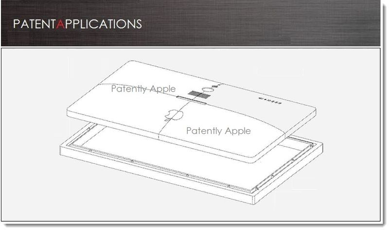
It’s a bit odd that we still haven’t heard anything from Sony about a possible launch of a tablet device, but somehow you always get the feeling there’s something cool they are working on at the moment. And if Engadget’s latest report should be taken into consideration, and it should, then the Japanese corp is currently working on some sort of a Playstation tablet, running Google’s android Honeycomb on board. Sounds almost unbelievable, right? And yet, it might be true. The name of the presumable device is “S1” and according to various sources, there’s a good chance it would boast a 9.4-inch screen with 1280 X 800 resolution, front and rear-facing cameras, USB hub, a Tegra 2 processor, volume on / off buttons and an IR emitter for the use of Sony TVs control. Rumor has it that the S1 will go for a $599 price tag with a planned September ship, or maybe even before. Stay tuned for a whole lot more.

New iPod nano MP3 Player Announced, Comes With a Revolutionary Multitouch Display

One of the most interesting products that Apple has just rolled out at the Music event yesterday morning is the new iPod nano device which the company has completely revamped and transformed it into a nice squarish touchscreen player. Yes, the 6th generation iPod nano is actually equipped with a neat multi-touch user interface, while the body itself is now 46 percent smaller and 42 percent lighter than previous models. In addition to that, the Cupertino guys have also added couple of hard volume buttons on top and a tiny clip on the back (no more armbands needed). And despite the fact that Apple has officially ditched cool features like the integrated camera or video playback support, It would be still reasonable to shell out $149 for 8 gigs or $179  for double the storage in order to get yourself one, especially now when the new nanos boast a 24 hours battery pack, along with a pedometer, FM radio tuner and even Nike+ support. Full PR and a quick hands-on video (courtesy of Engadget) after the break.

Continue reading New iPod nano MP3 Player Announced, Comes With a Revolutionary Multitouch Display

iTablet Gets Released In The UK, Packs Everything The iPad Doesn’t Have

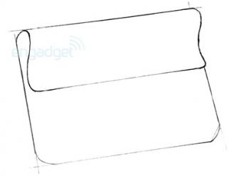
Now that Apple’s iPad has finally turned official and gone into mass production, it seems just a matter of time until new tablet machines would rise and shine in geeks world and closely watched in months to come. And one UK company that didn’t wait long (’till Apple’s newcomer goes live)  and recently taken wraps off its latest greatest pride, the iTablet, is X2 Computing that offers a 10.2-inch widescreen TFT or 12.1-inch widescreen XGA – both touchscreens at 1024 x 768 resolution – due to start shipping with Windows or Linux OS in April 2010, for an undetermined price. Basically, these iTablets pack most things we wanted to see in Cupertino’s iPad but couldn’t find, like three USB ports, optional HDMI output, 1.3-megapixel webcam, multi-tasking and out-of-the-box integrated flash support. Besides that you suppose to see other included specs like Intel’s 1.6GHz processor, paired with Wi-Fi, Bluetooth, 3G connection, white, grey, pink, blue, red, yellow or black flavors and up to 250GB of storage onboard. Stay tuned for more.

Update: Word on the street says that both versions are sized at 35mm thick, which explains the big storage capacity offered, but sounds bulky, in our opinion. This way or another we’ll have to wait and see.

[via Pocket Lint]

Acer’s Aspire One Netbook Gets a Fancy Zen Decoration That Will Empty Your Pockets In a Sweep

From one Zen to another, Japanese top artist UFO-Hayashi has taken the netbook decoration assignment few steps forward by adding Kyo-Yu-ZEN pattern, which is one of the most traditional painting method in Kyoto, on top of Acer’s Aspire One unit, turning it into a lavish piece of cristal art that easily can be yours in case your pockets are loaded with $3000 of cash. If not, just hit the break and watch the presentation video, or jump straight to the eBay selling page to follow the auction.

[eBay via engadget]

Continue reading Acer’s Aspire One Netbook Gets a Fancy Zen Decoration That Will Empty Your Pockets In a Sweep

Sony PSP 3000 Gets Four New Carnival Colors

For those who plan on getting a new shiny PSP 3000 console, hold on for a while, as Sony Japan has just announced 4 new carnival colors to hit the gaming device, starting March 5th. The new collection, which comes in Blue, Red, Yellow or Green flavors is expected to be priced at ¥19,800 ($225), but in case you wish to include 4GB Memory Stick PRO Duo, a pouch, a wrist strap and a cloth in the bundle, it will cost you ¥24,800 ($279). In any case, both options pack a 2200mAh battery inside to your satisfaction, so it’s worth the waiting, specially if you’re tired of those boring black/silver hues.

[Via Akihabara News]

Xbox 360 Gets a Glowing Green Case

I must admit, i’m not a modding aficionados, but this new glowing green Xbox 360 neon case from XCM looks great, specially with the semi-translucent look that provides inner glance at the console itself. There’s no word on price but it should be available soon, so if you’re looking for a unique design for your gaming box, this might be a nice solution.

xbox-360-neon-xcm

[via Technabob]

Samsung T10 Player Gets a Limited Edition Flowery Design

Samsung introduces a new limited edition Flower design for its YP-T10 players, to be released in the following weeks. The new ‘La Fleur’ design is a blend of purple and black, made of strong aluminum and includes some matching floral wallpapers, to be presented as part of the UI. No word on price or availability, but this lineup is going to be very limited, so if you like it, watch carefully for further announcements. Meanwhile, check the video after the break.

samsung-yp-t10-fleur

[via gmp3]

Continue reading Samsung T10 Player Gets a Limited Edition Flowery Design

Creative Zen Gets New Pinkish And Reddish Colors

Creative has decided to broaden its Zen lineup by adding new sporty colors, including pink and red. There’s no special cause behind it, just a stylish move to offer the player to customers with different flavor. Beyond that, everything else pretty much stays identical to the previous models, including the 2.5-inch TFT display (320 x 240), storage capacity – ranged from 2GB up to 32GB, SD/SDHC slot, FM radio and more. Mind you, the pink version is exclusively available in Walmart, as the red one appears at Buy.com. Checkout the full specs after the break.

Creative-ZEN-Red-Pink

[via gmp3]

Continue reading Creative Zen Gets New Pinkish And Reddish Colors

Microsoft Zune Joy Division Special Edition Goes Live In June

Microsoft plans to launch a Joy Division limited edition version of its Zune MP3 player, courtesy for the the band’s Unknown Pleasures DVD release on June 10th. To shed more info, Unknown Pleasures is the first album by Joy Division, released in 1979. In 2000, Q Magazine has placed this great album at number 19 in its list of the 100 Greatest British Albums Ever, as Pitchfork Media placed it at number 9 in its list of the 100 Greatest Albums of the 1970s, so it’s very exciting to see a company like Microsoft, making this nice gesture, by endorsing the band with a special Zune edition, that will be designed by Peter Saville, the original graphic designer behind the Joy Division album covers.

Update: There are 500 copies available in the US for $400, coming in a luxury package.

Zune-Joy-Division

[via wired]

Continue reading Microsoft Zune Joy Division Special Edition Goes Live In June

Western Digital My Passport Essential Drives Get New Colors

Western Digital has officially released a new My Passport Essential lineup, coming with 10 stunning glossy colors that join the already exist dull black portable drive. The new series features a luxurious soft-touch finish and shiny vivid colors, including brilliant orange, super sunny yellow, raindrop blue, arctic white, deep viola, cherry red, ultra mint, real red, intense blue, and vibrant pink. Sized at 15 x 126.15 x 79.5mm, each of the drives is available in 120GB, 160GB, 250GB or 320GB capacities, so you can pickup your favorite color with prices ranged from $119.99 to $179.99, respectively.

WD-MyPassport-Essential-Colors

[WesternDigital via I4U]

XCM Introduces a Chrome Cover Shell For Xbox 360

I don’t really like this whitish Xbox 360 color, i think it’s dull and pale. To serve my desires (and others), XCM has created a really cool chrome Xbox 360 case, compatible with the HDMI ports. This new metallic mirrored shell will shine on your desk for merely $60, but if you want a matchable skin for your controllers, it should be $25 each, which makes this  escapade a bit expensive and very smudgy.

xbox-360-Chrome

[via slashgear]

3Rsystem Brings The Art Nouveau Pattern To Computer Cases

I really like the new Art Nouveau cases from Korean company 3Rsystem, it is chic, stylish and very high-end designed. This new “R240 GRACE” lineup features mirrored black or white faceplates, adorned with nice illustrations and made of high glossy bezel. In addition, it has an impressive reddish LCD screen at the bottom and a built-in iMON, to control your multimedia wirelessly. No word on availability, but if you want to get one of these, it will cost you between $70 – $80.

3Rsystem-case

[3rsys via aving]

More pictures after the break.

Continue reading 3Rsystem Brings The Art Nouveau Pattern To Computer Cases

Meizu M8: New Interface Pictures

So many rumors are floating around the Meizu M8 cellular-player concerning launching date, interface design, iPhone cloning issues and more. One of the latest rumbling refers to the following pictures, presenting the presumably GUI of the M8 device. Although we have no resource to verify the authenticity, it sure looks different from previous publications and distinguishes the Meizu from the iPhone. Stay tuned for the next scuttlebutt, in days to come.

meizu-m8-gui

[via gmp3]

Another picture after the break.

Continue reading Meizu M8: New Interface Pictures

iPod Shuffle Gets Diamonds and Gold For a Good Cause

Hey boys… hey girls, iPod Shuffle gets inlaid. This 18 Karat diamond encrusted was created by jeweler artist, Thomas Heyerdahl, in purpose to be auctioned for charity in London. If you care for a lavish 1GB mp3 player, made of white and pink gold, just open your wallets and count $40,000 – it’s for a good cause, so don’t be stingy.

diamond-iphone-shuffle

[via gmp3]

Nintendo DS Lite Gets A Matte Black Limited Edition Design

Recently, we have spotted some new Nintendo DS colors, hitting the market, but this one has stricken us with its modish elegant matte black exterior and shellac white interior. This rare DS Lite version is a result of an alliance between the highly esteemed designer, Hiroshi Fujiwara, and Japanese fashion magazine, Honeybee. Unfortunately, it is very very limited and located in Japan only, so you can pray to have one but the odds are really faint.

nintendo-ds-lite-rare-black

[via kotaku]

Another picture after the break]

Continue reading Nintendo DS Lite Gets A Matte Black Limited Edition Design

Colorware Revamps MacBook Air With New Tints

If color was your reason not to purchase a new flat MacBook Air, then your excuses are over, thanks to the creative people in colorware. The company customizes a wide range of laptops, based on clients demand, giving them vivid flavors and artifacts appearance. You can choose your style out of 35 aluminum colors and create your favorite design by adding your own logo. The only problem is the price that stands on 500$ for base system color and 50$ per add-on, which makes your MacBook Air adventure very expensive.

colorware-macbookair

[via slashgear]

Alienware Futuristic Android Phone

Alienware’s powerful machines are known for many years. Yet, only recently, has the concept of galactic designs been put into practice and inspired the company to join forces with Dell in order to create an alien phone concept, running an Android OS platform inside, with a blue glowing grill and a slider shape structure from the outside. Sensitive touch keys and navigation joystick are part of the deal as well, but prices and availability are still missing. Connection between galaxies seems imminent.

alienware-android-phone

Sony Ericsson W980 Walkman Gets Clamshell Design

Sony Ericsson has just introduced the new W980 quad-band HSDPA 2100 Walkman lineup, with nice rounded black shell design and “Walkman on Top” function, allowing full player control without opening the shell. The W980 sports the following features:

  • Display: 262,144 colors (240 x 320).
  • Storage: 8GB internal capacity
  • 3.2MP camera with video recording.
  • Features: HSDPA high speed connectivity, FM radio transmitter, Bluetooth A2DP, MP3/AAC audio compatibility, Shake Control Technology – shake your phone and change the song.
  • Availability: Q3 2008.
  • Price: Unknown.

sony-ericsson-w980

[via gizmodo]

More pictures after the break.

Continue reading Sony Ericsson W980 Walkman Gets Clamshell Design

Newman Red Heart Player Designed For Valentine’s Lovers

To those of you who haven’t decided what to buy to your partner for Valentine’s day, this new mp3 player from Newman might be a reasonable solution. “Couples” mp3 music device is actually 2 individual players, turning into one big red heart, once combined together. The players come with 1/2GB storage capacity, mp3 and WMA audio support, clean two touch buttons design, FM tuner, recording function and strap attached, so you can…you know, put them around the neck, like those corny necklaces we had 20 years ago. Price is around 55$ so you have 10 days to decide.

Newman-Hearts-Player

[via imp3]

More pictures after the break.

Continue reading Newman Red Heart Player Designed For Valentine’s Lovers

Nintendo DS Light Gets Extra Boost Speakers

If you want to use your DS light on the go, you have to settle for the mediocre built-in speakers. To solve the quality problem, GameTech introduced a special sound shell that provides better speakers and serves as a case and as a base stand for a comfortable use, in case it adds some weight and turns your DS into a mammoth non lifted unit. Next !

 ds-lite-case-speakers

[via crunchgear]

Japanese PCs Designed For Billionaires

If you got 6 figures spare money in your bank account, you can afford those bling PCs, designed for the very rich and famous by a Japanese company, named PC Zeus. The company offers 2 lavish computers encrusted with a golden case or a diamond studded platinum case. Prices are $562,800 or $750,400 respectively. Do me a favor, if you consider buying one of those, email me first.

japanese-bling-pcs

[via gizmodo]

Sony Vaio T Model Gets New Stylish Skin And Stronger CPU

Sony produced slim laptops long before Apple introduced the MacBook Air. One of those Sony’s impressive models is the Vaio T Type. The notebook featured 11.1″ panoramic screen (1,366 x 768), Core 2 Duo U7500 1.06GHz CPU, 1GB memory, 80GB hard drive, DVD-R drive, memory card reader, Bluetooth 2.0, fingerprint sensor, built in camera, 802.11a/b/g WiFi support and more. Now, after the Vaio T had lost its slimmest premier to the MacBook Air, Sony has decided to revive the line, adding a stronger Core 2 Duo U7600 1.2GHz CPU and a new stylish cover skin. No further details on pricing and availability.

Update: The new T series skins are selling for $1583 in Japan.

Sony-VAIO-T

[via akihabaranews]

More pictures after the break.

Continue reading Sony Vaio T Model Gets New Stylish Skin And Stronger CPU