So this just happened at Jimmy Fallon’s latest and greatest show, when Grammy award-winning singer Christina Aguilera performed in a game called the “Wheel of Musical Impressions.” Turns out the singer was pretty good at it and she just made a point that she is definitely the tops when impersonating Britney Spears, as well as certain others like Shakira and Cher.
Watch the video and let me know what you think about her performance
Pebble, a company that has earned a name in the market for developing wearable technology solutions and became very famous after nabbing more than $10 million for its revolutionary smartwatch on the popular crowdfunding site Kickstarter, is now rumored to be working on the next-generation of its smartwatch, featuring a whole new design, based on a thinner and clean watch elements. The kicker is a 2/2.5-inch color display on top, operating under a revamped OS.
According to an image which was reportedly pulled from Pebble’s own asset servers, by 9to5google, it looks like the US-based wearable company will probably release or announce a slimmer Pebble watch with a color e-paper-like display (which appears to be limited to Black, White and Yellow production) sometime between tomorrow and next month. Mind you, there’s a countdown timer on its website for tomorrow 10AM ET. A new watch? Perhaps.
Meanwhile, the new alleged smartwatch, which you can see walled up, boasts a slightly bigger bezel with merely four different buttons on both of the sides. The watch reportedly won’t include a touchscreen support, but the battery will hold up for a couple of days of off-and-on usage without charging, just as previous models.
The hardware should include a Cortex M4 processor under the hood while software wise, the operating system has been completely revamped by former people who previously worked on the great webOS, and is now said to be close to stock Android Wear more than ever.
As for price, it is likely to remain around the $199 range.
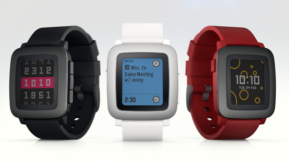
Update1: Pebble has officially returned to Kickstarter and launched a second crowdfunding campaign to raise money for its latest and greatest Pebble Time watch with a new timeline interface. As for this moment the goal of raising $500,000 has been reached in just a few moments and the company already hit the $1 million mark in less that 20 minutes(!) and $2 million mark in less than an hour(!).
As we’ve already mentioned, the next-generation of Pebble’s smartwatches are going to be about 20% thinner than previous models, with a colorful screen atop and a new user interface.
Here are some key facts that you should know about Pebble
Pebble Time features a new color e-paper display and microphone for responding to notifications.
No compromises on what you love about Pebble: up to 7 days of battery life, water resistance and customizability.
Pebble Time is fully compatible with all 6,500+ existing Pebble apps and watchfaces.
Three colors available exclusively on Kickstarter. Pebble Time starts shipping in May.
Extra special engraving for our original Kickstarter backers who support us again.
Pebble Time comes in three colors:
Black watch case and silicone band with black PVD stainless steel bezel
White watch case and silicone band with silver PVD stainless steel bezel
Red watch case and silicone band with black PVD stainless steel bezel
We know you haven’t quite recovered from Dell’s super slim Venue 8 7000 tablet introduction which took place at this year’s Consumer Electronics Show (CES) in Las Vegas, but nonetheless, we’re still very excited to break the news that the electronic giant is about to add two 10-inch Android/Windows tablets to its burgeoning Venue lineup.
The two expected slates, the Venue 10, which packs an Android Lollipop platform under the hood, and the Venue 10 Pro, which runs the Windows 8 version, are said to include a pressure-sensitive Wacom pen performance technology, as well as configurable screens and a plastic chassis covering the top (either in blue or black flavors). There’s also a keyboard dock, which connects underneath in the portrait orientation, with both models to house a quad-core Intel Atom processor onboard, along with a SIM card slot for optional LTE network, full-sized/micro-USB ports, a microSD card reader, 10 hours battery, and activity alert light signal, designed for teachers to know when the kids are using the internet.
In terms of pricing and availability, the new Venue tablets will come with a $299 price tag each, while adding the keypad dock will result in an extra $50 ($349), and the stylus touchscreen pen isn’t for free either. But it still seems like a very good price after all.
When you think about the name IKEA, you usually think of something that looks like it belongs in the home decor department, right? Well, more or less, but not necessarily at all times. What else could IKEA possibly offer other than modern beautiful furniture combinations? Um.. I think it is a question of using imagination rather than logic. Why? Because the Swedish giant have gone and released a mobile keyboard for iOS and Android devices.
That’s right, IKEA now has its own keyboard app that will help you visually communicate your emotions using Emojis and Emoticons. The aim, IKEA explains, is to provide a better way to improve communication between people who decided to live together, in the sense that a lot of arguments revolving around the clutter issues inside the house, and the app, which has just been released, is going to help them out by letting them download the keyboard and ultimately, make their life a lot more successful and organized.
With that, IKEA thinks that you will add more happiness, peace, and universal love to your life.
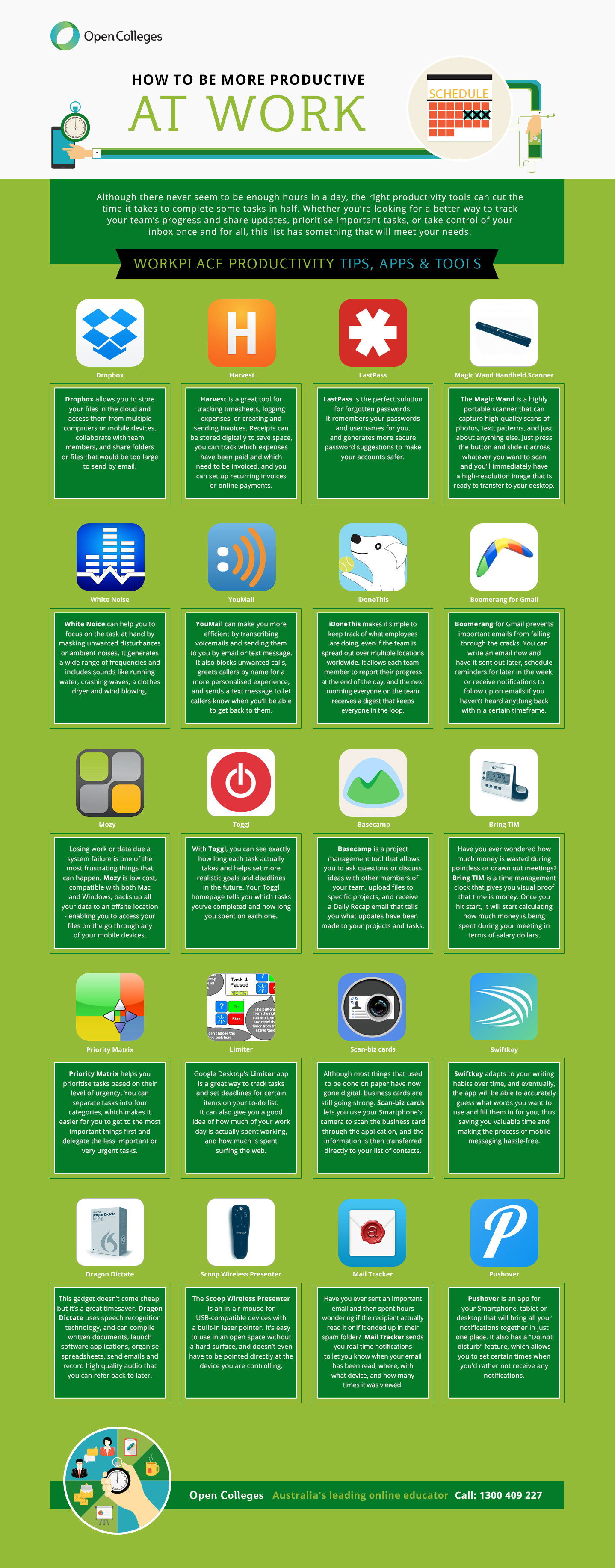
Staying productive at work is something that many of us often struggle with throughout the day. And don’t get me wrong, it’s not that we are incapable of doing anything, it’s that sometimes we can’t rouse ourselves to get things done. This struggle often results in the wrong ranking of plans, even when we think we are on the right way and follow the established collection procedures.
What’s the best way to handle this stuff, you guys are asking? One thing which is particularly helpful to people in the long run is to search, find, and use the best working methods available. Another, is to select some third-party apps that will eventually leverage your productivity at work.
We acknowledge the fact that different people may have different needs, and different needs may ultimately require different apps, but the general idea is to get everyone the best configuration that can exploit their creativity and productivity at work.
For this reason we have decided to share this cool infographics with some of the best apps to help you be effective and accurate in your daily complicated tasks. Check out the full list below and let us know what do you use to stay productive.
Do you have any plans to develop a new apartment or renovate your old house with new exciting design?
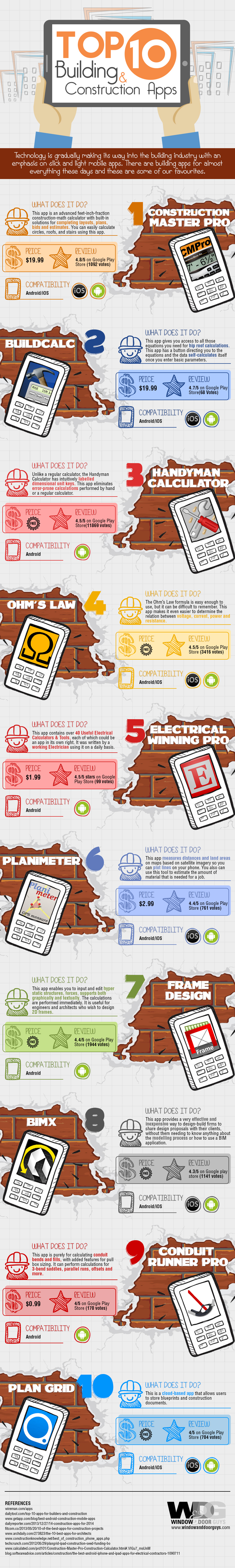
It’s 2015, and technology in the building & construction industry is becoming more and more influential. This is because there are apps becoming available that make things so much easier for builders. The current batch of building apps have the potential to greatly improve efficiency and also improve safety on a building site. There is much less chance of making a mistake when using these highly rated building apps.
Some of these building apps charge a fee but just looking at the reviews it seems they are well worth the small investment. There are also many free building apps that are really simple to use and would be handy for anyone involved in any type of construction.
So If you are looking for a handy dandy set of tools to help you out with a new home design, just take a look at this cool list of practical and useful apps.
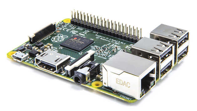
For those who have never heard the name before, the Raspberry Pi is a small sized computer that runs Linux and sells for only $35. Over the last couple of years the device has been a great success and exceeded all expectations, with a whopping 4.5 million Pi boards units sold to date. And despite a relatively short existence the Raspberry Pi has already come a long way. One of the most obvious uses of the Raspberry Pi is as a super tiny portable computer, but the practical and effective uses of the Raspberry Pi know no bounds.
Earlier today Raspberry pi announced their new model the “Raspberry Pi 2”. They have improved the hardware / specs substantially (from the Model B+ ) and optimized the platform to work better with a wide variety of open-source apps, including WebKit, LibreOffice, Scratch, Pixman, XBMC/Kodi, libav and PyPy.
Looking at the board and the inside of the new P2, the CPU is now a Broadcom 900MHz quad-core ARM Cortex-A7, while the RAM has been doubled to a full 1GB LPDDR2 courtesy of the guys over at Micron. And while the overall look is more or less the same, the Foundation says the new model is roughly six times more powerful than previous Rasp Pi hardware.
In some other great news, we hear that the Raspberry P2 will run Windows 10 out of the box – FREE of charge. According to the Raspberry Pi Foundation, the group has been working closely with Microsoft for the last six months to bring Windows 10 to the new Pi2 model.
The Raspberry Pi 2 is now available at the same competitive, low price $35 dollars from Element 14 and RS Components.
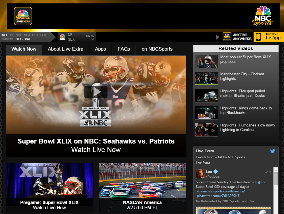
Super Bowl XLIX is about to kick off in Glendale, Arizona, at 6:30 p.m. EST. There are many ways to watch the NFL game live. If you are planning to watch it in the U.S, it will be broadcast on NBC’s TV channel, starting at 1:00 PM (ET), with a pregame show. In addition to that, NBC will also stream the Super Bowl final online, free of charge, on NBCSports.com. Yes, you’ve heard that right, the NFL broadcast will be available to anyone, even those without a cable provider (and no login required).
To watch the live stream via your iPhone or iPad devices you will have to Download the NBC Sports Live Extra app – HERE
To watch the live stream via a Mac or a PC you will have to visit NBC’s own website – HERE
But Super Stream Sunday content is also available online through some other channels. For instance, you can AirPlay mirroring your tablet broadcast stream directly to your tele via Apple TV. Furthermore, Verizon Wireless customers can download the company’s NFL Mobile app and watch the game live on either their iOS, Android, Windows Phone device (this one will be charging you $5 to watch).
Some other alternatives include the Slingbox option, where you can stream the live show to your handhelds with their mobile apps — iOS, Android, Windows Phone, and if you’re a Dish user you can use the Dish Anywhere app for iOS, and Android.
For viewers outside the U.S things are getting a little more trickier. Either you can use a VPN service to get to see the NBC broadcast or alternatively, you can buy the NFL Gamepass or watch via UnoTelly‘s web-based. In europe, you can also watch the stream via common sports channels.
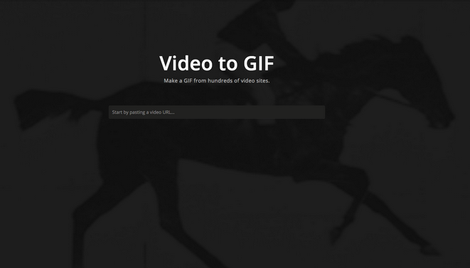
GIFs are the internet. Wherever you go across the net, you see a lot of crazy photos posted all over web. Whether these are cats, dogs or any other pet you have, let alone extreme and funny activities or just a crying newborn baby take– It’s all there. And people like GIFS, really, they do, but what is the most convenient way to make one? There are many tools to create animated GIFs online, that can easily be found on the Internet by doing a simple search on Google.
Imgur, the popular photo sharing service, today released another tool to the pond, but not JUST another one, if you will, but more like the easiest of ’em all. Yeah, the online tool (sorry, mobile users but service is currently only available on the desktop site) which goes under the name Video to GIF will help you turn a video into a GIF image by simply copying the wanted URL address from a wide range of popular video websites directly into the given input window. From there on, when you’re surfing in the following link (imgur.com/vidgif) just click and drag to set your start time and drag to adjust the total runtime, rightly after. You can add any text at your choice if you want and then choose the “Create GIF” option to officially start the process.
The tool is not perfect, but yet allows us to create some truly beautiful high-quality GIF images. Sometimes it will save the file into a .gif and in some other occasions will push it into Imgur’s GIFV format in the form of a .gifv extension.
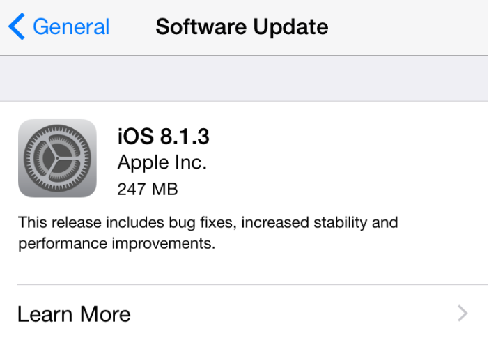
Today Apple released iOS 8.1.3, with bug fixes and performance improvement to the line of devices running iOS 8. In this context, the new update reduces the amount of storage required to install software updates over-the-air. The rationale beyond this move is to provide effective solution to the common complaints about ridiculous requirements to have at least 5GB of free storage on your iDevices in order to successfully install the company’s firmware update.
Apple has also fixed some bugs in this update which address issues that prevented users from entering Apple ID passwords for use with Messages and FaceTime, as well as an issue that stopped multitasking gestures on the iPad, a bug that causes some absence of results on the Spotlight search, and additional configuration options education standardized testing.
The new firmware updates can be installed in the following devices: iPhone 4s, iPhone 5, iPhone 5c, iPhone 5s, iPhone 6, iPhone 6 PlusiPad 2, iPad 3, iPad 4, iPad mini, iPad Air, iPad mini 2, iPad Air 2, iPad mini 3, iPod touch, 5th-generation.
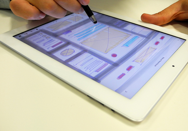
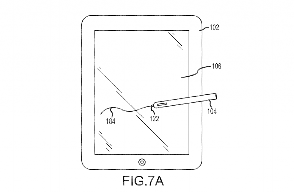
Apple’s rumored 12.9-inch “iPad Pro” is said to be released sometime in early 2015, with word on the street that a line of bigger screens is already in the works for at least one year or so. Now we’re learning from various sources close to the matter that the Cupertino giant is planning to extend the new breed of tablets with some new engaging features to enhance their work performance. One of the features worth noting is the handy stylus pen. Apple Insider reports that Apple might consider adding this tool to its upcoming lineup, while basing their info on a quote from Ming-Chi Kuo, a well reputed Apple analyst at KGI Securities, who has come to the conclusion by conducting his own research and observations of the company, along with the fact that Apple already filed for some patents of a stylus pen before.
To his words, “given that it’s more precise than a person’s fingers, a stylus can be more convenient to use than the combination of keyboard and mouse in some cases.” And “therefore, we believe Apple’s stylus will improve the user experience of 12.9-inch iPad.”
That makes a lot of sense, considering the fact there are plenty of apps that actually require a stylus these days, either for painting and drawing or simply because your handwriting sucks. And what’s better than a bigger iPad tablet to help you improve your skillset and creativity, eh?
Moreover, according to Kuo’s report, the first edition of the stylus will not require any hardware modifications to the iPad itself, however, future iterations of the pen, which are likely to include support for 3D handwriting technology, might do.
If rumors are true, then Tim Cook is clearly going against Steve Jobs’ wishes (who stated in the past that “if you see a stylus, they blew it”). However, it also means that the company is slowly getting into its full stride again after the sudden departure of its late co-founder.
Naturally we are all just speculating out of our geeky minds here but yeah, I think that time has come for Apple to finally release a stylus product as it adds functionality and features that were missing from the iPad.
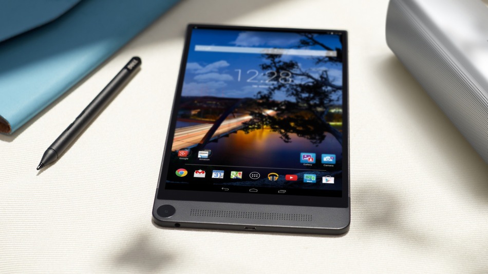
We’ve already got the chance to see Dell’s ultra thin Venue 8 7000 slate when it was first unveiled back in September but now, at CES 2015 the 8.4-inch slab, powered by a 2.3GHz Intel Atom quad-core processor, is finally set to make a debut. And while not as cheap as some other mid-range Android devices available on the market right now, it is reassuring to know that your money is going to be well spent and not wasted on some ordinary specs. In that concern, the Venue 8 7000 device is well equipped with a stunning QHD 2,560 x 1,600 OLED edge-to-edge display, alongside Intel’s state-of-the-art Real Sense Snapshot 3D camera. That’s right, the tablet houses an in-depth rear 8MP camera at the bottom as well as duo 720p stereoscopic sensors atop. The Venue 7000 is definitely one of the first tablets to incorporate Intel’s latest 3D technology, hence the reason it arouses a lot of curiosity among the geeksters around the world.
Measuring in only 6mm thin (thinner than the iPad Air 2 and iPad mini 3) the Venue 8 7000 is said to include 2GB of RAM under the lid, along with your choice of WiFi or LTE connectivity options, an Android 4.4 KitKat for the OS and an internal memory of 16GB which can be further expanded via a microSDXC memory card.
The Dell Venue 8 7000 is now available on Dell’s website both in the US and in Canada for $399.99 and will complete global release in different countries like Australia, New Zealand, China, Hong Kong, Japan, Singapore, India, Germany, and the UK by early 2015.
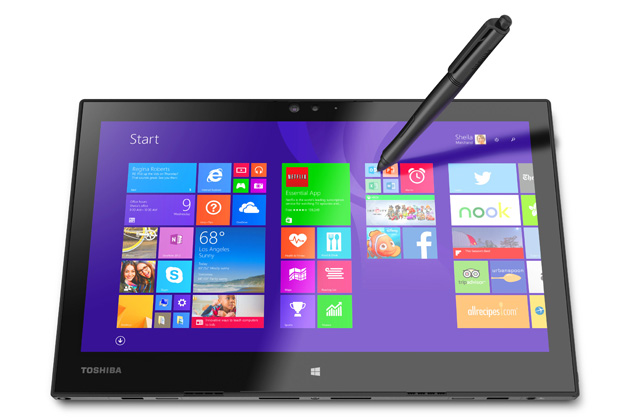
At CES 2015, Toshiba has officially introduced a possible 12.5-inch rival to the Microsoft Surface Pro 3 tablet. The giant device, that will be released under the name Portege Z20t is actually serving as a hybrid machine between a PC and a tablet and is claimed to be powerful enough to deliver any project you’d be working on, even the most difficult ones.
The Portege Z20t which will go on sale this January, comes equipped with a low-power Intel Core M processor below the surface, as well as a 1,920 x 1,080 screen resolution on top of the slab and an optional Wacom-based digitizer, which enables up to 2,048 levels of pressure-sensitive pen input. As with many other handhelds available on the market these days, the screen is covered with an anti-glare protection layer to minimize glare and un-wanted reflections.
Measuring in only 0.35 inch thick and 1.6 pounds, the Z20t also includes a pair of cameras, as well as Wi-Fi 802.11ac connectivity, Bluetooth 4.0, Micro-USB hub, Micro-HDMI output, Ethernet, RGB, microSD slot expansion and two internal USB 3.0 ports. As for power, the Portege Z20t is said to provide up to 9 hours of battery life when you work with the tablet as a standalone device, and up to 17.5 hours of continuous work with the keyboard docking station attached.
Toshiba will offer the Portege Z20t with options for either 4GB or 8GB of RAM and 128GB, 256GB and 512GB of SSD storage variants. Price wise, the slate will start at a whopping $1,399 for the basic entry-level unit plus a keyboard, but without the optional Wacom pen support. If you wanna try adding the pen, prices will jump all the way up to 1,899.
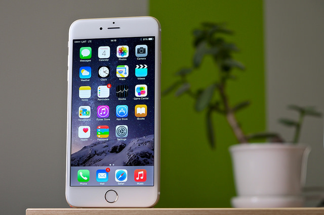
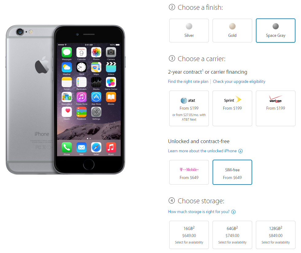
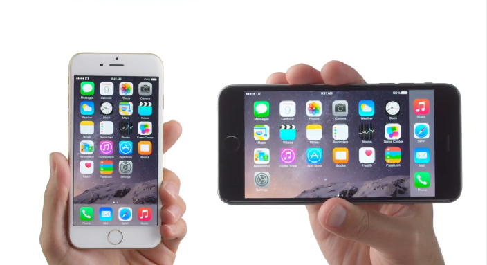
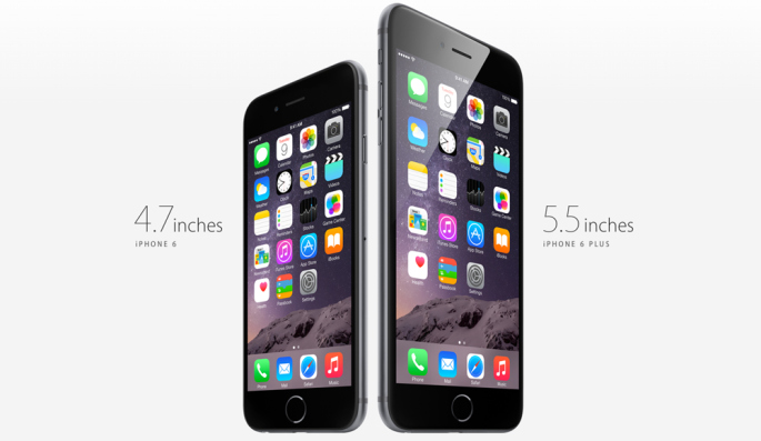
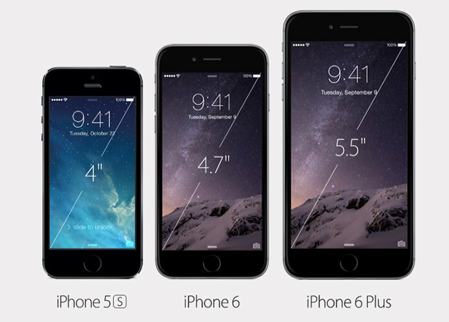
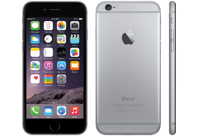
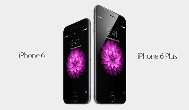
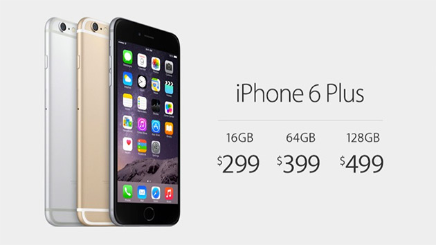
Apple will officially start selling SIM-free iPhone 6 and 6 Plus devices in the US of A today. At least that’s what a recent report from the guys over at 9to5Mac says, based on people familiar with the matter. The phones will be available for purchase at retail and the online stores, so you can choose whatever suits you best.
Up till now, You could only buy one of Apple’s latest and greatest line of iphones in the US via one of Uncle Sam’s popular mobile carriers either with a contract or a contract-free package, but starting today, if things are going to work as planned, people from all over the world will be granted the opportunity to nab a factory-SIM free device directly from Apple.
Currently, there doesn’t seem to be a lot of change in pricing, with the iphone 6 to start at merely $649 for the 16GB version and up to $949 for a 128GB 6 Plus device.
Update: We have confirmed the news – Apple now selling SIM-free unlocked iPhone 6 and 6 Plus devices both online and on its retail stores. Do you have one already or are you getting one today?
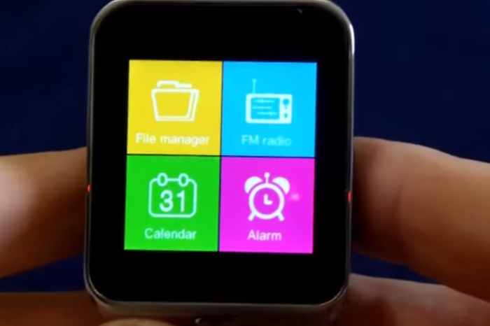
The ZGPAX S28 Bluetooth Smart Watch Phone has just arrived to my door a few days ago with a package that includes a 450mAh battery, good for up to 3 days of continuous work, as well as a beautiful 1.54-inch 240×240 pixels capacitive touch screen on top. The watch is powered by an MTK6260 processor under the lid and will be easily syncing with your handhelds, sending ’em push notifications, or incoming phone calls and messages (as long as you have an Android device). The watch also includes an FM stereo support, along with an MP3 player, Voice recorder, Pedometer, Sleep Monitor, Looking Phone features, Anti lost, Sedentary reminder, SMS, MMS and group messages, Calculator, Email, schedule, memos and so much more. The S28 can also be used as a standalone mobile device, both for dialing and answering without the need of a smartphone sitting close. The watch is now available on the web for $75 MSRP.
It is that time of the year again when everyone rushes to sum up the year and plan for the next. So these past few weeks we have been working on getting as many numbers as possible to understand the current conversion optimization statistics. Understanding what marketers are doing, how shoppers are behaving, what devices people are converting on and more importantly what to look forward to in 2015 can be a crucial part of your plans for the upcoming year.
Here are some very interesting numbers coming up from this year’s companies and spenders:
63% of marketers optimize websites based on intuition & best practices.
73% of companies have no idea why consumers abandon their shopping carts.
Poor A/B testing methodologies are costing online retailers up to $13bn a year in lost revenue.
Here’s what you all should look at in the conversion optimization statistics infographic below:
Talia helps businesses plan and execute conversion optimization programs. She runs thousands of A/B tests using emotional targeting and persuasive design to grow their business.
Talia is a frequent keynote speaker at marketing conferences and was recently listed as one of the most influential experts in conversion optimization. Follow her on twitter at @taliagw and learn more about her conversion optimization training programs.
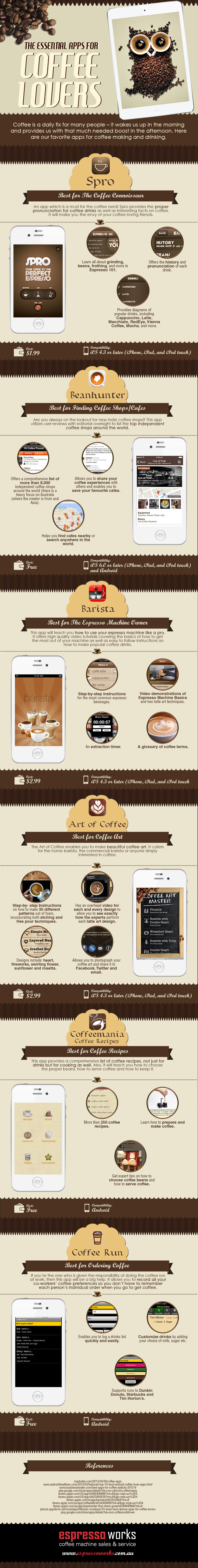
Coffee is something that most of us count on as our daily fix or pick-me-up. In fact, Americans consume 400 million cups of coffee per day, that’s equivalent to 146 billion cups of coffee per year! It’s no surprise then that a range of apps have been built around this much loved beverage.
This cool infographic provides a round-up of some of the best apps for coffee lovers at the moment. Whether you’re a coffee amateur or a coffee connoisseur, we’ve got for you a digital solution in the palms of your hand . Below, you’ll find a list of apps that will help you out either when you’re interested in finding out about an app that can help you discover your nearest independent coffee house or learn about an app that allows you to record all your co-workers coffee preferences to make ordering coffee a stress-free affair. If you enjoy making coffee at home, that’s not a problem at all, there’s also an app that provides you with a whole host of amazing coffee recipes.
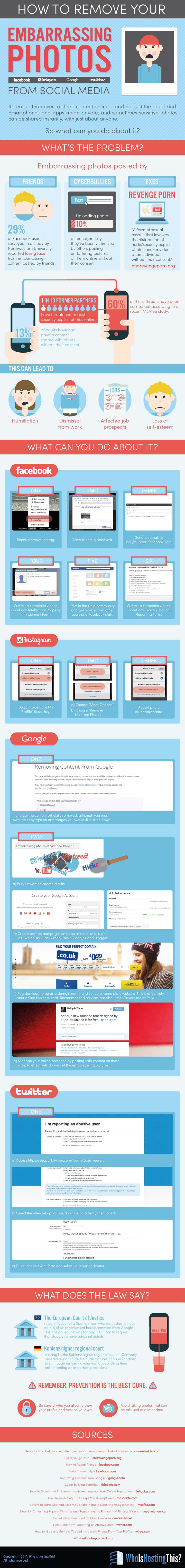
You know how it is with the youngsters these days, they go to a party, have a few drinks and laughs, take some awkward selfie photos and then immediately post ’em on their favorite social media hub (e.g Facebook, Instagram, Twitter or even Google Plus). So what happens next, you may be wondering? Well, it’s getting to be very embarrassing when they finally realize how critically harsh and incredibly painful these social networks can possibly be. Just try to imagine the high volume of inflammatory comments and the damage which might result from it. Not exactly what they would have expected, eh?
Perhaps too late for some, but it is only then when they get to know the proper ways on how to manage their social media life. But how can you minimize the damage caused by your own actions (or others)?
As scary as it may or may not sound, there are a few options out there to get this done.
Check out the infographic below to learn more about the steps you can take when you find embarrassing photos online.
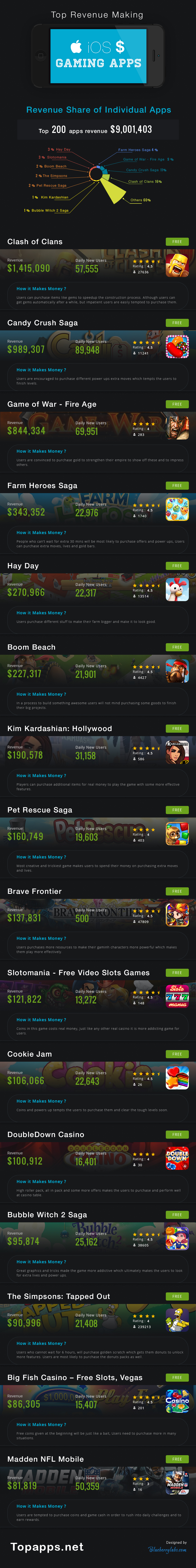
Mobile applications are already an inherent part of our daily life. The average activity includes basic social networking elements, as well as taking photos, watching videos, streaming music and playing video games. Yes, the mobile phone has apart from communication also become a very powerful device for gaming, and game applications are the most popular apps on the App Store, according to any common standard rates.
Due to the growing popularity of these apps, Apple (and Google) has created an ecosystem that allows software developers to create applications that will work on multiple devices at a global level.
There are now over 1,300,000 apps on the iOS App Store, with the top-grossing games to offer free + in-app purchases, selling virtual goods and upgrades to improve a gamer’s performance and overall experience.
The total revenue of top 200 iOS gaming apps has reached a staggering $9,001,403 collectively, with Clash of Clans taking the first place with a total revenue of $1,415,090, followed by Candy Crush Saga with $989,307 in earnings. The third spot goes to Game of War-Fire Age which makes revenue of $844,334 while the fourth is taken by the Farm Heroes Saga with $343,352 overall.
Take a look at the full results in the infographic below. What do you think?
We’ve all heard the phrase “you only have one chance to make a first impression”, this is even more true when it comes to mobile landing pages. At the most basic level a landing page is the first interaction a customer will have with your website. Getting that first impression right is critical. Earlier this year we published the post, responsive design is not a mobile optimization strategy focusing on the importance of creating dedicated mobile landing pages for your mobile traffic and not using responsive design to convert visitors into customers.
Mobile Statistics:
Smartphone mobile commerce revenues amounted to 14.8 billion U.S. dollars this year. (Statista) (tweet this)
By 2016, mobile local search is expected to make $3.2 billion in revenue compared to desktop’s $10.2 billion. (Kelsey report)
50% of smartphone users have made a purchase via their phone (Prosper Mobile Insights). ()
73% of smartphone users say they used the mobile web to make a purchase instead of using an app (JumpTap.com). ()
Below are 42 mobile landing page optimization tips that will set you on your way to convert more mobile visitors into paying customers divided to:
Strategy
The Basics
AB Testing
The Strategy
1. Know where to start – Creating an entire mobile web site is expensive and tales a lot of time. The best way to get started is by tracking analytics and understanding the pain points and drops in conversion you currently have. Once you’ve understood those, you’ll know where to start. The most important elements you want to track for mobile conversions are volume of traffic, demographics and buying patterns.
2. Understand your customer’s goals – Make sure you understand how your goals differ with mobile and desktop users. Do you want them to have the exact same experience? We use web differently than mobile, the experience is different and sometimes we use 2 or 3 devices at the same time for completely different reasons. Figure out what your visitors are doing on your mobile site, understand what they’re trying to achieve and create a user journey that helps them get there faster and quicker.
3. Define Your Goals – Once you’ve defined and understood your visitor’s goals, define yourlanding page goal and design an experience with that goal in mind. Remove side information, multiple call to actions buttons and other gimmicks. Focus on the most important elements of your landing page and how they help visitors complete your goal.
4. Change their life: There are thousands of companies doing the same. People spend very little time on mobile sites and need to understand your value proposition in a matter of seconds. Remember to focus on the customer and their benefit. Less: “We are the best in the world” more: “This will change your life”.
5. Define the desired action – know the one desired action you want visitors to take on your mobile landing page and lay out a clear call to action that stands out and logically moves visitors to the next step.
6. Say it at the top – A visitor should be able to identify what’s in it for them quickly without needing to read complicated texts and stories. Make sure to have your value proposition at the top of the page. Your headline and call to action should be above the fold (what visitors see when the land on the page) and give your visitor the information they need quickly.
7. Be clear about the outcome – it’s important that visitors clearly understand what they will receive if they provide information and how you will use that information once it is collected.
The Basics
8.Forget about scrolling – Create pages that fit within the boundaries of a mobile screen that eliminate the need to scroll. This should apply to both landscape and portrait modes.
9. Design for landscape and portrait – most people think of the portrait view when designing mobile landing pages, but depending on how your visitor orients their phone they may also be seeing your mobile site in landscape mode. Make sure your mobile landing page scales for both.
10. Use Localization – GPS-enabled devices allow for specific, localized content that can reduce friction and increase conversions. In your registration forms you can detect your visitor’s state and city by the zip code they insert. Make the “zip code” your first address field to leverage on this option.
11. Remove external links – By removing the external links to other parts of the site you can control the visitor’s journey and focus them on your call to action. Remember, new tabs open immediately in mobile and navigate the visitor away from your target. Make it a quick and easy journey for your users without luring them to other places.
12.Clean out the clutter – Focus on what’s important, keep the page as clean as possible, minimize friction and keep buttons as far away from each other as possible. The less clutter, text and colors, the more visitors will complete the funnel.
13. Maintain consistent flow and design –Don’t surprise your visitors or try to fool them, use the same messaging and design on your mobile landing page as they saw in the ad. Be consistent with the messaging, this will assist with converting visitors once they’re on your page and improve your ad’s quality score.
14. Don’t make people pinch and zoom – The focus point of a landing page is determined by you. The way you design your landing page will determine what visitors do on your site. By making them pinch, they, not you, choose where to focus on the site.
15. Click to call – Many of mobile searches are aimed at immediate contact. By using direct “click to call” buttons instead of a copy-pasted number you allow for quick conversions and an easier path your visitor. Make sure to set up your phone tracking to track incoming calls before starting out.
16. Adjust the Keyboard – make sure you use the proper keyboard for each form field. When a visitors needs to insert a number or an email, they should be able to do so quickly without changing their keyboard output.
17. Keep your forms minimal – Registration forms are frustrating on all devices, when it comes to mobile, even more so. Avoid open text fields when possible, as writing on mobile can be exhausting. Make sure your form is large and clear, using the full extent of the screen, and keep fields as well as the submit button large enough for clicking with a thumb (missing the right field because its too small can be a drag).
18. Simplify search – make it easy on your visitor to find what they need quickly. Have the search element in a key position to ensure people find what they want fast. (Remember it’s not the most important feature so don’t let overtake other elements).
19. Carry your visitor’s identity – The vast majority of smartphone conversions come from either a direct link or email marketing. Use emails to carry the identity of your users into your mobile platform.
20. Allow to “shop later” – Sometimes we just don’t have the time or energy to complete our registration or purchase process. Make it easy on users to complete their journey on other devices and convert later. Offer a simple way to complete the funnel on another device via email or save-to-cart functionality.
21. QA, QA, and QA – Just because you tested the mobile site on your mobile phone doesn’t mean it works on everyone else’s. Before starting out check Google Analytics to discover the most common mobile screens your visitors use. Make sure to check your landing page on multiple devices and track it over time.
22. Ask for less – to minimize friction and increase conversion, ask for less from your visitors. Get the most important information you need to start a process and get additional information later. Screens are small, time is short and people won’t stay there if your funnel is hard work.
23.Keep copy to a minimum – Most visitors will not want to read through several paragraphs of text. Surface the most important information on your landing page and quickly move visitors to the next step in your conversion funnel.
24. Emphasis your call to action – The call to action is the first thing a visitor should see on your landing page. Provide a quick way for people to follow your call to action and make it easy to complete the funnel. Make your call to action button visible and easy to click on with a touch screen.
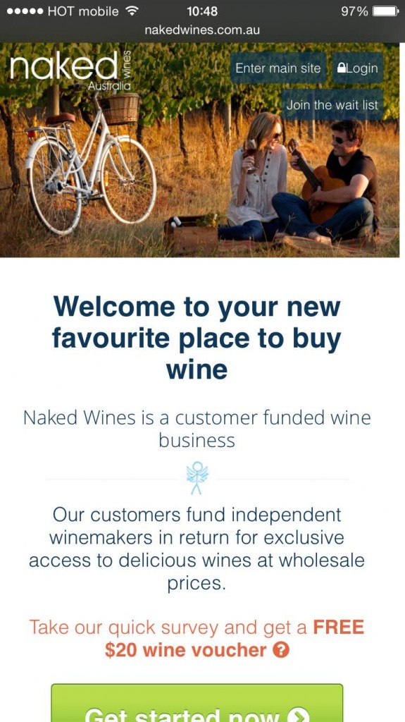
Check out the example below by Naked Wines:
A lot of text
The call to action button is cut
25. Optimize your forms – To make it as simple as possible for visitors to complete your forms, test breaking them into multiple, simple steps.
26. Keep titles short – Keep your title no longer than 3-4 words to maintain a one-line headline and not more.
27. Build for limited data – Mobile data connections can be slower than home broadband connections. Users can run out of patience waiting for your mobile site to load. Make sure to keep it relevant for mobile users and light.
28. Stay away from flash –it may look nice on web (and doesn’t convert), but it won’t on mobile. HTML5, GIFs and JPEGs highly recommended.
29. Take location into account – We use our smartphones while watching TV, driving, shopping and other various locations. Make it easy on the eyes & use icons for faster navigation (include short explanatory text).
30. Embrace social behavior – Social login have high conversion rates and are a great way to encourage visitors to interact socially with your product.
31. Offer exclusivity – The majority of people prefer to checkout on desktop screens. To increase conversions try offering mobile exclusive sales to reduce friction and increase sales.
32. Design for action – Design all clickable elements as buttons (not just text links), make them big enough and add white space around them to emphasis them.
33. Less is more– Use as less text as possible and eliminate all unnecessary design elements – leave only functional elements.
34. Personalize your message – smartphones offer a lot of important information on visitors. Incorporate features that are available on mobile like GPS and location-based information for the users, for example: Shipping to Washington!
35. Take font into account – make texts more readable. Use larger font, bigger line-spacing and letter-spacing to allow for easy reading and skimming.
36. Optimize for SEO without damaging conversions – Avoid using a lot of text on your mobile landing page and introducing clutter by using an expandable-div. This will make pages shorter, and visitors will be able to click on what interests them.
AB Testing on Mobile
37. Test KPI’s – Before setting out to start testing, establish your business goals and translate them into digital KPIs (e.g – signups, purchases, downloads). Once you’ve determined your KPI’s make sure your tracking is set up correctly.
38. Reach significance – while running tests make sure you run them until you reach statistical significance, Google Experiments will tell you when you’ve reached it or you can use this A/B test calculator. Reaching significance will ensure you learn as much as possible from your tests and know they’re correct.
39. Exclude irregular days – conduct your tests in an environment that will give you the most authentic results. Avoid testing during holidays, events or paycheck days.
40. Be systematic – To achieve clear results and understand the meaning of the test results, make sure to run one test a time or, if you have sufficient traffic run simultaneous tests with different test groups.
41. Test Strategies, not elements – After you’ve taken care of all the technological issues and elements that can increase conversion, be sure to start testing strategies to better understand your users. Testing button colors or titles will only get you to a certain point. In order to gain larger wins and learn more from your tests, you need to start testing emotional strategies.
42. Use a checklist – with so many things to remember prior to launching your campaign it is best to use a checklist to make sure no important steps have been missed. A checklist also ensures that you and your team are following a consistent process for each new campaign.
Wrapping up
Responsive design is not a mobile optimization strategy. To get more out of your mobile visitors, creating dedicated landing pages and different user journeys for them is key for success.
Do you have any mobile landing optimization tips of your own? I’d love to hear your comments!
Talia helps businesses plan and execute conversion optimization programs. She runs thousands of A/B tests using emotional targeting and persuasive design to grow their business.
Talia is a frequent keynote speaker at marketing conferences and was recently listed as one of the most influential experts in conversion optimization. Follow her on twitter at @taliagw and learn more about her conversion optimization training programs.
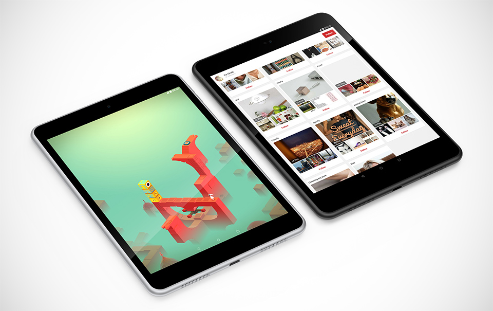
It’s been a while since Nokia has officially released a brand new Android/Windows tablet to the wild, so it is nice to see them adding one more. The Finnish company which was acquired by Microsoft a little under a year ago for $7.2 billion, is finally back on track with the addition of a 7.9-inch slate. So, what this is all about? We’re looking at a 6.9mm thick device, dubbed the Nokia N1, that features 2GB of RAM inside as well as WiFi connectivity and 32GB of internal storage.
While this N1 tablet looks a lot like Apple’s iPad mini 3, it is actually thinner and lighter than pictures would suggest. Nokia outfits the new slab with a nice HD display that measures 7.9 inches diagonally and features a resolution of 2048-by-1536 pixels on top (same as Apple’s 3rd-gen iPad mini model). The front-facing camera offers 5-megapixel resolution alongside an 8-megapixel shooter on the rear. In terms of speed and performance the N1 will arrive to the market with a 64-bit 2.4GHz quad-core Intel Atom Z3580 processor on board, together with a duo set of speakers, and your choice of either “Natural Aluminum” or “Lava Grey” colors.
The tablet runs on Android 5.0 (which has just been confirmed to be called Lollipop) but there is a software layer that Nokia has added on top of its existing proprietary platform, called the Z launcher. Furthermore, the tablet is said to be one of the first devices in the world to feature the reversible type-C faster USB connector. Unfortunately, it is likely to be the only single USB port.
The N1 is due to launch in China for $249 sometime before the Chinese New Year which takes place on February 19, 2015, with a release in Russia and a few European countries to follow shortly after.
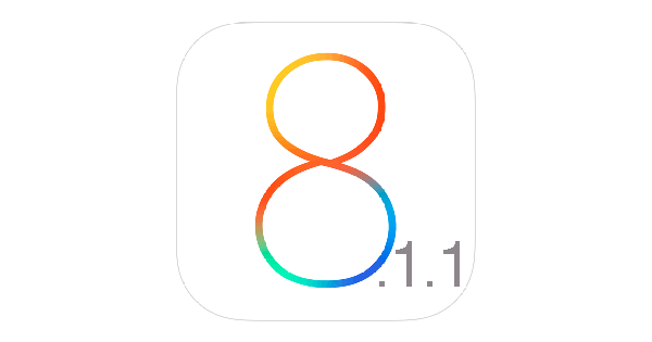
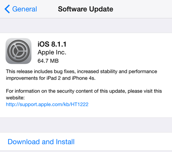
Apple has just released iOS 8.1.1 with some minor bug fixes for the iPhone, iPad, and iPod touch. In addition to that, the new release is set to bring a few several improvements to Apple’s latest and greatest iOS platform including a few security updates, as well as an increased stability, and for the major part, performance improvements for some of the company’s oldest devices including the iPhone 4s and iPad 2, which have apparently become somewhat sluggish with iOS 8.
iOS 8.1.1 is available immediately as an OTA download. Simply go to to Settings > General > Software Update. the update is relatively small and should be
iOS 8.1.1 is compatible with the following iDevices:
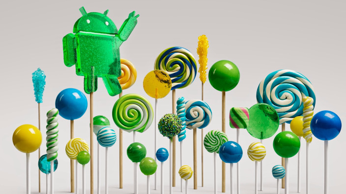
It’s Android Lollipop day, as Google has announced it will officially start rolling out OTA updates for its latest and greatest Android 5.0 OS to several Nexus devices, including the Nexus 5 and the Nexus 10, which will go straight from KitKat to Lollipop, Nexus 7s, plus the Nexus 6 and 9 which are both currently getting “minor” bugfix updates. It appears that Samsung and Sony users will have to wait a bit longer for this update as well as Nexus 4 and 3G/LTE versions of the Nexus 7 devices.
According to a recent post on the Google Product Forums the details of the new update are as follow:
The over-the-air update for Lollipop is now starting! The update is starting for these devices:
Nexus 6: Minor update to address bugs
Nexus 9: Minor update to address bugs
Nexus 5: Update from KitKat to Lollipop
Nexus 7 WiFi (2012 & 2013): Update from KitKat to Lollipop
Nexus 10: Update from KitKat to Lollipop
It will also be put up on Android Open Source Project (AOSP).
Note: The OTA update for 3G/LTE versions of the Nexus 7 2012 and 2013 have not yet started, nor have they started for the Nexus 4!
Update: Motorola has also announced an official OTA release of the latest Android Lollipop update for its second-gen Moto G and Moto X mobile devices. The mobile company has posted on its website the following:
We’ve started to roll out Lollipop in phases just a week after the public release of the software to the following devices in the US -Moto X (2nd Gen.) Pure Edition, Moto G (2nd Gen.) US GSM, and Moto G (2nd Gen.) Global GSM retail versions sold in the US.
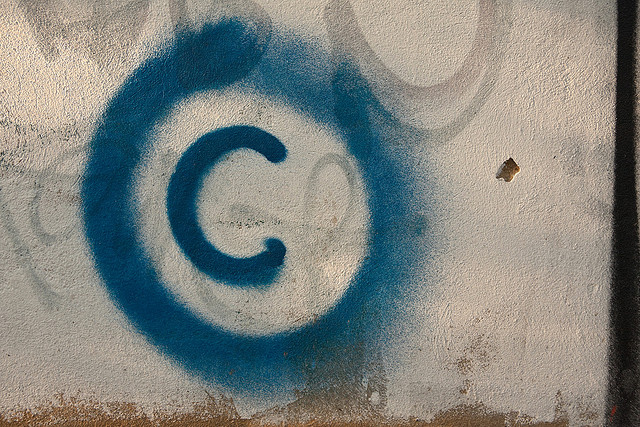
You know how it is when you want to download a photo for your website or this wonderful song that you have heard on the radio, and you kinda wondering if they’re copyright protected and where exactly does the borderline go.
As you all probably know, the internet is a dark place when it comes to copyright issues, but the history tells us it has widely changed over the years and helped to further shape copyright law into what it is today. However, the more things changed, the more they’ve managed to remain the same, only just that bit more complex (and restrictive).
A lot of people are just not familiar with the laws or how the Internet works when it comes to copyright laws, and this infographic sketch shows us how it started, right from the very beginning.
While the Internet offers us the ultimate freedom to go and access almost anywhere and download almost anything we want, a copyright Infringement should be taken-in immediately as a possible risk factor.
Have you ever been faced with the dilemma of copyright infringement? What do you think about it?
Most marketers spend the majority of their time and budget on driving users to their sites and landing pages, but very little thought is given to the experience the user has once they reach there. In fact, companies typically spend $92 to bring customers to their site, but only $1 to convert them (Eisenberg Holdings). This lack of attention and investment in landing page optimization is a huge missed opportunity for organizations.
Learning From Others
A great place to get started in optimizing your own pages is to look at common landing page examples and mistakes that many companies are making on a daily basis. In this article I’ll explore 15 landing pages’ major mistakes and offer different tests you can run to increase conversion:
6 Elements Addressed in Each Landing Page Design
1. Call To Action (CTA) – This is the most important part of the landing page as it is the end goal for what you want the action you want the user to perform. The CTA should be the first natural object a visitor sees. An effective landing page services on clear objective (e.g. sign up, leave their contact information, download a whitepaper, request a demo, or buy now). The call to action should represent the only action you can take on the landing page, which means removing any menus or links on the page. The CTA should also stand out from all other elements by using high contrast, bright colors, and strategic placement. Lastly, make it absolutely clear what the user will get when they click on it. For more information on CTA’s, check out this detailed article on Call to Action Buttons.
2. Messaging – An effective landing page talks about benefits, not features:
Putting the customer in the spotlight, not your product or service. Good messaging conveys the change a customer will experience in their daily lives with your product, not how amazing your product is. This message should also be conveyed in a matter of seconds. Providing convincing information to allow a visitor to make a decision. Understanding the experience a visitor needs to go through is key to higher conversions.
3. Registration Forms – If the goal of your page is to capture leads or contact information, your landing page will have a registration form. Creating an effective, and high converting registration form involves several factors and there are several ways to increase their conversion:
a. Minimize your request – ask for the minimum possible
b. Be precise- Explain the reason for singing up and be specific.
c. Call to action – make sure to have a clear call to action that indicates the next steps that need to be taken.
d. Guide the user – Help users understand where they are, and where they’re going. Use indicators, explanation fields and don’t surprise the user.
e. Consider social signups – Following the minimizing requests necessity, introduce social connect for easier signup.
There are many other elements to take into consideration, and we’ll discuss them when we dig deeper in to our landing page examples.
4. Page Structure– The look, feel, and overall structure of a landing page will have a large impact on how it performs, and ultimately conversion. Minimalist design tends to perform better, so be sure to maintain a clean landing page with clear navigation and little distraction. The most important content should be placed at the top of the page, or “above the fold.” This way a user does not have to scroll in order to get all of the necessary information to convert.
5. Images – I know, I’m probably like a broken record by now BUT: Our brains process images 60,000 times faster than text. The Image is IMPORTANT.
A picture is worth a thousand words, and having an image that captures your visitors’ attention, or stirs emotion can make or break landing page performance. Some things to keep in mind:
a. Use imagery to add meaning: either to the brand, or to the content
b. Get more meaning from fewer graphics
c. Use images deliberately to support your message and communication goals
d. Remember the landing page’s goal and the users’ goals, and apply graphics in subtle proportions
6. Colors – Believe it or not, color has a powerful influence on our emotions and decision-making abilities. Colors are a great way to communicate emotions in a matter of seconds. Checkout this extensive article on color psychology.
So, lets take a look at these landing page critiques and learn as much as possible from them. I’d love to hear your thoughts and comments on the landing pages. If you’d like to have your landing page critiqued next, send a quick email to [email protected].
—-
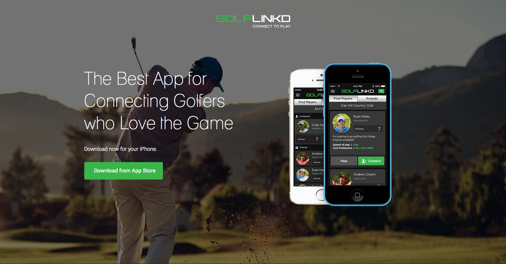
GolfLinked
I know I’m not the targeted audience, BUT:
What’s in it for me? So this is the BEST app for connecting golfers. Great, but how is it going to change my life? Circling back to messaging –> it should be about the customer not the app. What’s in it for the user?
Let’s talk about the image –the image is one of the most dominating elements on your landing page and can be used not only to convey a message but to direct users attention to other important elements. The image shows a golf player with his back to us (which makes it impersonal) but further more, the image is distracting. In fact the first thing a visitor notices on the page is the iPhone and not the call to action, which is what we want them to notice.
The Call to action is placed on his butt. Enough said. No one wants to click on anyone’s butt.
Stop emphasizing your logo and even worst making it clickable, companies do this all the time. It’s attention grabbing, if you’re not Apple or another huge brand there’s no need to highlight your logo. Move it out of the spotlight.
The use of colors – Green is a great color for creating a fresh, clean and new feeling. Green also serves as a great natural color that is easy on the eyes.
What to test:
Have your image facing/pointing at the call to action button – it will focus the visitor’s attention in the right direction. Finding an image that works for golf isn’t easy at all, we ran a similar test last year.
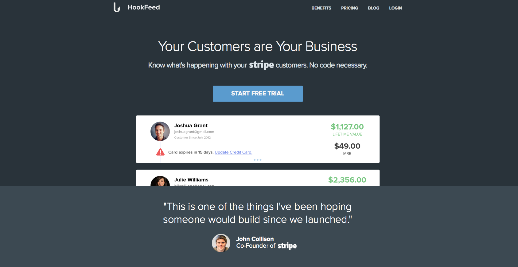
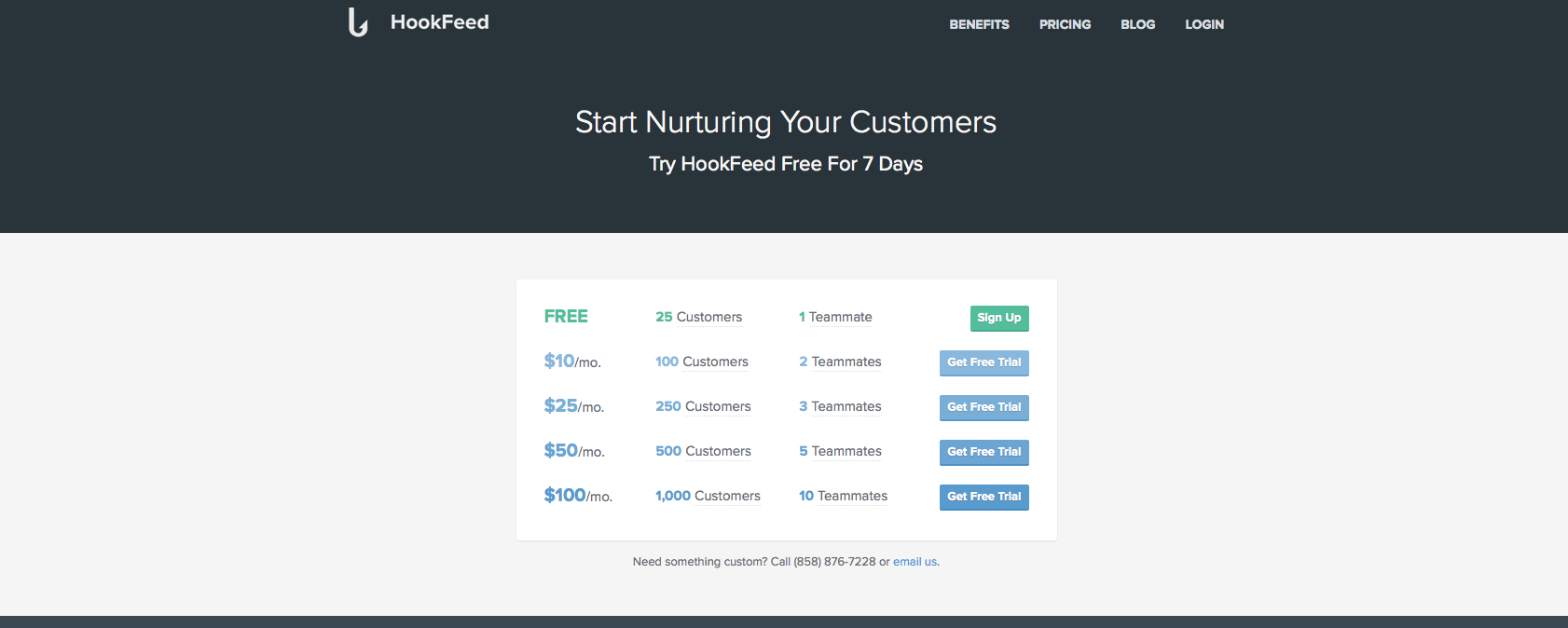
HookFeed
The headline is really vague. My customers are my business? What do you do? Why should I use this product? It doesn’t give me enough of an insight to how this will make my life much easier. I’m not sure how segmented are the visitors arriving on this page, but it lacks a more in-depth explanation.
Great use of social proof quotes, especially from Stripe’s co-founder. People love to feel others like them are using the same products and services as they are.
Nice call to action, contrasted from the rest of the page, stands out and it is the first natural elements my eyes focus on.
Extremely Confusing Funnel – The call to action button opens a confusing list of options. You’ve just gotten people to tryout your free trial but instead you’re confusing people and asking them for too much.
2 Elements You Can Test:
Before showing them a list of prices, start by collecting their email details that way you can follow up on them if they leave.
Once they’ve entered their email address, send them to the product and have your list of offers in a layer above it. This way, customers will feel they’re just a step away from reaching the product and will complete the funnel.
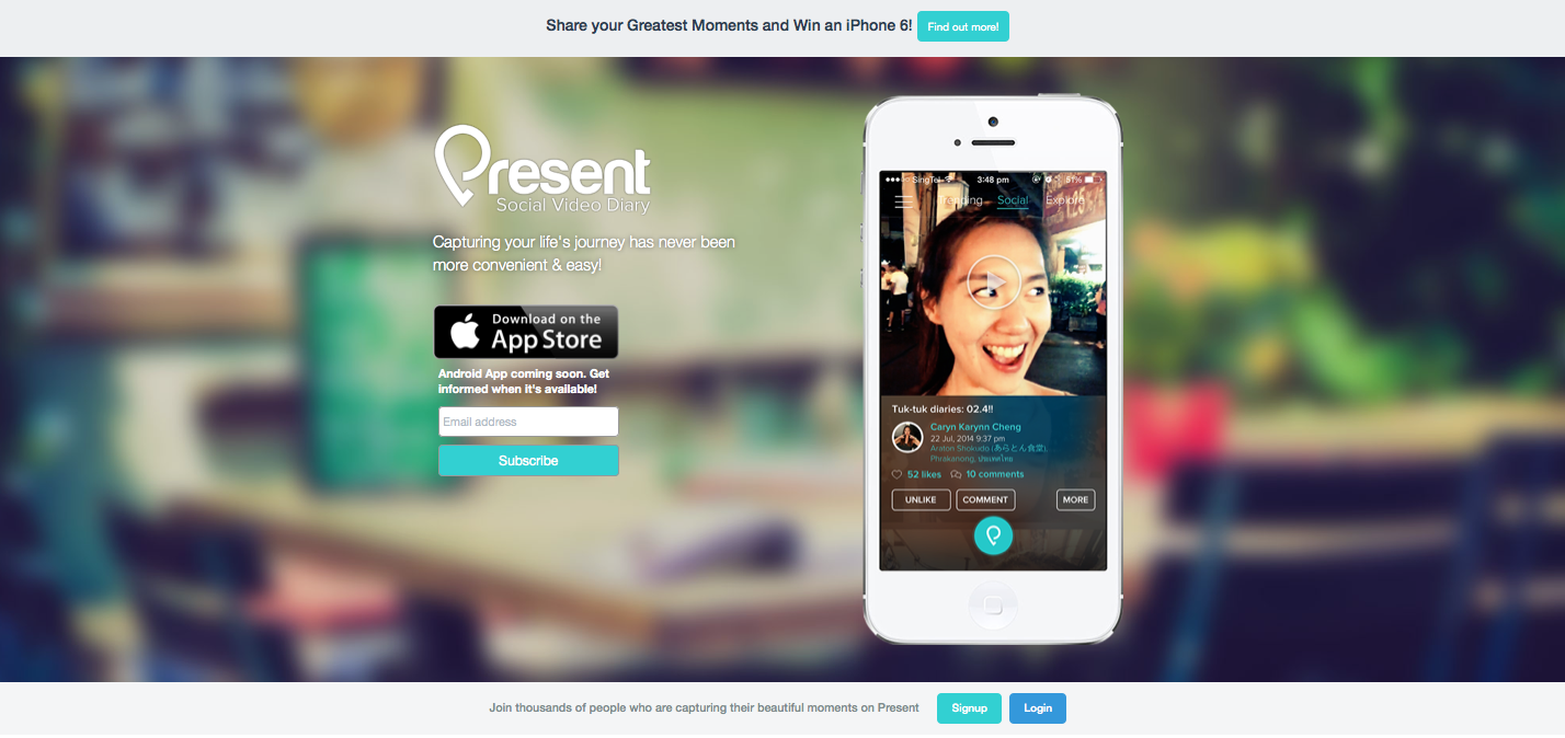
Present
The image of the girl conveys a great feeling of excitement and adventure. For an app that wants to get you excited about capturing your life in video, it does a great job. One comment: Flip her! Get her to look the other direction.
The messaging is great – “A social Video Diary, capturing your life’s journey.” I know what this is, I know how it will improve my life and I can get this in less than 5 seconds.
What do you want a visitor to do? Find out more, download the app or subscribe? All 3 buttons on the page have the same weight and it’s not clear what the target is.
What To Test:
Flipping the girls image to look at the CTA
Try using the “Win an iPhone 6″ competition as an exit pop, so that when people come to leave they have a last minute proposition.
If you want to subscribe Android users to a mailing list, you can do that with a simple link under the “Download App” button asking: “Android user?” a click on that can open a subscribe window.
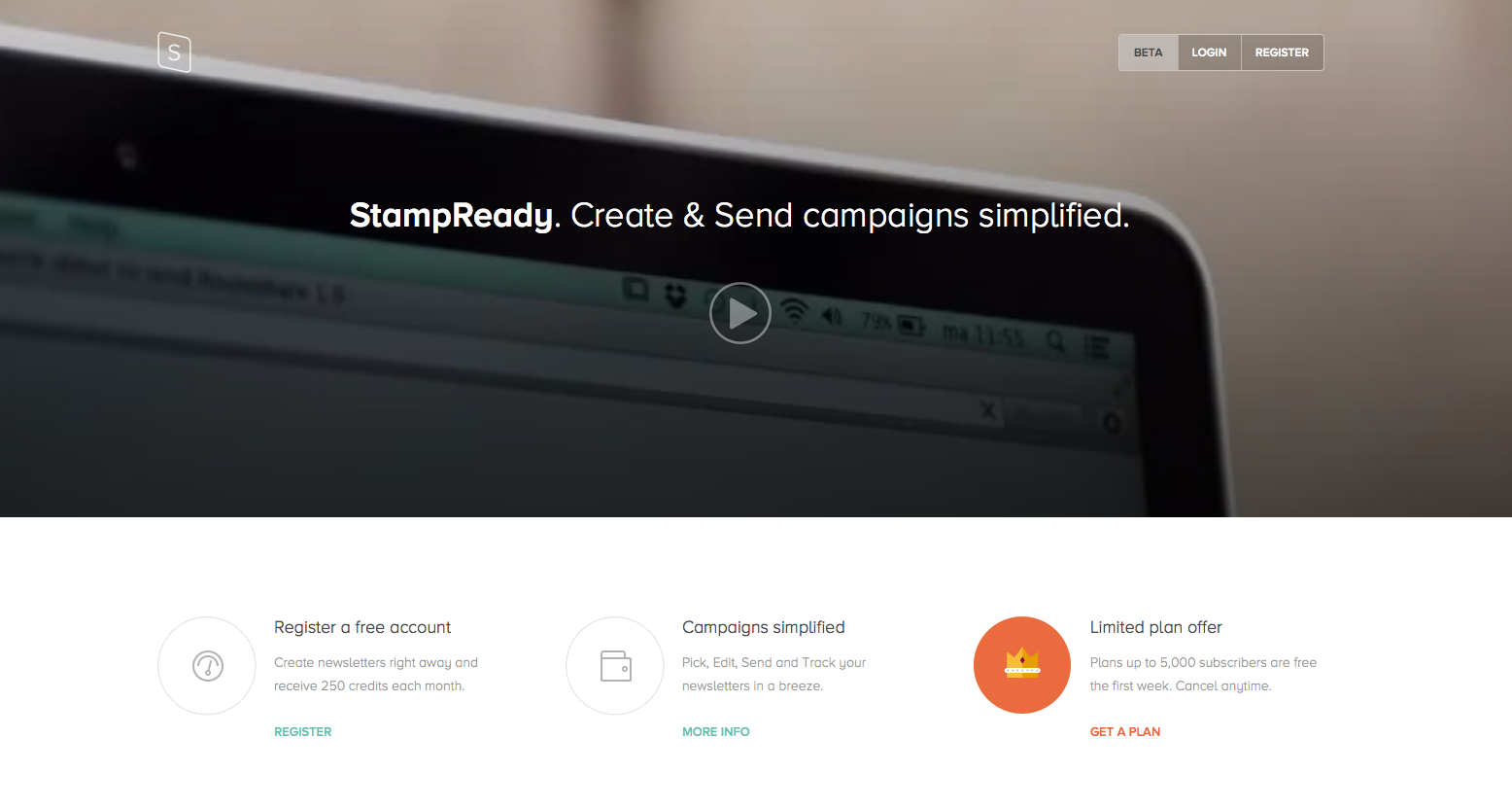
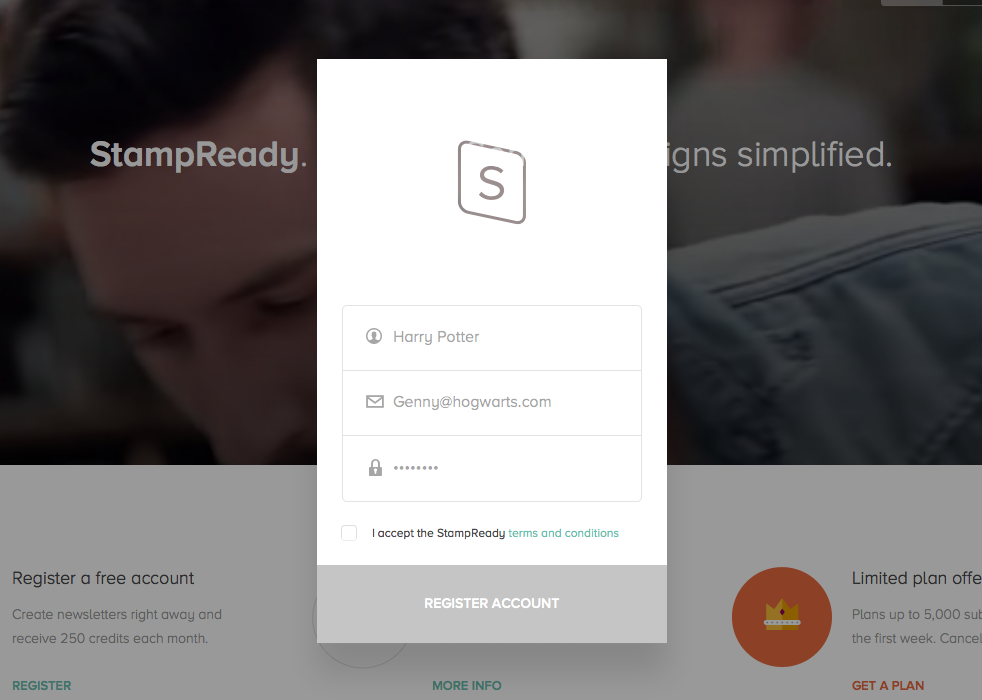
StampReady
What is your call to action? Are you trying to get people to watch the video? Or register?
Everything’s grey. You need to use your design and colors to point the visitor in the natural direction of the call to action.
Nice work on the signup form, it’s short and to the point. I would however change the color of “Register account” to something different than grey, more actionable and I would think about changing the messaging on the call to action to something more exciting.
The messaging doesn’t tell me anything. What are you offering? Why is StampReady better for me? How is it going to simplify my life? I’m also not sure about having the name of your company in the headline. The headline is meant to give you the big picture in under 3 seconds, unless you’re a well known brand, that won’t work.
What to Test:
The image/video in the background says nothing about the service. As you’re already showing a video as your main call to action, I would have a static image in the background that would give more of a feeling of what StampReady is for its customers.
Add a clear call to action
Change the messaging
Add color to page
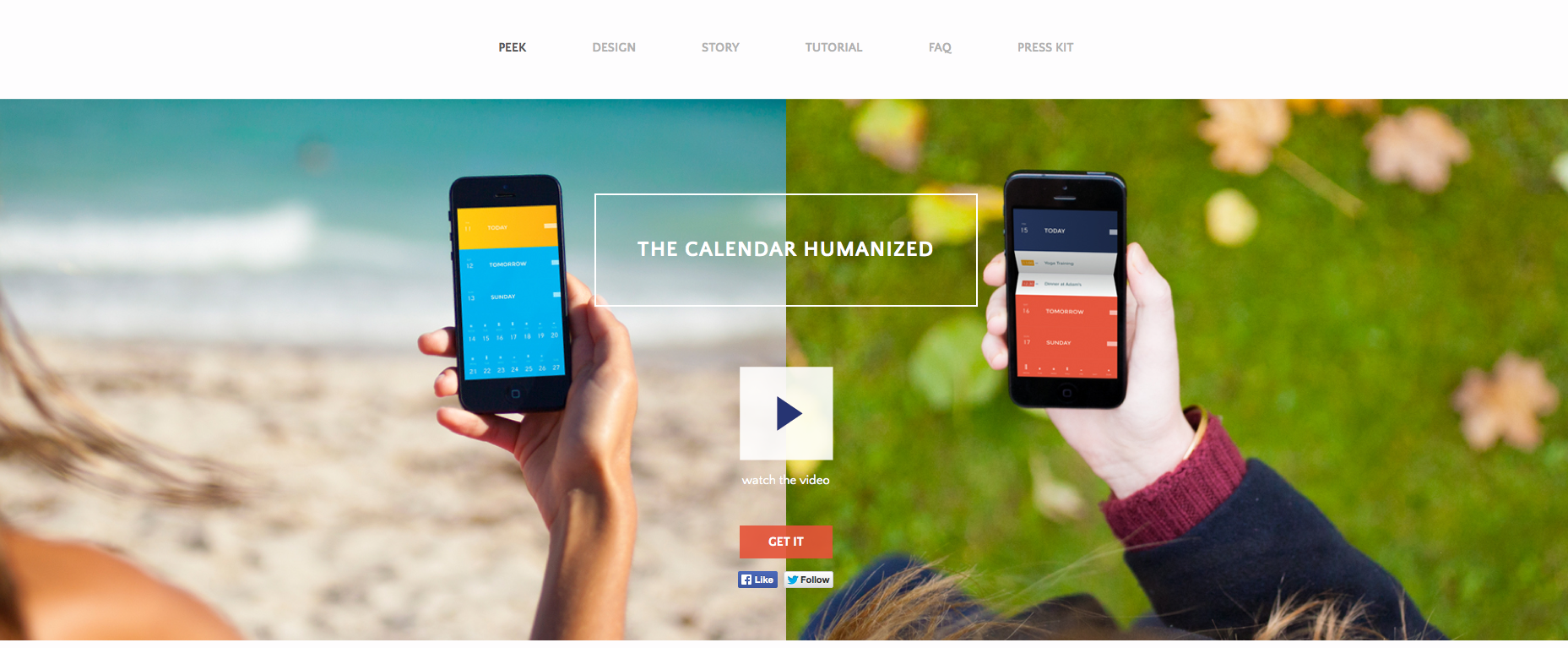
PeekCalendar
What’s the CTA? “Watch the video” or “Get it”? choose.
What do you want me to look at? This is similar to the previous comment. There’s so much going on with colors, images, text, screenshots, buttons I have no idea what the flow is, what I’m suppose to do or what your app does.
I’d definitely test one main image, or if you’re set on having 2 then less colors, more focus. Also, note how you can barley read the “watch the video” text, it almost blends in with the background…
Where’s the emotion? Where’s the “This is the answer to all your scheduling turmoil’s?” (and there are soooo many!!) A pair of hands holding an iPhone with a calendar that looks just any other isn’t the answer.
Love the title, calendars are extremely hard to manage (like email) and I like the reference to it being humanized for actual people to use.
Things to test:
Find the right image
Test using a screenshot from the app that shows the actual difference and value you bring
If you can’t, then test using an image that conveys emotion (no screenshots or iPhones), just an image that says “this is how you will look like/feel once you use our app.”
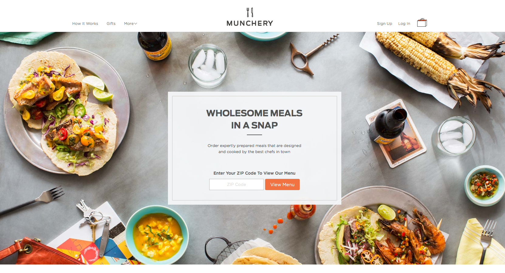
Munchery
The use of images could be optimized. A great way to direct users attention to the call to action button is using the images themselves as indicators. For example, instead of having the corn facing outwards, have it facing the call to action button. Basically all elements on the landing page should point to the call to action.
I’d definitely look into focusing the user on one message only that explains the service quicker.
Actionable call to action messaging: “View Menu” – I know exactly where I’m heading with it and it gives a safe feeling.
Great use of colors to provoke emotion, arouse the taste buds and basically make people hungry.
What to Test:
The Messaging doesn’t explain the product. In fact, you have to read the fine print to really understand what Munchery do ‘Wholesome Meals In a Snap’ could be a site with recipes… There’stoo much text and it’s hard to take in. Try reducing the text “Order expertly…” and see if you can use it as your headline.
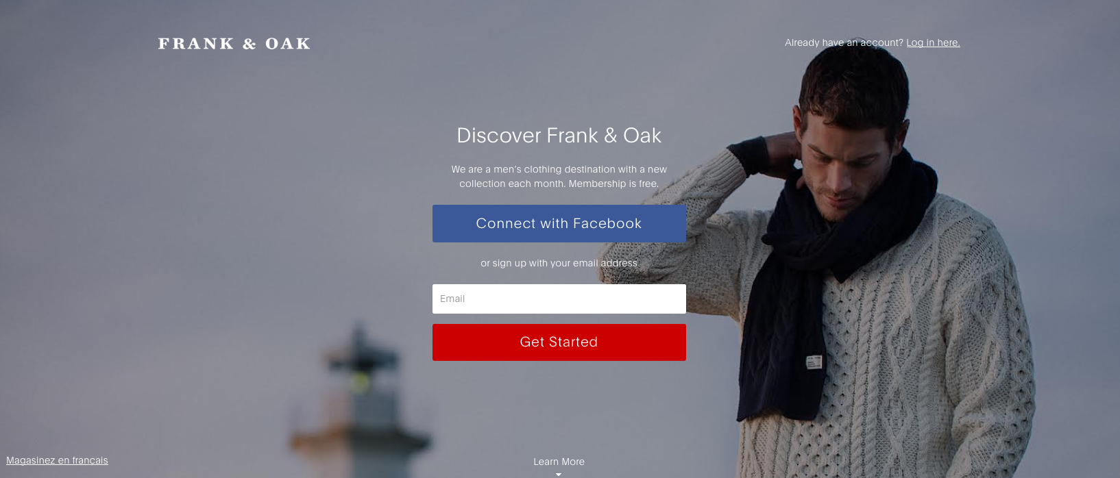
Frank & Oak
The messaging is completely vague. Why should I discover Frank & Oak? Similar to the case of StampReady, putting your brand’s name in the headline is like answering a question with a question. You’re basically asking people to read more and investigate, people don’t have time for that.
Too many ‘Call to Action’ buttons. Both their colors are in complete contrast to each other and the background and I don’t understand what you prefer I’d do: Signup with facebook or my email? It’s extremely important to have one call to action, if you want to give people another way of signing up offer it under the large call to action button in a way of a link.
What to test:
The image is a controversy, on one hand it’s doing great use in pointing towards the call to action. On the other hand, he has his head pointing down and he looks sad. Depending on culture, an image of a person staring at the user is too intrusive, but no eye contact whatsoever creates the sense of detachment, depression and seclusion. I’d test a different image, still pointing at the CTA but something more cheerful.
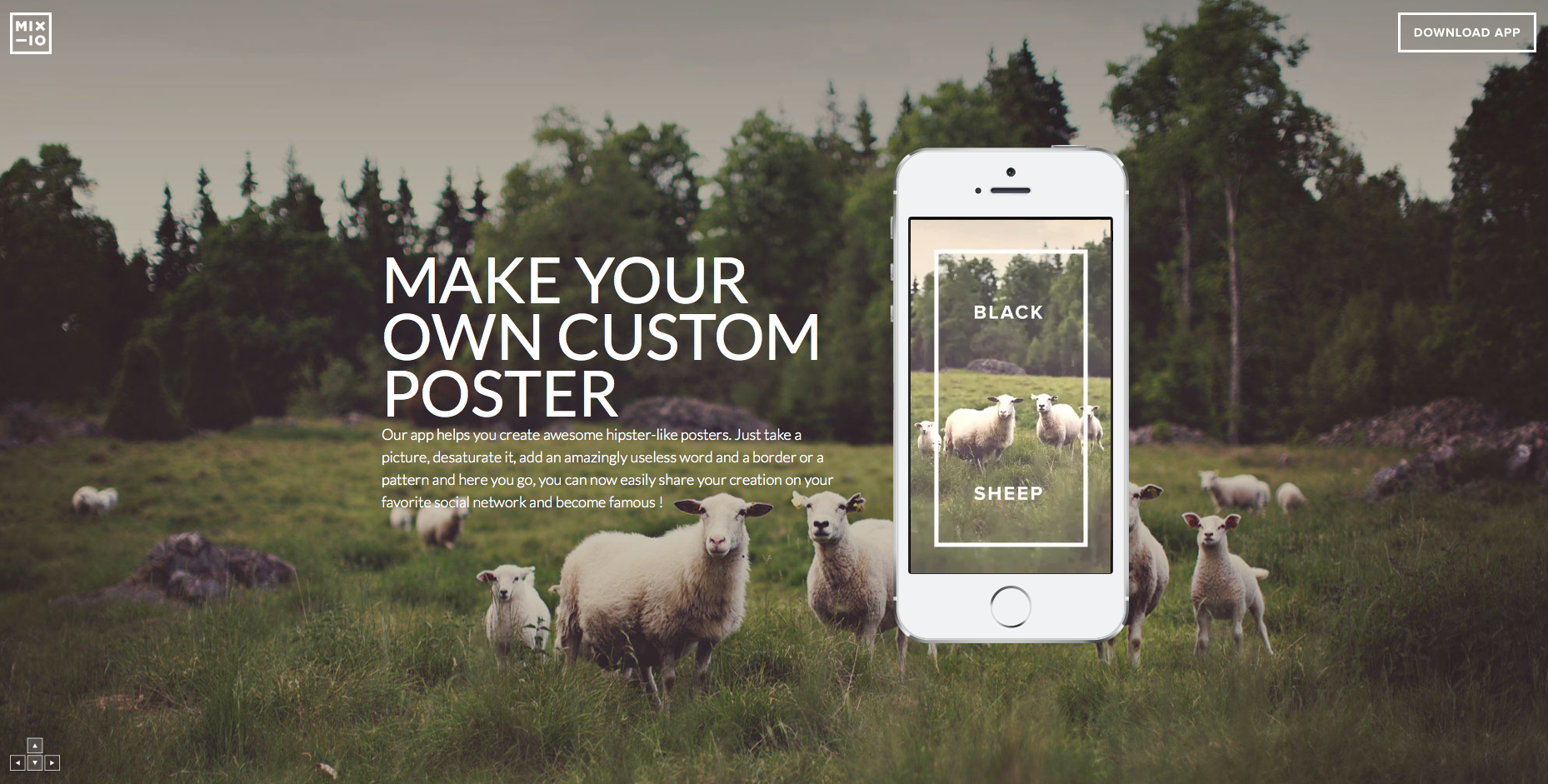
Mixioapp
To understand Mixioapp I had to do some scrolling, downloading and watching.
The messaging isn’t clear enough to understand how this works or when. The amount of text under the main headline is basically telling visitors “Don’t read this!”
The call to action button almost doesn’t exist. Located on the far top right corner in the same white color that all other elements on the page are in, it’s hard to see how people even notice it.
To play fair, I checked the page on my mobile device and was surprised to find that although it is a downloadable app, there was absolutely no call to action to be found. Basically, you have to scroll all the way to the bottom of the page to be told how to use this app. Not to mention to be told what this app is…
The use of color on the landing page is important. Mixioapp’s messaging is all about taking pictures while on an adventure or just on a daily basis when magical things happen. Green represents fresh, new and growth, which is just what their targeted audience needs.
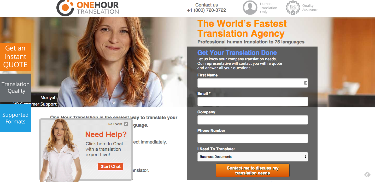
One Hour Translation
It’s easy to get what you do, but the first thing that appears on this landing page is clutter. The amount of colors and things going on this page is overwhelming.
The amount of call to action buttons is distracting and hard to comprehend. There’s no room to breath. Do you want people to fill in the form? Or do you want people to click on ”Get an instant quote”? The page can benefit from some cleaning up and redefining the goals of the landing page.
The amount of text is also an issue, all the text is on the right of the page and as a result you get is headline attached to a subtitle the additional text, the form and the security icons. Keep in mind that people may need al this info in bullets + the text needs more spacing.
I cannot say this enough: Marketing isn’t about the product or service, it’s about the change you make in a consumers life. Being the world’s fastest translation agency is fantastic but it’s about you, not the customer. I’d definitely mention it, but would try and test over headlines with a more targeted message to the customers.
I love using icons to ensure trust and security; the use of badges and certificates is a great way toenhance brand security. In One-hour translations’ case I would suggest repositioning them in a place that would give them more emphasis.
What to test:
A good way to emphasis an element is to give it some white space. Whitespace will help differentiate between the important and the less.
Cleaning the page completely. Removing text, all the elements and amount of colors.
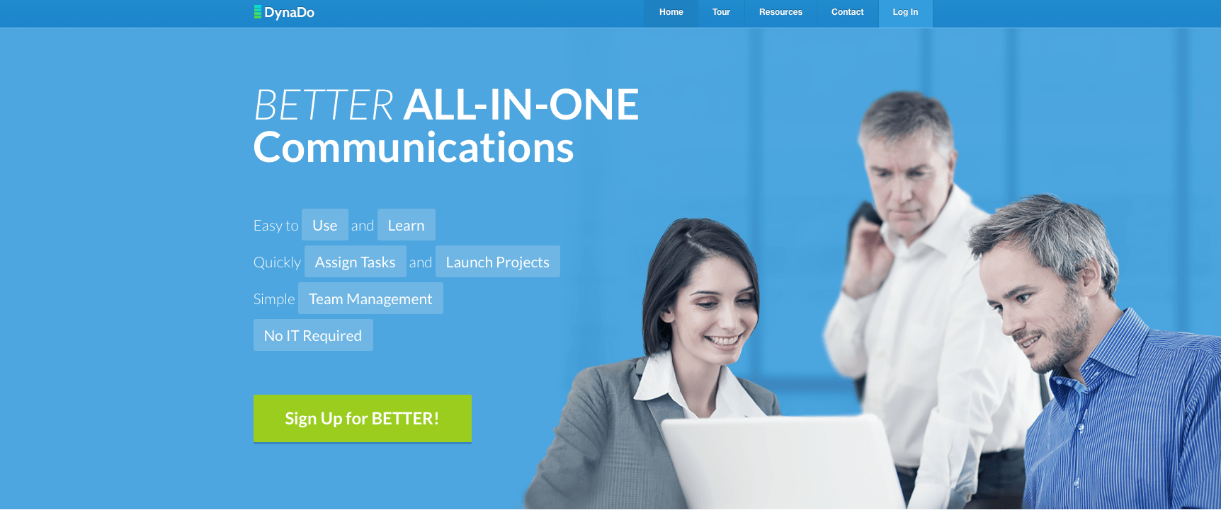
Dynado
It took me too long to understand what Dynado is offering. “Better All-In-One communications” could be so many products… why are there random words highlighted below the headline? It makes it extremely hard to read the text and understand what they do.
There are literally hundreds of products out there today doing team management and communications. I have no idea why Dyando is better than others.
Using random stock photos of people around a computer does not help their case. Most companies use a task management and communication tool for teams that are remote… they don’t sit around looking at a computer together so I’m not sure what they were going for here.
What to test:
The call to action button has two issues that I’d fix:
The first is the text – the title of the page says Dynado and the headline of page uses the word ‘Better’ as part of the sentence, so most people have no idea that “Better” is the name of the product and it’s very confusing.
The other thing I’d test is the color of the button, I don’t usually do these kinds of tests (before testing strategies) but the white text on the neon green button make my eyes squint.
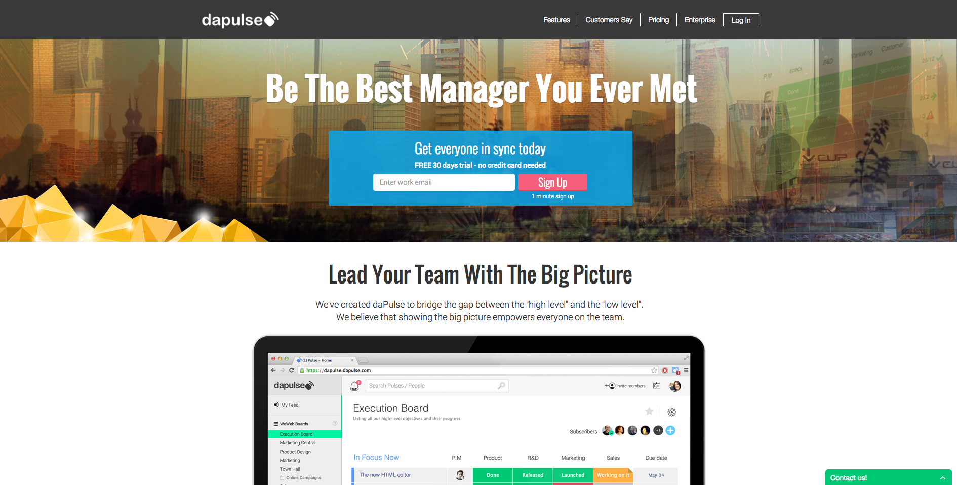
daPulse
I decided to critique daPulse as a second point of view on team collaboration platforms (full disclosure, I used to work with these guys):
The messaging is great, as mentioned before the world is crowded with different platforms and products and it is extremely important to stand out and say how your product benefits the customer. This is true to all industries, your competitors are doing the same as you more or less and it’s up to you to show your customers the emotional benefits in purchasing your product or software. It’s not about being the best product, it’s about making a change in your customers life.
Appealing to managers on a personal level and telling them they’re going to become amazing managers is what categorizes daPulse as different (Great job!).
The signup area is a little over crowded, I would definitely test moving the “free 30 days trial” sentence below the form and giving it less emphasis. Visually, I’d also enlarge the top part of the page to give it more emphasis and in turn enlarge the signup area.
Notice how the image in the background amplifies the “connecting remote teams” theme; although not a clear image and I’m not quite sure what the gold in the corner stands for, the idea of worldwide collaboration is clear and precise.
What to test:
I’d consider using the testimonials and trust elements in a more prominent position on the page (right now it’s at the bottom).
I don’t know how targeted and segmented are the visitors arriving on this page but I’d consider further clarifying what it is that you do by adding a subtitle.
The John Maxwell Team
The first thing that comes to mind when looking at this page is: A coach of what? Very vague headlineand I’m not sure why it is in quotes. I’d move the part about “leadership” to the headline.
Starting a video automatically is extremely annoying. Don’t do it.
The registration form is short and to the point, I would however merge the first and last name fields. I’d also work on the text above the fields, as it is very hard to read clearly.
The messaging of the entire page is about life’s transformation and then the call to action button says, “click here to get started”, I’d consider trying “Change your life today!” or something along those lines.
What to test:
The call to action should also be a contrasting color to the rest of the page. I’d also consider adding some type of background color.
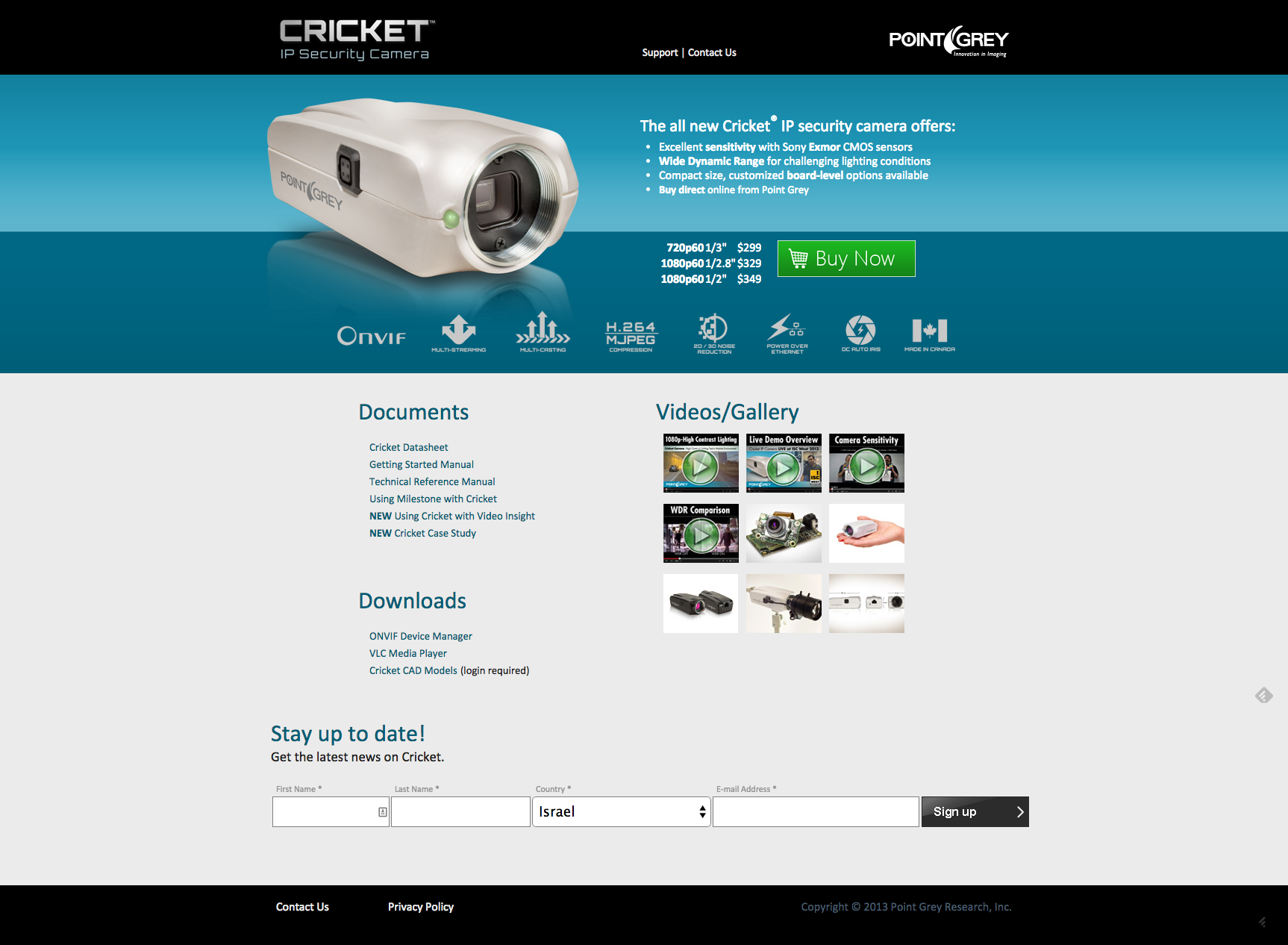
Cricket IP Security Cameras
The use of the color Green on the call to action button is very good as it is the general direction in which a visitor will look at.
The list of benefits is great but I can’t read it. White space is crucial here, and I’d also increase the headline to make it more noticeable.
Great use of security elements and icons blow the call to action.
What to test:
I know they’re selling security cameras but that image is just terrible. No emotion, no interest and no purpose other than showing the visitor what the camera looks like. When talking about security you want to make visitors feel secure and peaceful before even purchasing the product. Show them how safe they’ll be once they acquire this camera.
Last but not least
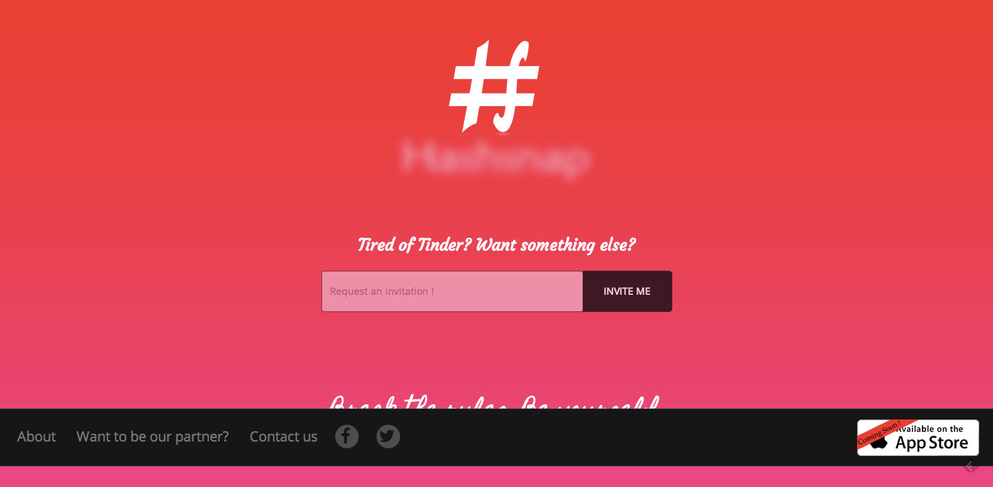
A company that will be launching their dating app in 1.5 months sent this landing page to me and asked me to review it. Their goal for now is to sign up people, so that once they launch they can send them the news and get them engaged. As there’s not a lot to go on, this will be short but I do have some important comments.
This is a screen capture from a standard screen, which means you have a bug and it needs to be fixed, as I can’t read that sentence at the bottom
The hierarchy of elements on your landing page doesn’t make sense. It seems that your logo and company name are more important than the sign up form. I’d enlarge the signup field and button and give it much more weight. In addition the black stipe stands out more than other elements on the page and is hovering all the attention. I’d consider changing the color, moving it lower in the page.
What does “invite me” mean? This again to do with the messaging, you need to put yourself out there and not by compering yourself to your competitors. Explain what happens when you signup, what is the value and why it’s worth your visitors while.
What to test:
Your messaging gives the visitor absolutely no value; you’re basically just saying you’re an alternative to Tinder. Nothing about your product, why it’s different or how it will make a change in the world of online dating. There are literally thousands of online dating platforms; you have to give people a reason to signup, because right now there isn’t one.
This concludes this month’s landing page examples and critiques. I hope you get a few ideas from these landing pages critiques and I’d love to hear about them. If you have any questions about my comments let me know in the comments below, I’d love to hear them.
Talia helps businesses plan and execute conversion optimization programs. She runs thousands of A/B tests using emotional targeting and persuasive design to grow their business.
Talia is a frequent keynote speaker at marketing conferences and was recently listed as one of the most influential experts in conversion optimization. Follow her on twitter at @taliagw and learn more about her conversion optimization training programs.
All these talks about Apple having a 12-inch iPad device launching next year have brought the market into some interesting new highs, with Microsoft’s 12-inch Surface Pro 3 tablet already out around the globe, Lenovo announcing the 13.3-inch Yoga tablet Pro 2 model and Acer to intro the 12-inch Aspire Switch slab.
The later is actually a 12.5-inch (1920×1080) hybrid machine which is more of a combination of a basic laptop and a tablet sitting on top. The keyboard in here is obviously detachable, which makes it as an easy going tablet on-the-go, and the operating system is of a Microsoft Windows 8.1 breed.
Under the 12-inch swivel screen, which is only a tad bigger and sharper than the company’s own Iconia Tab 10 slate, you’ll also find Intel’s low-power Core M processor at 800MHz when in tablet form and up to 2.6GHz in a PC mode. In addition, you have a choice of either 60GB or 120GB of solid-state storage, tucked with a micro-HDMI video output, and a USB 3.0 port. The battery inside is good for up to 8 hours of continuous video work.
the 12-inch switch is claimed to be five devices in one with various uses and different modes of transform.
The Switch will be available in North America in early 2015, with no pricing details disclosed. The tablet will arrive in Europe, the Middle East, Africa and Asia sometime before the end of this year, with prices expected to start around the 649 Euros.
Colors, can have a tremendous impact on a consumer’s decision to purchase. With today’s 3 seconds to convince visitors to convert kind of world it’s important to use colors, images and messaging the best way we can. As our brains process images 60,000 times quicker than text, color can have a huge impact on your landing page’s conversion rate. In the following article we will explores the emotional power color has on our brains and decisions, along with tips for how you can incorporate color psychology into your landing page designs.
The Emotional Power of Color
Colors are a way of communicating certain messages and feelings in a matter of seconds. When we use the right colors, they can have an emotional effect on our visitors and direct them in to action. According to Kissmetrics, 85% of shoppers place color as the primary reason for why they buy a product and color increases brand recognition by 80%. People are also said to make subconscious decisions in under 90 seconds, and color is a great way to trigger action.
Segmenting Colors by Gender & Age
In general when we design our landing pages we don’t put a large emphasis on gender unless we’re targeting our product to a specific gender. We use colors to portray specific emotions and make a memorable experience for our client’s users. Depending upon the type of product or service you offer, and the industry in which you operate, gender preferences may play heavily into purchase decisions. It pays to understand which colors persuade a particular gender to stay on a page or make a purchase.
According to research from Sherwin-Williams colors that appeal most to women are blue, purple and green while orange, brown, and gray are least appealing.
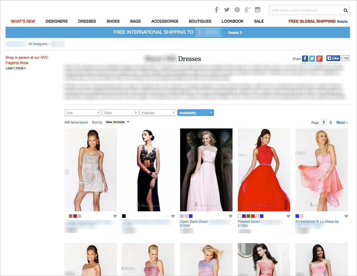
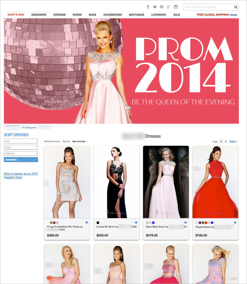
Earlier this year we worked on a women’s ecommerce store selling prom dresses in the US. in this test we introduced the color pink to project calm, hopeful and positive feelings towards shopping prom dresses online. The color pink was introduced to more than just the banner or background, the images on the page were given a pink hue and were all directing to a certain type of experience – our goal was to help women (mothers and daughters) experience the delight of shopping online in a world of calm and positive emotions . These changes and others increased revenues by 86%.
Before:
After:
According to the same research from Sherwin-Williams, men preferred blue, green, and black, while brown, orange, and purple were the least loved. Again, again and again we see that the emphasis shouldn’t be on the gender or age but on the experience you’re creating for the visitor.
When designing your landing page you should also take into account the age of your audience. You may already have a clear sense of the age of your audience, or if you are using Google Analytics, you can find this information under the Audience tab. Children and younger generations tend to prefer warmer colors that are associated with positivity and high energy. These include red, orange, pink, and yellow. Brown, purple, yellow, and blue are generally associated with sadness and negativity by children.
Colors & Types of Consumers
Color also has a unique ability to attract certain types of consumers and impact shopping behavior.
Impulse shoppers tend to gravitate toward black, red orange, and royal blue. This is evidenced by the colors found in fast food, outlet malls, and clearance sales.
Shoppers on a budget tend to be influenced by navy blue and teal. This is evidenced by the typical color schemes found in large department stores and retail banking.
Traditional buyers are drawn to pink, sky blue, and rose. Clothing stores will use these customers to attract traditional buyers to their shops.
Designing For Emotion
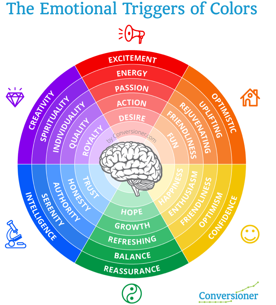
Color is one of the most subtle and effective ways to instill a specific emotion. Colors can make us feel happy or sad, relaxed or hungry. Different research shows that certain colors elicit particular emotions, and by understanding the psychology of color you can establish an emotional connection with consumers.
Yellow
Yellow is a great color to give a gentle energy to a landing page. It is mainly used to inspire happiness, laughter, hope, and sunshine. However, you should use yellow sparingly as it can also irritate the eyes if it is overused. In the landing page below we used the color yellow and other yellow elements to generate fun and sunshine.
Red
Red can be a great way to draw attention to an element, like a call to action, but use in moderation as the color can become overwhelming. Red can can bring out emotions of passion and love, as well as anger or danger. Red also has a tendency to cause us to feel hungry, which is why you see fast food chains like KFC and McDonalds make heavy use of these colors in their branding.
Green
The use of the color green can be done to emphasis regeneration, clean, health and wealth. Green is commonly found in financial institutions, as it is indicates growth, financial health, and possibility. Earlier this year we introduced the colors green to establish a look and feel of wealth, relaxation, fresh and new. Green is also known as being the easiest color our eyes can process making it easier for us to focus on other elements on the landing page.
Orange is more inviting than Red, but still grabs attention. Orange is one of the most common colors for creating call to action buttons. Earlier this year we discussed Fanta’s use of the color orange and
Blue
Seeing the color blue causes the body to release chemicals that are calming, which causes it to evoke feelings of soothing, calmness, and spirituality. Dark blue is commonly found in corporate designs because it promotes stability and professionalism. Lighter blues give a more relaxing and friendly feel. Take Twitter and Facebook, for example.
Purple
This color is associated with creativity, royalty, nostalgia, and wealth. Like blue it can also have a calm and soothing effect, however depending on the shade it can also be used to create intrigue. Purple can be used to make a design appear more luxurious or wealthy, and is often used in beauty and anti-aging products.
The Impact of Color on Conversions
There are plenty of examples where a simple change in the color of increased sales and conversions, since other than copy, design and color play a huge role in the success or failure of any landing page or product. Although changing an elements color on a landing page can have great impact on conversions, it is very hard to analyze results from these types of tests and scale from them. Deciding on the colors of your landing page or brand is more than just the color of your Call to Action button, it’s a strategy. Since colors portray emotions, you can use them in a way that communicates a certain experience.
I just got back from Europe and witnessed all of the McDonalds chains around me in Green. It intrigued me to understand why such a strong brand known for its RED color would change to Green and apparently McDonalds is swapping its traditional red backdrop for a deep Green — to promote a more eco-friendly image in Europe. The power of color.
McDonalds isn’t alone, in a marketing study, Heinz changed the color of their signature ketchup bottle from red to green and sold over 10 million bottles in seven months, resulting in sales of $23 million.
What’s Next?
With all of the information and data provided you should be able to start incorporating color psychology into your landing page designs in order to see which colors resonate with your target audience. It’s important to understand that work does not end with simply creating a landing page and that continual testing of copy, layout, imagery, and particularly color is need to truly impact conversions. How have you incorporated color into your designs?
Talia helps businesses plan and execute conversion optimization programs. She runs thousands of A/B tests using emotional targeting and persuasive design to grow their business.
Talia is a frequent keynote speaker at marketing conferences and was recently listed as one of the most influential experts in conversion optimization. Follow her on twitter at @taliagw and learn more about her conversion optimization training programs.
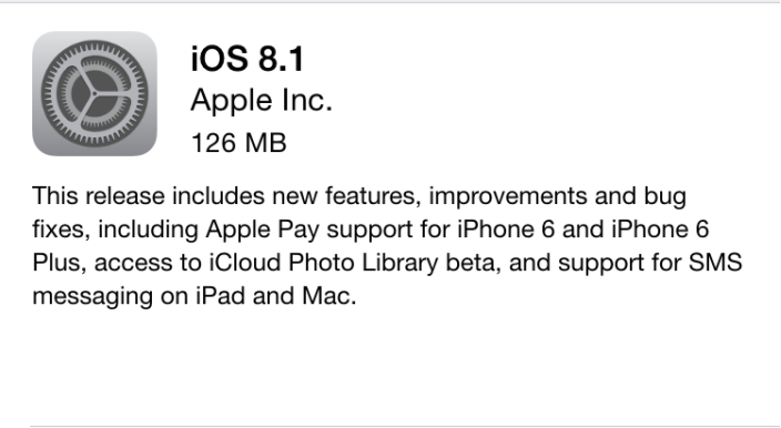
Apple has just released iOS 8.1 to fix some issues that affected iPhone 6 and iPhone 6 Plus users who have previously downloaded iOS 8.0.1 and 8.0.2 which have profoundly impacted cellular network connectivity and Touch ID handling. In addition to that most users have also reported problems with abnormal battery drain, and a slow performance in surfing Safari that the firmware update is going to solve (hopefully, once and for all).
iOS 8 was officially released to the world on September 17th, followed by iOS 8.0.1 which was instantly pulled out due to massive bug reports. Apple then released iOS 8.0.2 on September 26th, and now the iOS 8.1 update.
With iOS 8.1, Apple will also introduce Apple Pay for iPhone 6 and iPhone 6 Plus. The service will be offering Apple users to tap their fingers on the rounded home button sensor in order to complete a mobile transaction through the terminal. The update will also include a beta version of the iCloud Photo Library service, which basically lets you auto-save your entire media library in the cloud , some further more continuity features and support for SMS messaging on both the iPad and Mac.
iOS 8.1 is compatible with iPhone 4S, iPhone 5, iPhone 5c, iPhone 5s, iPhone 6, iPhone 6 Plus, iPad 2, iPad (third-generation), iPad (fourth-generation), iPad Air, iPad mini, iPad mini with Retina display and iPod touch (fifth-generation). You can easily update to the latest version of iOS either manually, through iTunes, or using OTA. Mind you, that the servers might be painfully slow.
Let us know if you are experiencing any issues with your Apple iDevice after loading iOS 8.1 on board.
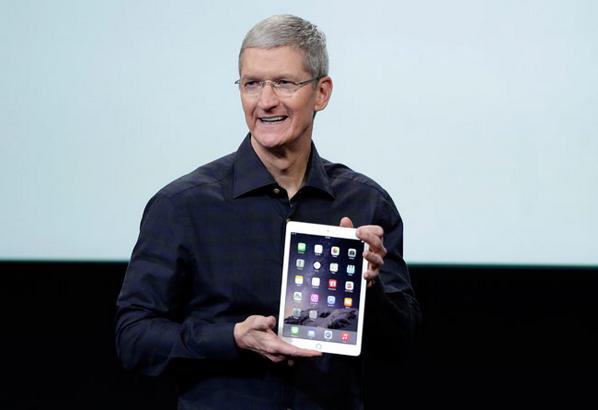
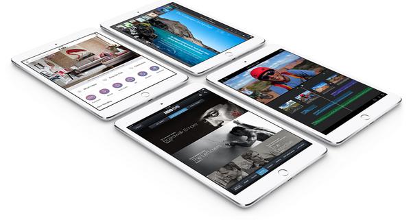
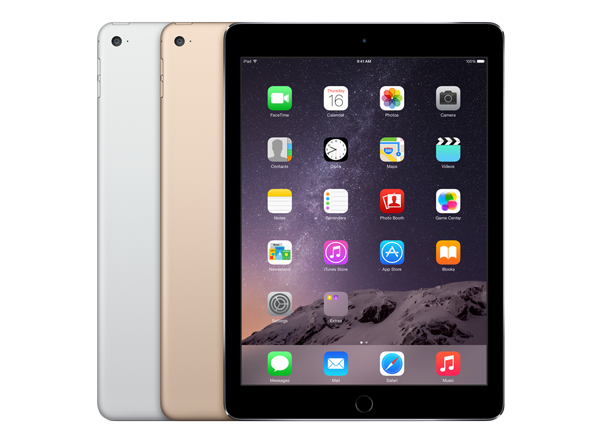
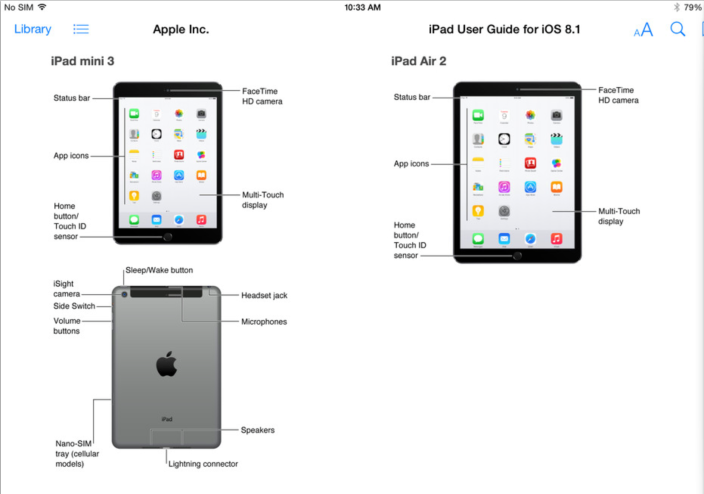
Apple today has officially announced its latest and greatest version of the iPad tablet. The newly named iPad Air 2, which was tagged by Apple’s Phil Schiller as “the world’s thinnest tablet,” is only 6.1mm thick and about 18% thinner than the original iPad Air.
Apple says that it has sold 225 million iPads to date, and the next generation is likely to add a whole lot more to the inconceivable numbers which, by the way, are already bigger than the PC sales all together. Going back to the iPad air 2, that has the same 9.7-inch display form factor as previous models (2048 x 1536 pixel resolution), only with a new A8X processor, which Apple says is 40 percent faster, has about 3 billion transistors and bags about 2.5x faster graphics performance than the previous iPad Air.
The camera on the iPad air 2 is also getting an upgrade in the form of a 8-megapixel iSight shooter with 1.12 micron pixels, f2.4 aperture and a whole new image processor on board. You can basically take 43mp panorama images with it and shoot some beautiful timelapse footage as well as Slow Motion videos and more. In addition, Apple will offer some cool editing software like the Replay and the Pixelmator. Moreover, the new tablet includes the M8 coprocesor that will track your motion whenever you go, as well as a better battery life with up to 10 hour per day. Apple says the iPad Air 2 has faster data transfer rate on Wi-Fi thanks to the new 802.11AC with MIMO support. And finally, the latest addition – An integrated TouchID fingerprints sensor that will work exactly the same as it does on the iPhone.
The iPad Air will be available in silver, space grey and gold flavor options in the following storage/pricing configurations: 16GB ($499), 64GB ($599) and 128GB ($699). The cellular/LTE version adds $130 to those prices. Apple is also reducing the prices of some of its previous lineups with the iPad mini, iPad mini 2 and iPad Air first generation to start at $249, and go up to $299 and $399, respectively. All of the new iPads will be shipping with iOS 8.1, while pre-orders to start tomorrow and the shipping to begin by the end of next week.
Apple has also revealed the iPad Mini 3. The third generation of the 7.9-inch tablet appears to remain pretty much the same from the outside look with the single exception of a new Touch ID sensor. Yes, the smaller Retina tablet device will also be housing the Apple fingerprint ID security scanner on the bottom, along with a 5-megapixel iSight camera and with the same A7 processor inside. While a relatively modest upgrade, you cannot help but appreciate the company’s efforts to provide all the users with the latest and greatest technology available. The Mini 3 will come with your choice of silver, space gray, and gold color options with pre-orders starting tomorrow (and shipping next week), at $399 for the 16GB version, $499 for 64GB and $599 for 128GB.
We have reached the day where Apple is expected to announce a new line of iPad tablets, including a second-gen of the iPad Air, the iPad Mini 3 and hopefully an Apple TV media device. Follow our LIVE feed and the latest news as it happens over here
And here we go again.. the Apple store is officially down. You know how it goes in a day like this where the Cupertino giant is unveiling new iPads and possibly new Macs, OS X Yosemite and an Apple TV. The event itself is expected to take place at this time of the day around the world:
US: 10am PT / 1pm ET
UK / EU: 6pm UK / 7pm CET
INDIA: 11.30pm IST
You can watch the Live Feed in here: http://www.apple.com/live or simply follow our coverage over at @niron, or in our blogging area which will likely go up very soon.
Oops! Look what we have in here. Looks like Apple has officially unveiled its upcoming new line of tablets, which is due to be announced tomorrow. Though, of course, we’re not sure whether this is an intentional glitch (to draw some attention away from Google’s multiple announcements), or an unintentional mistake, the company released a few more details about the iPad Air 2 and iPad mini 3 through iPad User Guide for iOS 8 within iBooks.
And while there’s not much to tell from the image, the visuals look both impressive and about the same as the previous versions, which is a good thing, when you come to think about it. As expected, the new devices will finally get a TouchID sensor, letting users unlock the tablet with their fingerprints ID, authorize app store potential purchases, and hopefully (hopefully) work with the company’s upcoming Apple Pay mobile payments system.
Price and availability are yet to be determined.
Update: Apple just pulled the screenshots from the iOS 8 guide.
We knew it was coming and now Google has finally shared details with its upcoming tablet, the Nexus 9. Slated to arrive in stores on November 3 (with pre-orders to start on October 17), the 8.9-inch 2048 x 1440 super HD slab, which was built in partnership with HTC, features a relatively small and portable device, made of a brushed aluminum all-metal body. The slate, which is set to cost about $399 for the 16GB packing version and $479 for the 32GB model is said to arrive with 2GB of RAM, as well as an Nvidia Tegra K1 chip, and a 8-megapixel rear camera shooter plus a 1.6-megapixel camera up front. The Nexus 9 will also include an optional 32GB 4G LTE variant, which will brandish a price point of $599 when it’s officially released.
The Nexus 9 is powered by Google’s latest edition of Android, also know as the Android Lollipop version 5. In addition to that, the Mountain View-based internet giant will also be offering a nice keyboard folio that magnetically attaches to the back of the tablet, and can easily fold into two different angles. The Nexus 9 will have a black, white or gold choice of colors.
Chinese computer giant Lenovo has already introduced their Yoga line of swivel tablets sometime around October last year. They allow you to use them regularly in multiple positions, either like a long standing screen, or simply as a proper laptop keyboard surface. The slates which have been widely pushed by actor Ashton Kutcher, present a new concept of tablet design, thanks to the clean and modern lines of the frame, as well as the long wide kickstand which makes for a comfortable reading or media viewing experience.
Today, Lenovo introduced two new Yoga Tablet models, with some rather interesting and more updated hardware specs.
What’s new in the Yoga is a number of add-on features being introduced this year. It’s not just the size of the screen that’s changed, with the outgoing Yoga tablets packing 10.1-inch displays Max in 1,280 x 800 pixels, and the new models cramming high-definition 1,900×1,200-pixel-resolution screens, the quality of the chips has also been improved and the overall design received a more sleek and contemporary look than anywhere before.
Yoga Tablet 2 Pro
The Yoga tablet Pro 2 is the larger of the options in the series. It packs a whopping 13.3-inch display, featuring 2560 x 1440 screen resolution. Impressive, isn’t it? Along with the giant screen, we’re also looking at a fourth-generation Intel Atom processor under the hood, as well as 2GB of RAM, 32GB of internal storage, a microSD card slot , allowing up to 64GB capacity, and a micro USB OTG port. The tablet runs under Google’s Android 4.4 KitKat OS, with an option to pick up Microsoft’s Windows 8.1 as the main controlling platform.
The real kicker? It has a beautiful integrated pico projector inside the kickstand. Yes, you’ve heard that right, a 16:9 built-in projector featuring 40-50 lumens and good for up to 50-inch image on any blank home-theater surface. Apart from that it sports 8-watt speakers plus a JBL subwoofer for great sounding audio experience. It is estimated that the battery on this device will last approximately 15 hours.
As far as pricing goes, the 13-inch model starts at $499 (32GB version), while the smaller iterations (8- and 10-inch models) will start at $249 and $299, respectively, with a retail version to be available at the end of October.
Yoga Tablet 2
Lenovo is offering the Yoga tablet 2 in 8-inch and 10-inch models, both with your choice of Android or Windows 8.1 platforms on board. The screens boast Full-HD 1920×1080 resolution, supporting 1080p formats natively. Both are said to feature Intel Atom processors on board, alongside a dual-band Wi-Fi connectivity and optional 4G for blazing internet speeds. Photography wise, you’re getting an 8 megapixel rear camera, as well as a 1.6 megapixel shooter up on the front, with a battery that can deliver up to 18 hours of continuous work.
In terms of capacities, the Windows version is claimed to house 32GB of internal storage with optional microSD slot expansion, while the Android version has only 16GB to store your data, music, photos, and videos.
As for the prices, Lenovo is widely competitive with their new line of Yoga Tablet 2, starting at $249.99 and $299.99 for the 8-inch and 10-inch Android models respectively, while the 8-inch Windows version will cost $299.99 (available in November) and the 10-incher at $399.99 (available in late October).
Apple has started sending out invites for a media event on October 16, which will be held at the company’s Cupertino headquarters, and is widely thought to be the launch of the next-gen iPad Air as well as a new line of Macs. The invites suggest a colorful teaser with some cropped lines of the Apple Logo and the upper leaf alongside a simple line that vaguely says: “It’s been way too long.”
What does it mean? It is yet to be determined, but besides the new hardware, the company is also expected to be launching its latest Mac OS X update, dubbed OS X Yosemite, and may also debut Apple Pay, its mobile payment solution for users.
As always, we will continue to update as much as it takes.
If you’re in the market for a new tablet, what will you be going for? In case you are looking to nab a brand new iPad, mind you that Apple is rumored to launch the second-generation of its popular iPad air next week, on October 16. The next iPad may include a fingerprint scanner in its home button and the company is expected to bring its latest and greatest Touch ID sensor technology to the new line of tablets, along with a slimmer chassis (0.5mm thinner than previous model) and probably a new faster processor and with a Gold cover option.
That’s what we have heard so far from the rumored specs, and today, we are finally obtaining confirmation to those words, thanks to a bunch of new and pretty reliable photos, published by the Vietnamese blog Tinhte.vn. This isn’t the website’s first attempt to post what they are claiming to be Apple’s next iPad, which, as mentioned, appears to include a Touch ID fingerprint sensor and redesigned speaker grills, but with a proven track record, what could go wrong?
So what do you guys think so far, does it look like the real thing? Are you planning to get the new iPad Air for yourself, or is the iPad mini with Retina display a more attractive option?
Apple has just released to the world a very useful online tool that will let potential iPhone buyers determine whether or not a second-hand iPhone (or any other iDevice for this matter) that they might consider nabbing is actually legit or not.
The company has announced that the new version of the iCloud tool will be enabled by default starting with iOS 8. In order to turn it into action you’ll need to go to iCloud.com, and type inside the IMEI or the serial number of a certain device. By doing so, the platform will be telling you whether a device is protected with Activation Lock and whether or not it’s ready for a new Apple ID signup or will require a password before another user can activate it.
In the case you already acquired a protected device Apple provides instructions on how to remove the Activation Lock and make it disabled once and for all. But make no mistake, it will require the cooperation of the previous owner.
Google has been capturing our rich imagination through developments like Google glass, prompting widespread discussion about the future of tech, ‘wearables’ and vision in general. Just think about the awe-inspiring number of opportunities to use the new gadget in different type of daily scenarios, and what might the future of the discipline look like and how might it best progress; perhaps a ground-breaking app for Google glass that will allow the user to take a photo just by thinking about it and look in a certain direction? That would definitely be cool, but also a little shady, to say the least.
And what it requires to get to the next stage? How about a smart contact lens that could monitor anything from blood pressure levels to recorded brain signals, and diabetes sugar rates? Perhaps it’s the same science fiction you use to believe in some catchy Hollywood movies, or maybe just a new and better reality for some people in the far or near future.
To learn more about the way things might look in a few decades from now, be sure to check out this nice and detailed infographic chart:
Today, HP has launched a bunch of new Windows tablets, at the entry-level price range. The two, dubbed the Stream 7 and stream 8, are said to offer a year-long subscription to Microsoft’s Office 365 Personal package, plus a very generous 1TB OneDrive storage, as well as 60 minutes of free Skype calls. The smaller model, the 7-inch HP Stream 7 tablet, which will be due on November for only $99, is powered by an Intel Atom quad-core processor (Atom Z3735G) under the lid, paired with a 1280 x 800 pixel display on top with 1GB of RAM, and 16GB of solid state storage. We’re also looking at a pair of integrated stereo speakers on board alongside an optional 4G LTE network connectivity, and a standard microUSB hosting port. The bigger flavor, the 8-inch HP Stream 8, is much like the 7-incher, with a similar interface and the same capacity and internal processor. It comes with an extra inch for the real-estate surface and a $150 price tag and with the same guaranteed delivery date for ground shipping, starting sometime this November.
Apple has just rolled out a new update to its very popular iOS firmware. The latest release, dubbed iOS 8.0.2, is a followup answer to the company’s earlier buggy iOS 8.0.1 update which literally disabled cell phones connectivity and Touch ID functionality on many iPhone 6 and 6 Plus devices.
The Cupertino giant pulled the problematic update within hours and issued instructions on how to downgrade to iOS 8.
The update is quick and recovers pretty much all the problems on the iOS 8.0.1. To get it loaded on your smartphone simply go to Settings>General>Software Update and hit the Install button. Another option is to get it updated via Apple’s own iTunes software.
“iOS 8.0.2 is now available for users, it fixes an issue that affected iPhone 6 and iPhone 6 Plus users who downloaded iOS 8.0.1, and includes improvements and bug fixes originally in iOS 8.0.1,” the company said in a new statement. “We apologize for inconveniencing the iPhone 6 and iPhone 6 Plus users who were impacted by the bug in iOS 8.0.1.”
Version 8.0.2 also provides us with some needed fixes that should heal the anticipated HealthKit apps, as well as fix to some third-party keyboard problems, and an immediate improvement to the Reachability feature on iPhone 6 and iPhone 6 Plus.
The new release contains improvements and bug fixes as follows:
Fixes an issue in iOS 8.0.1 that impacted cellular network connectivity and Touch ID on iPhone 6 and iPhone 6 Plus
Fixes a bug so HealthKit apps can now be made available on the App Store
Addresses an issue where 3rd party keyboards could become deselected when a user enters their passcode
Fixes an issue that prevented some apps from accessing photos from the Photo Library
Improves the reliability of the Reachability feature on iPhone 6 and iPhone 6 Plus
Fixes an issue that could cause unexpected cellular data usage when receiving SMS/MMS messages
Better support of Ask To Buy for Family Sharing for In-App Purchases
Fixes an issue where ringtones were sometimes not restored from iCloud backups
Fixes a bug that prevented uploading photos and videos from Safari
Apple has aired two new ads for the iPhone 6 and iPhone 6 Plus entitled ‘Huge’ and ‘Cameras’ in which it features Jimmy Fallon and Justin Timberlake. You can see in the ads that the Cupertino giant is highlighting some of the most important features that the new devices are offering to users – the updated cameras with the slow motion and high quality time lapse shooting functions from one hand, and the larger displays they both boast on top, from the other (the iPhone 6 and the iPhone 6 Plus feature 4.7-inch and 5.5-inch HD displays respectively).
This isn’t the first time the two, Jimmy and Justin, are running over a couple of lines in an Apple ad, as we have seen a similar footage during the iPhone 6 event. Yet, the dialogues are quite funny, to say the least, although you can’t really see the characters themselves.
Apple announced that opening weekend iPhone 6 sales were over 10 million. This is a record for the company in the first three days of sales.
It’s Apple’s iPhone day, and long queues already forming outside the company’s global retail stores in anticipation of the launch of the iPhone 6 and iphone 6 Plus at 8am this Friday. It is only natural that people would be interested in the new phones coming from Apple, after the positive reviews the devices had received and the pre-orders record of roughly 4 million phones.
On this morning of the iPhone 6 launch we are able to see huge queues of people waiting in line to get the chance of purchasing a limited stock of Apple’s latest iteration of 4.7″ and 5.5″ smartphones. The Apple Stores around the world all have queues, loads of queues.
The iPhone 6 comes in silver, gold and ‘space grey’ flavors and features an A8 chip, a Touch ID fingerprint identity sensor, iOS 8, and an iSight camera with a larger and faster 8MP sensor.
Budget tablet market begins to hot up, and no one seems to know that better than Amazon. The U.S e-commerce giant today announced two entry-level models for its Fire tablet line, making them the perfect purchase for holiday goers. The new series includes the Fire HD 6 (six-inches diagonal ) and Fire HD 7 (seven-inches diagonal), with both tablets featuring 1280 x 800 resolution displays, as well as 252 ppi and 216 ppi pixel densities respectively.
Amazon Vice President Peter Larsen said the company is aiming at broadening their target audience but without compromising on quality in any way. “If you get down to those low price points, you start to trade stuff off,” he said. “We hear about it from customers all the time.”
The two Fire HDs are expected to run under Amazon’s own Fire OS 4 Sangria platform, paired with similar 1.5GHz quad-core processors under the lid (delivering three times much faster graphics processing than previous models) and with Dolby Digital Plus audio, as well as dual camera i.e. both rear and front facing camera for photography and video calls.
The HD 6 price will start at ONLY $99, while the HD 7 is priced as much as last year’s Fire HD model, at $139. Both are said to be available in five different colors, including black, white, fuchsia, cobalt blue and yellow, with shipping to begin in October and pre-orders to start today.
Just In Time — Apple has officially released its new firmware update to the iPhone and iPad software. Apple’s new mobile operating system , iOS 8, is now available for free download for a number of products, but If you’re getting an error – please be patient – it’s probably because the servers are getting overloaded right now.
The new iOS 8 is compatible with:
iPhone 4, 4s and 5, iPod Touch 16 GB, 32 GB and 64 GB (5th generation), iPad 2, with retina display and iPad mini.
It’s not a big change, but it’s definitely a little better. People who buy an iPhone 6 or iPhone 6 Plus will get iOS 8 pre-installed, while the rest will have to get it from iTunes. Here’s a short list of some of the best new features in iOS 8: Device Continuity, QuickType/3rd party keyboard support, HealthKit tools, HomeKit controls, iCloud drive, Family sharing app, Improved messaging features (photos and voice), New integrated Spotlight search system, Additional camera video capabilities (such as time-lapse), Interactive actionable notifications platform, Fresh Siri features (‘Hey Siri”), New “Contacts” look, and a WiFi calling support.
There are two ways to get the new update for your iDevices:
1) Go to Settings > General > Software Update, and hit the “Download and Install” button. After you have it downloaded onto your slab, click the “Install” button and wait for the process to be over.
2) iOS 8 can also be downloaded on your computer via iTunes, and it requires Apple’s latest release version.
Update: Make sure you have at least 5GB+ to install iOS8.
Apple’s next-generation iPhone 6 and iPhone 6 Plus mobile devices are finally available for pre-order for Cupertino fanboys in USA and eight other countries, including the UK, France, Canada, Germany, Hong Kong, Singapore, Australia, and Japan. With shipping scheduled to begin September 19, 2014.
If you are interested in buying one of the two without a contract (SIM free), you’ll need to pay the full price upfront.
The iPhone 6 and iPhone 6 Plus prices start at $199, and $299, respectively, while the iPhone 6 Plus starts at $299 and $399 when purchased as part of a two-year contract with all three U.S carriers AT&T, Sprint, or Verizon.
Unlocked contract-free option for the two models (including T-Mobile), will set you back as follows:
Dell, one of the well-known manufacturer of electronic and tech devices, announced a brand new 8.4-inch tablet at the Intel Developer Forum today in San Francisco, California. Inspired by the iPad success, tablet makers have been battling to produce thinner devices. Dell is obviously one of the leading candidates for the highly prestigious accolade, and with its recent revelation, the Venue 8 7000, the company is aiming to set the new standards.
At only 6mm thick, the new slab, which will run on an Intel Atom Z3500 Moorefield chip, is supposed to be the world’s thinnest tablet ever made. So thin, that when you hold it to the light, you are able to see your hand through it (just kidding). As said, It sports an 8.4-inch 2560 x 1600 pixel edge-to-edge OLED display on top of the surface, tucked with 16GB of internal storage, plus an 8 megapixel camera on the back with a 2 megapixel front shooter. Dell is also setting the line with Intel’s latest technology, known as the RealSense 3D platform. It basically capable of turning any map into an in-depth 3D look in a snap.
More over, the rectangular 7000 model is also expected to pack 2 or 3GB of RAM, as well as WiFi, Bluetooth and 4G LTE type, plus micro-USB 2.0 ports, and an Android KitKat for the operating system.
If you want to hold out for the Venue 8 7000 it should be available by the 2014 holiday season, with prices yet to be announced.
CUPERTINO, Calif. – Apple announced the iPhone 6 and the iPhone 6 Plus on Tuesday. The 6 is the company’s flagship mobile device, coming in Silver and Space Gray colors at your choice plus a Gold just in case any of you are thrust into this luxurious phone. It has a ‘Touch ID’ fingerprint reader, same as the previous 5S series had, as well as Apple’s new A8 processor, which is 25% faster than last year’s models, capable delivering about 50 percent more energy efficient. That means 4 hours of 3G talk time for the 6 model, and 24 hours for the Plus; up to 10 days standby for the 6, and 16 for the Plus, about 11 hours of video for the 6, and 14 for the Plus. There’s also a new M8 co-processor to handle all motion data, and track your activity. Connectivity wise, we’re looking at an 802.11ac WiFi, Bluetooth 4.0 and 150 Mbps LTE network. Finally, the phones are also featuring an integration of short-range NFC and mobile payment technology.
While the a camera on both the iPhone 6 and iPhone 6 Plus will still capture 8-megapixel images as before, it now offers a more advanced iSight sensor and an f/2.2 aperture lens paired with the same True Tone flash, capable of catching up to 43-megapixel panoramic photos, plus stunning slow-motion videos with 240 frames per second.
Th screen on the iPhone 6 devices is as follows:
iPhone 6 — 4.7-inch display: 1334 × 750, 326 PPI
iPhone 6 Plus — 5.5-inch display: 1920 × 1080, 401 PPI
Some measures:
The iPhone 6 – 5.44 x 2.64 x 0.27 inches (138.1 x 67 x 6.9mm) and weighs 4.55 ounces (129g)
The iPhone 6 Plus – 6.22 x 3.06 x 0.28 inches (158.1 x 77.8 x 7.1mm) and weighs 6.07 ounces (172g).
Probably one of the most important improvements inside the new iPhone devices (besides the camera) is the A8 chip, a 64-bit SoC that’s 20% faster CPU, 50% faster graphics. It has 2 billion transistors, on a 20nm process, and It’s 13% smaller than the A7 — this is a truly amazing computer-power chip.
Apple has also announced a bigger model, dubbed the iPhone 6 Plus, which is basically a similar version of the 6 only with a bigger screen display (5.5-inch 1080p Retina HD display) and a mildly little thicker body form (7.1mm vs. 6.9mm). It has an “Ion-strengthened glass,” up on the hood, paired with an IPS liquid crystals panel beneath, and an “anodized aluminum back” on the rear. The iPhone 6 Plus is available for pre-order from Apple on September 12th, and both will be available for shipping on September 19th.
As has been the case in previous keynotes, much of today’s announcement has already been leaked ahead of the event. Over the past few months, we’ve seen plenty of images and video footage of both the new iPhone 6 and the iPhone 6 plus. And as it turns out most of the rumors were pretty spot on.
The iPhone 6 lineup maintains the same price points (at least in the US) as before, with new 4.7-inch iPhone 6 to cost $199 (16GB), $299 (64) and $399 (128GB). While the new 5.5-inch iPhone 6 Plus to set you back for $299 (16GB), $399 (64GB) and $499 (128GB). Expect similar pricing in Canada. Apple also drops prices of the previous models as follows: iPhone 5S: $99, iPhone 5C: “free”
More and more iPhone 6 rumors keep on cycling around every corner of the world, and we are right now doing as much as we can to filter the info and bring you the best. This time we’re looking at one of the longest, most detailed instructional videos on Youtube of what appears to be a model of the next generation iphone device. At this point, we have no way to verify this footage, whatsoever! But still it is an interesting early glimpse of what we are about to see tomorrow.
Hit the Play to watch the video
[youtube id=”eQopSbASO40″]
[toggle title=”TRANSLATION OF TEXT”]
One is an iPhone 5s and the other is, I’m not sure what it is gonna be called, probably the iPhone 6. You guys might be curious if this phone that I am holding might be a knock off or fake, but it does have an Touch ID, I (you) don’t think so? Let’s try and see that again.
My personal feel of the phone is that it is faster than the 5s. When I got the phone, I personally feel that it is very light, much lighter than expected when seeing the (leak) images online. It might be seen that the iPhone 6 is gonna be heavier, but it is not. Thus, I feel the iPhone 6 is much a lot lighter than the iPhone 5s. That is the first thought about the phone.
(80% accuracy)
The second thought is about the screen size. One might think that it is gonna be too big and needs more than one hand to operate, and Apple has done it with only one hand usage. (Not sure: By making the screen size taller to achieve it). Still feels comfortable using the iPhone just like the iPhone 5s.
(50% accuracy)
Thirdly is the ‘radians’ (according to Google Translate) or ‘Bezel’ on the sides, somewhat like the Samsung’s I9300 (or SIII). Which makes it feels comfortably good with one hand. [Talks about technology of the screen with him mentioning “2.5”.
On the back, it still retains the design of the iPhone 5 backing of the 3 parts. And still on the back, the iPhone 5s camera is within the body of the phone, but the one on the iPhone 6’s camera is protruding outwards. Some may feel that it is ugly, but I personally feel that if the camera quality is better, it is something good too (or I don’t mind either).
Since there isn’t much apps or software running, the performance feels about the same. But if according to Apple, the internal specs would certainly be an increase. For that, we would only know after the event.
Let’s open the camera app, this is the screen, (takes picture), taking pictures feels very fast, very fast, can’t imagine that. *Goes on opening the Photos app* Photo still feels quite small.
And that is all.
*Shows the different apps on the phone*
Unsure of the megapixel of the camera due to the lack of information.
The health app may connect to the iWatch.
Apple’s iPhone launch event is only three days away, but leaks haven’t stopped coming in. Apple set to reveal a new line of iPhone devices, as well as a smartwatch, which was rumored to be in the making for quite some time, and its latest and greatest iOS 8. As rumors of the new iPhone design continue to swirl, we’ve stumbled upon a series of short “hands on” videos related to the most expected iPhone 6. In those videos you can see a guy playing around with what appears to be Apple’s next-gen iOS 8, running on an iPhone 6 (or whatever it is). As usual you should take this footage with a little grain of salt, but you should also pay attention to some of the details included in the videos. For instance, this tiny little red stripe icon which apparently includes an image of a credit card, that most likely indicating of an electronic payment capability through Passbook. In addition to that, the submitted clips which have been recently uploaded to Chinese video sharing site MiaoPai (by a user called “zzray”), also present a new Health app plus many other upcoming iOS 8 features. What do you think, is that the REAL DEAL?